Events
McDonald's Doesn't Need No Stinkin' Overt Branding
You know McD's hash browns when you see them
Look ma, no logo!
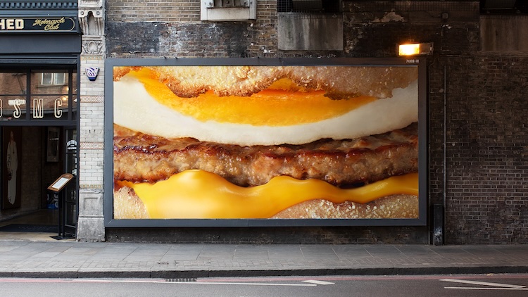
Across the U.K. and Ireland, McDonald’s offers intense yet unadorned breakfast-item close-ups that hit almost like pop art, rather than advertising.
Glistening hash-brown potatoes, gooey melting cheese and sun-kissed eggs adorn billboards, in-store activations, social media and TV spots launching today. The pics are striking, like visions from some fast-food universe with deep-fried mountains and valleys stretching to the horizon.
McD’s pioneered the bold-yet-minimal approach, and that’s what we get here. The McDonald’s name never appears. Images and sonic cues tell the story.
Of course, for most folks, the stuff’s instantly recognizable. Only the most brand-deprived will fail to get the message.
I’d argue that the fact you can tell it’s McD’s enhances their artistic merit. It’s the whole intersection-of-art-and-commerce thing, meta-commentary that’s visually dynamic and layered because it’s actually selling something.

“You can spot a McMuffin from miles away. Think of a hash brown. We bet it’s a McDonald’s hash brown,” say James Hodson and Jason Keet, the Leo Burnett U.K. creative team behind the campaign.
“So, we thought our job was to just get out of the way. No logo. No product names. No catchy copy. Just the shapes and textures that we all know and love.”