Events
10 Great Album Covers, Chosen by Jaye Thompson of Mother
Kid Cudi, The Roots, Amy Winehouse and more
The qualities that draw me to a piece of art can be summed up by three main characteristics: concept, color and composition. With my background as a designer, I find it inescapable to not evaluate something based on a conceptual narrative or insight. It’s this that brings context and meaning to the work. When a point of view can be represented in a strikingly distinct way that arrests your attention, it’s what I like to describe as “visual crack.”
Part of what makes an album great is not just the ability to execute sonically, but to consider this broader conceptual narrative—everything that surrounds the music. That includes performances, videos, and of course the album artwork. It should all feel like a cohesive world that an artist has shaped—an album is a single planet among the universe of their entire discography.
As I was writing for each album entry, it made me consider how each album has contributed to shaping my musical identity and what influences I unknowingly borrowed from it. For better or worse, these are just a few examples of the music and album artwork that have stuck with me and have remained in my rotation throughout the years.
Kendrick Lamar
To Pimp A Butterfly (2015)

When the cover art for Kendrick Lamar’s second LP was revealed on Instagram in March of 2015, I was stunned by the audacity and absolute unapologeticness of the cover. Executed in a way that is reminiscent of archival imagery, the visual showcases an assembly of Black men flaunting cash, liquor, and gang signs in front of a revered staple of American society. For added emphasis, we see a judge lying on the ground, knocked unconscious in the foreground. The entire composition feels like a metaphorical (and literal) middle finger to a country that so often villainizes and ignores Black men. The narrative of the album pairs perfectly with the content of the cover and showcases Kendrick’s ability to curate such a nuanced and richly layered image.
Mos Def
Black On Both Sides (1999)

The rawness and vulnerability expressed in this portrait of Yasiin Bey (fka Mos Def) was something I had never seen before of Black men. Quite similar to the indiscernible expression of the Mona Lisa in the Louvre, it’s not quite clear what the subject of the cover is feeling. We see a glimmer in his eyes—is it sadness? Hope? Both? The intense closeness of the portrait forces the viewer to not ignore the man in front of them. The image conveys a sense of silence, but the unignorable close proximity simultaneously makes it feel like it’s shouting —demanding to be seen for who he is.
Danny Brown
Atrocity Exhibition (2016)

Before this album, I wouldn’t have called myself a Danny Brown fan or a casual listener. But as soon as I saw the artwork for this project, I had to know what the music sounded like. The first song off of Atrocity Exhibition is called “Downward Spiral,” a fitting introduction to an album that details the artist’s tormented psyche and internal conflictions. The cover is psychedelically abrasive, as the glitching and fracturing unravel the artist. Vulnerability isn’t always delicate or quiet, sometimes it’s ugly and savage.
Kid Cudi
Man On The Moon: The End of Day (2009)
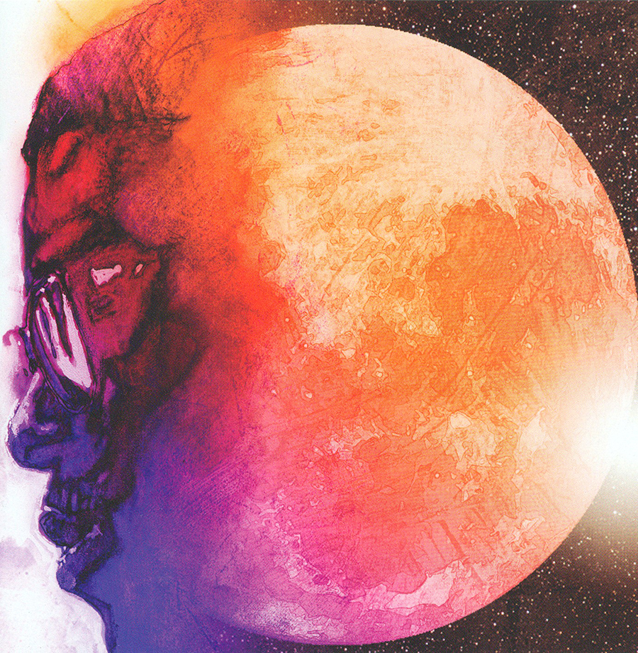
I hold this album in such high regard that the cover has implicitly become canon for my own personal and artistic aesthetic. The clash of orange and purple hues creates a juxtaposition of melancholy and optimism, alluding to the conflicting dualities Kid Cudi examines about himself throughout the project. This artwork simply captures genuine emotions we all feel at times. Whether it’s that of an outcast who can’t quite seem to fit in or the mindstate of a vivid dreamer with their sights set beyond the stars, it’s a poignant image that has established itself as a fixture in culture.
The Temper Trap
Conditions (2009)

The music from the Melbourne band’s debut album can be simply described as ethereal and softly anthemic. The visual of the little girl shrouded in darkness, with just a few of her facial features peeking out, has always felt like the perfect expression of how the music sounds. A bit somber without coming off as dreary or depressing, with a touch of innocence and honesty revealing itself amidst the cloudy production. Her expression is difficult to gauge—possibly uneasy, but not panicked. It’s always felt like a metaphor for stumbling through the unknown and unilluminated parts of life—we’re never sure where we’re headed, but we keep moving, trying our best to keep our composure and find the light.
Rihanna
ANTI (2015)

Some images are drenched in symbolism, layered with such multiplicity that they beg to be studied. I believe Rihanna’s magnum opus, ANTI, is one such image. A mesmerizing piece of art to match the music it accompanies. Commissioned by the artist Roy Nachum and part of a series called “Blind,” the images come across as quite enigmatic, conveyed by the dizzying double visual of the figure, the crown that obscures her eyes, and the lone balloon in her hand. The vibrant red against the otherwise monochrome image pierces through almost violently, but paired with the crown it comes across as regal. In addition, the braille messaging relays a poem by Chloë Mitchell, adding even more depth to the artwork. There are just so many different facets to spark conversation around the idea, contributing to making this one of the best albums to come out of the 2010s.
Big KRIT
4eva N a Day (2012)
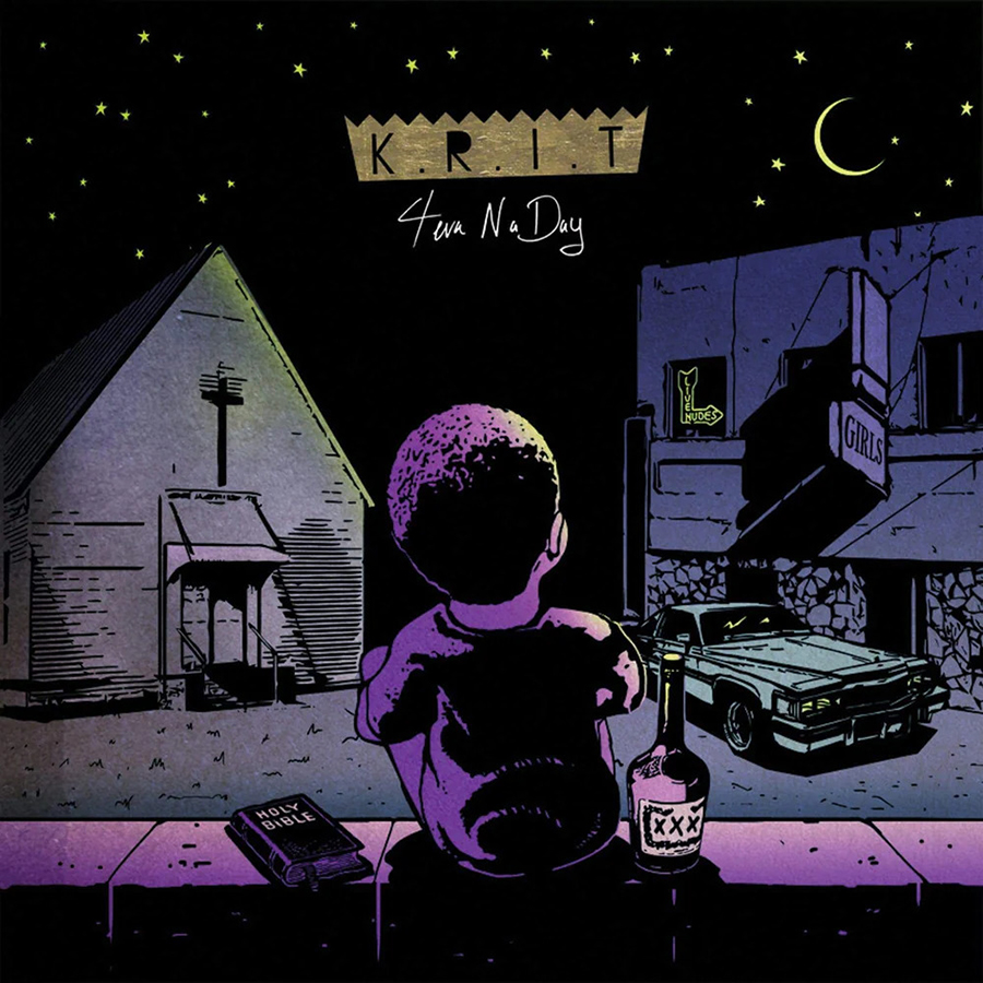
Some of my favorite works of art explore the moral complexity of characters and situations. This illustrated piece shows a character straddled between a church on his left—symbolizing righteousness—and a strip club on his right, representing one’s vices. A bible and bottle of alcohol are on either side of the character. I think this image is a perfect analogy of the dual forces constantly at work in one’s life, and the decisions we are faced to make. KRIT’s masterfully introspective lyrics provide catharsis as he is figuring out his path as a man presented with the same choices.
The Roots
Undun (2011)

It wasn’t until years after this album came out that I learned about the photographer of this image, Jamel Shabazz. He was a street photographer in New York during the 80s, who was known for taking everyday photos of Black youth. This image feels so nostalgic and harkens back to a time we can all relate to. The moment in which Shabazz captured the young boy in the air, as if he was levitating above the mattress, reminds me of how invincible adolescence felt at one point. So much seemed possible, not yet tainted by the cynicalness of adulthood. Our innocence was still intact. This moment, frozen in time, is like an homage to those summer days spent with friends, using our unbridled imagination to turn the most boring of things into an adventure.
Rhye
Woman (2013)

The debut project from the duo Rhye is a deeply emotive and intimate alt-R&B album that blends atmospheric production with ethereal vocals, creating a dreamlike aesthetic. The expertly composed photo makes the best use of cropping to create a quiet mysteriousness and sensual elegance of a recognizable form that somehow simultaneously feels abstract. It’s something that could stand alone as a single image and still be appreciated.
Amy Winehouse
Back to Black (2006)

It wasn’t until after Amy Winehouse had passed that I started digging into her discography. Listening to her albums with the knowledge of her personal hardships made me receive the music differently. The portrait of Amy sitting forlornly with her hands in her lap staring into the camera looking dejected pulls at the heart. For all of the reasons why this album cover can be viewed as downhearted, I think it’s a beautiful portrayal of a human confronting her flaws, choosing to be vulnerable for the sake of her art.
Art of the Album is a regular feature looking at the craft of album-cover design. If you’d like to write for the series, or learn more about our Clio Music program, please get in touch.