Events
U.K. Convenience Store Startup Embraces Slick Design
Among Equals casts Storrd as a 'beacon of hope'
With Tesco, Sainsbury’s and Waitrose dotting so many high streets, does the U.K. really need another convenience store? A startup called Storrd thinks so. And it debuts with a sleek ultraviolet aesthetic designed to grab eyeballs in a very crowded field.
Among Equals developed the look and feel, bathing the “actually convenient” brand proposition in purple light.

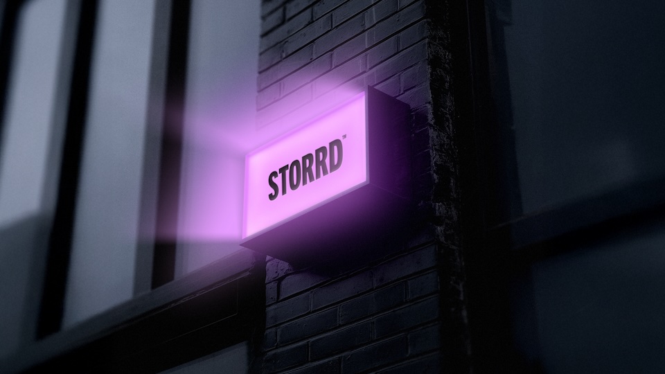
The approach feels neo-noir—neon-noir, actually—with retro-futuristic tones across Storrd’s IRL, OOH and digital identities. It’s like something out of Blade Runner, a place for replicants to grab a late-night burrito.
Cheeky copy justifies the place’s existence with nods toward consumer concerns. Lines from “Because sticky floors are not a vibe” to “Because grabbing milk at 11 p.m. shouldn’t feel like a drug deal.”

“When Storrd approached us, it was instantly clear they weren’t just launching another convenience store—they were determined to become a genuine beacon of hope in a sector that’s lost its way,” says Emily Jeffrey-Barrett, founder of Among Equals. “That ambition powered every creative decision, shaping a brand world that’s bold, intuitive and utterly unmistakable in its promise: to make everyday purchases simpler, faster and genuinely enjoyable.”

“Storrd’s mission to reset expectations mirrors our belief that great brands should cut through the noise—delivering clarity, not clutter,” Jeffrey-Barrett says.
The first Storrd recently opened on Jamestown Rd. in Camden, North London.
On wet, moody nights—they get a few of those in England, right?—the place’s logo, reflected in a puddle, might look something like this: