


 Events
10 Great Album Covers, Chosen by Rana Chatterjee of LG2
Blue Phantom, Funkadelic, Akira Miyazawa and more
For as long as I can remember, I’ve been drawn to records. As a child, I would stare at my father’s collection of Western Pop and Indian Classical LPs with religiosity, drawn to both the sound of the music and the visuals on the covers, and even more so, the liner notes that often included the lyrics, credits and personnel list. Absorbing every detail about the album as it played was a ritual that I would carry with me to adulthood. Early in my university years, I fell in love with samples—the source material for many of my favorite hip-hop songs, which could be found primarily on soul/funk/jazz/rock records of the ’60s and ’70s. This obsession with samples became a gateway to “digging,” a colloquial term for spending a lot of time rifling through stock in used record shops, gambling on albums that were often completely unknown to me. I began to develop my own instincts for what might constitute an interesting piece of music, all based on the cover art. Here are 10 of my favorites, in no particular order.
Blue Phantom
Distortions (1972)
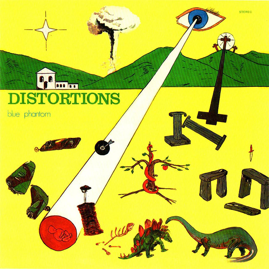
Cover art is certainly not a guarantee of whether or not a piece of music might appeal to you. I’ve been smitten by the most psychedelic of album covers, only to be greeted with the vocal stylings of a faux Paul Anka once the needle touched the record. That is certainly not the case here. This is a U.K. issue of an obscure Italian Music Library (used as stock for radio, movies and TV) and art director Alan Lester certainly did a good job of capturing the spirit of the music on this LP: extremely weird. An all-seeing eye projecting a beam onto a scene which includes a baby, dinosaurs, elements of Stonehenge, a lone rogue dagger and a mushroom cloud in the background. It’s likely that this cover was actually art directed by whatever substance Lester ingested prior to the deadline. There’s a real counter-cultural charm in hand-drawn covers because they stand out in the sea of mass produced, professionally shot and designed covers that tend to occupy space in most record stores. Plus, it’s a real departure from stock library protocol of the era, usually designed with a standardized layout and color across multiple LPs.
Roy Ayers
Coffy (1972)
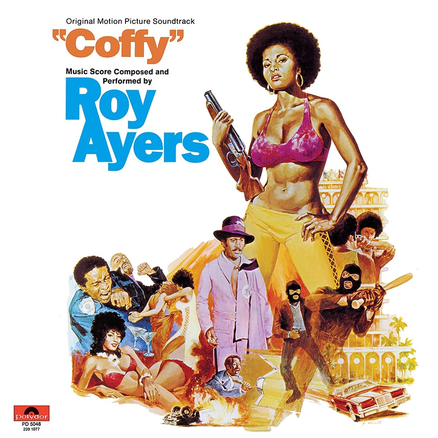
Soundtracks can also be a canvas for great cover art. I love when 70s B-Movie / Blaxploitation films adapted their poster concepts for LPs as opposed to creating something from scratch. This was often done out of necessity, with these smaller film budgets unable to support a custom design approach for different pieces of media. In many ways, these illustrated posters left more to the imagination than using photography or trying to lift still images from the often low budget quality of the films themselves. Coffy was a revenge film, about a Black female vigilante (played by the legendary Pam Grier) seeking retribution from a drug dealer who got her sister addicted to heroin. The vintage illustrative style that Japanese-American artist George Akimoto uses here feels very era-specific but there’s something about the detail and character of these images that feels timeless. Incidentally, Vibraphonist Roy Ayers’ soundtrack is equally as badass as the lead character herself.
The Joey Jefferson Band
The Joey Jefferson Band (1975)

Beautiful retro type work art directed by Dick Thomas for the Bay Area-based jazz funk outfit The Joey Jefferson Band. I’m a total sucker for cool type-driven covers. And nothing stands out more on a record store wall, especially with photography (and largely, band photos) being the standard for most albums of this era. There hasn’t been a single instance where this record was featured on a record store wall and my eyes weren’t drawn instantly to it.
Funkadelic
Cosmic Slop (1973)

If “overstimulation” was a genre of album covers, Funkadelic would be the forefathers. Artist and illustrator Pedro Bell began as a fan of Funkadelic, sending drawings to band manager Rod Scribner, who eventually commissioned him to begin creating promotional materials for the band. But Bell didn’t just create artwork. He created entire universes, with every album cover acting as a portal to alternate reality complete with its own bespoke heroes, villains and mythology. Key to Bell’s work was the use of the gatefold LP, a cover that opens like a book and allows the story being told on the front to continue on the inside, seamlessly integrating the credits and liner notes. He used every ounce of real estate on his cover work for Funkadelic and George Clinton from 1973 to 1986. And while the Clinton-helmed outfit’s music was already firmly entrenched in left field, Bell’s work gave generations of teenagers the visual tools to tune in, turn up and get lost in an entirely new world.
The Dramatics
Whatcha See Is Whatcha Get (1971)

Everything from the type to the palette here feels distinctly ’70s in the best way, but the most “dramatic” thing about this cover has to be illustrator Neil Deckert’s eye graphic, which gives this cover borderline surrealist vibes. Imagine this album sitting on the floor of a young Snoop Dogg’s home in ’70s Long Beach, California, the sounds of the Dramatics emanating from his household. Both Snoop and this album were birthed in 1971, and the vocal stylings of Ron Banks and company left a strong enough impression on him to include them on the single “Doggy Dogg World” from his 1993 debut Doggystyle.
Harlem River Drive
Harlem River Drive (1971)

An album that sounds just like the cover looks. Top notch Puerto Rican soul/funk from the NYC neighborhood parkway it’s named for. If you’re still reading this and have doubts about how nerdy I am, I keep this record filed in a section in my collection dedicated strictly to black and white covers. Art direction on this one is courtesy of Ruby Mazer’s art department, whose chief output was creating the seminal standardized look used by jazz label Mainstream in the ’70s.
Can
Ege Bamyasi (1972)

Fun fact: In 1970s Turkey, there was an Okra brand named Can, which according to Google, translates to “Bell.” And it’s the actual can featured on the cover of the fourth offering from this German Krautrock band. Ege Bamyasi actually translates to “Aegean Okra.” Don’t think there’s any deep seeded okra symbolism here, just the happy accident of a band member finding a can that says “Can.”
Akira Miyazawa
Karazishibotan (1969)

This is an instance where the artwork itself prompted me to make a purchase. I was on vacation in San Francisco and popped into the massive Amoeba Music down the street from where I was staying and after an intensive sweep of the store, I found this curious album sitting in the International section for $5. The image gracing the cover was a man holding what looked like a weapon, but I later realized was a flute (likely composer Akira Miyazawa’s instrument of choice). The artwork immediately spoke to me, so I took a gamble, as one often does when presented with interesting looking LPs at an affordable price. The album was well worth the price of admission, with the music feeling like an incredibly funky Japanese take on a Spaghetti Western score, something befitting of a Tarantino flick.
The Unfolding
How To Blow Your Mind and Have a Freak-Out Party (1967)

A late ’60s novelty record and a clear attempt to cash in on what the record company viewed as a psychedelic trend of the period. The Unfolding is not a real group, but a studio ensemble assembled solely for the purpose of creating a one off-release, a common practice in the time period. But where the album falls short of being a noteworthy piece of psychedelic music, it succeeds at being a decent piece of psychedelic marketing. In part, because the aesthetic eschews the minimalist approach synonymous with the era for a collage-heavy approach designed to keep the listener “stimulated” while listening.
Asiko
Take a trip with Asiko (1977)

More than anything else, I’m curious how ’70s Afro-Jazz-Funk outfit Asiko delivered the final artwork file for this LP. Using a combination of good old fashioned cut-n-paste techniques and colored markers, the art resembles doodles on a high school binder more than it does the design of a product intended to be sold publicly. Therein lies its charm and its brilliance. I challenge any professionally photographed LP of the time to compete for attention on the shelf with this one. I’m a sucker for retro DIY design, and any aesthetic that challenges the very principles we’ve become accustomed to championing.
Art of the Album is a regular feature looking at the craft of album-cover design. If you’d like to write for the series, or learn more about our Clio Music program, please get in touch.

