12 Album Covers That Ask: Can You Handle What's Inside?
Helmet, Deftones, Nine Inch Nails and more
I’ve spent my career chasing that elusive moment when design and sound blur into one question: Is the sleeve what you hear, or is the music what you see? I also play drums, which probably explains my lifelong obsession with rhythm, whether in layouts or in riffs. For me, album covers are not packaging. They’re portals, identities and time machines. Here are some sleeves worth talking about.
Beastie Boys
Hot Sauce Committee Part Two (2011)
AD: Mike Mills
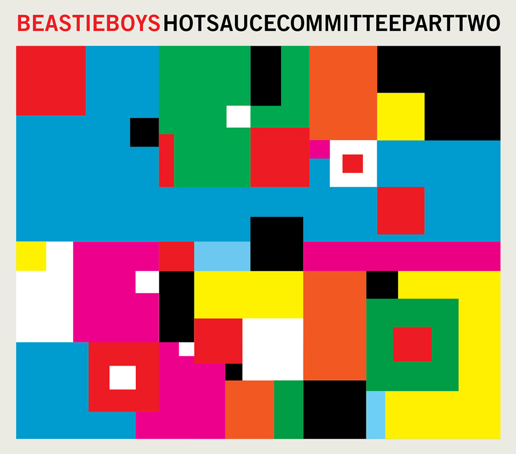
This ended up being the final Beastie Boys record though none of us knew it at the time. Mills’ sleeve is deceptively simple. It’s intriguing enough to pull you in, but the real treasure is inside: pages of characters, doodles and drawings you can get lost in for hours. A playful farewell wrapped in design. Recommended track: “Say It.”
Primal Scream
XTRMNTR (2000)
AD: Julian House, Intro U.K.
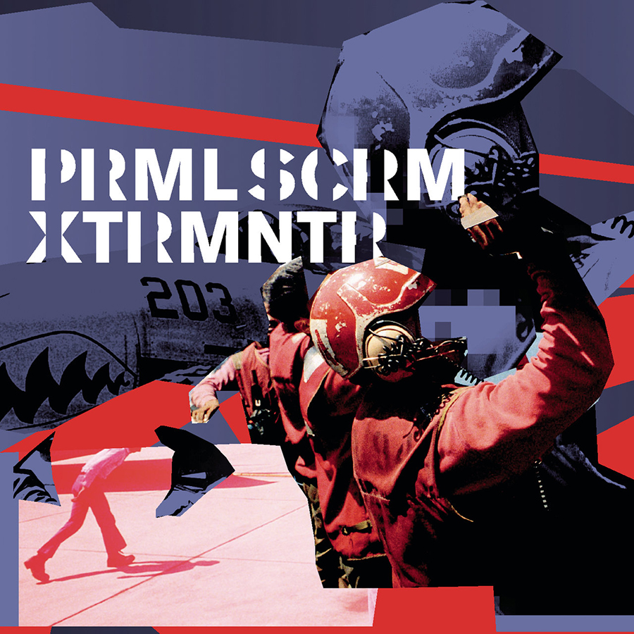
Crossing into the new millennium, Primal Scream delivered a brutal vision of the dystopia we now inhabit. Julian House’s design screams urgency: coded typography, militant graphics, danger in every pixel. Two decades later it hasn’t aged a day. If anything, it feels prophetic. Recommended track: “Kill All Hippies.”
Sonic Youth
Washing Machine (1995)
AD: Mike Mills, Kim Gordon
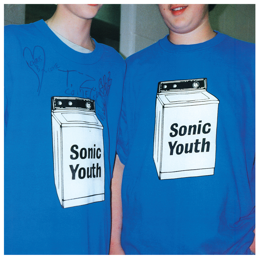
Exactly 30 years ago, I was at Lollapalooza in The Gorge, full on tripping, when “The Diamond Sea” stretched into eternity. The sleeve—with two oversized T-shirts, casual and cryptic from a picture taken by Kim Gordon—feels like Sonic Youth’s perfect inside joke. Noise, beauty and a refusal to explain anything. Just like that night. Recommended track: “The Diamond Sea.”
M83
Dead Cities, Red Seas & Lost Ghosts (2003)
AD: Stylophone, Justine Kurland
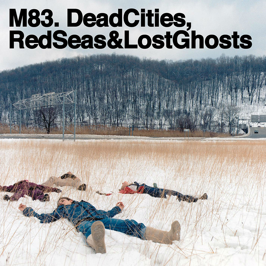
How can one image prepare you so precisely for the sound ahead? Justine Kurland’s photograph “Snow Angels” freezes innocence and mystery, while the bold aerial typography screams “DEAD, RED, LOST”—these are words as landscapes. It’s haunting, luminou, and eerily predictive of the dreamlike immersion inside. Recommended track: “On a White Lake, Near a Green Mountain.”
Föllakzoid
II (2013)
AD: David Correll, Domingae
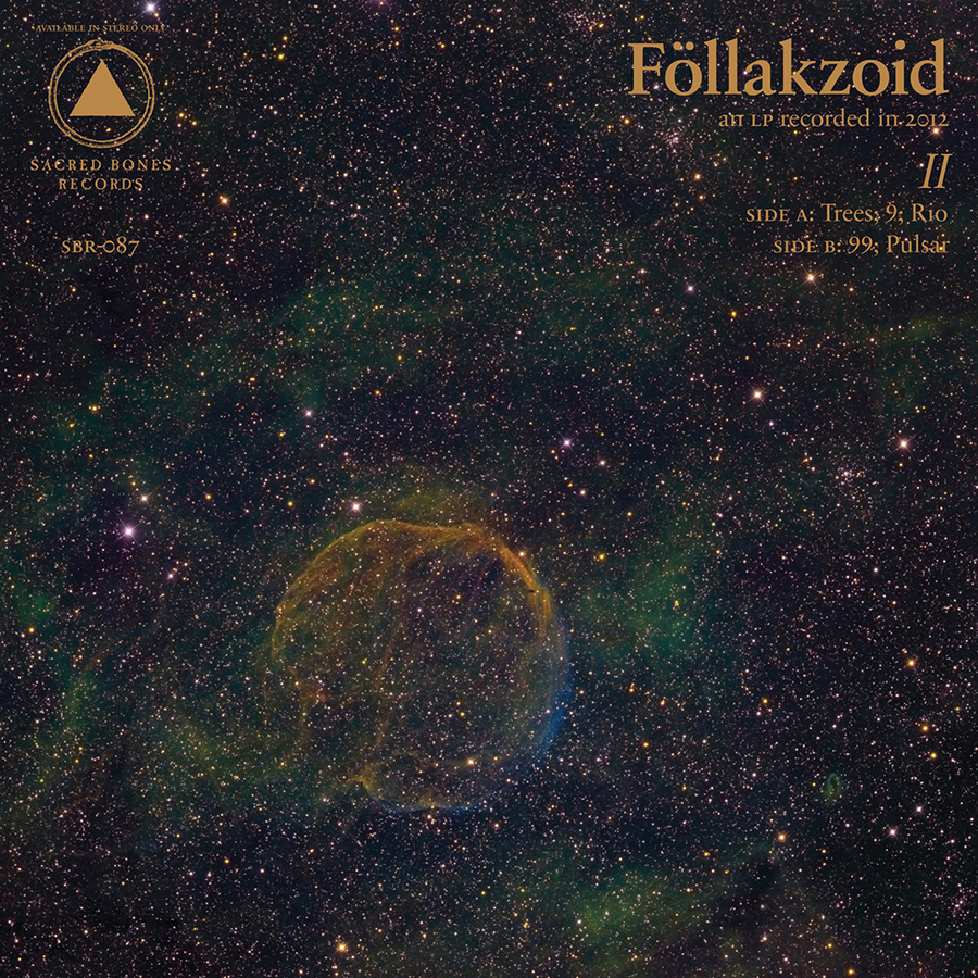
When people say music takes you places, II is the passport. The cover feels less like packaging than coordinates to another dimension. Domingae and Correll knew: The image is already the trip, the sound merely the continuation. Psychedelia stripped to geometry. Recommended track: “Pulsar.”
Helmet
Betty (1994)
AD: Reiner, Dennis Hallinan
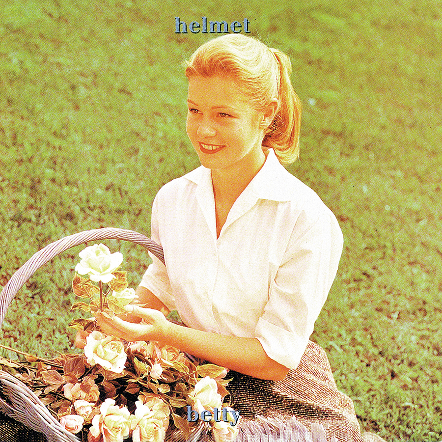
Betty doesn’t age, she just updates her wardrobe. Three decades later, her stare is still equal parts grunge cool and cryptic allure. The cover feels less like a portrait and more like a dare: Can you handle what’s inside? Betty is 31 and looks amazing, timeless in a way only noise, distortion and attitude can be. Recommended track: “Speechless.”
The Chemical Brothers
Born in the Echoes (2015)
AD: Tom Hingston
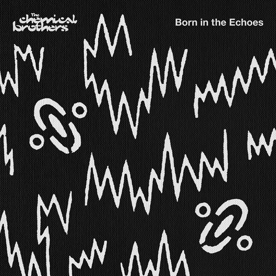
The future … I’ll see you there. Recommended track: “I’ll See You There.”
Deftones
Private Music (2025)
AD: Frank Maddocks

One of my favorite bands delivers a record so powerful you start remembering who you were when you were younger. Maddocks’ sleeve is elegant, precise and just a little haunting, the kind of design that feels inevitable once you’ve seen it. Recommended track: “Souvenir.”
Nine Inch Nails
The Fragile (1999)
AD: David Carson
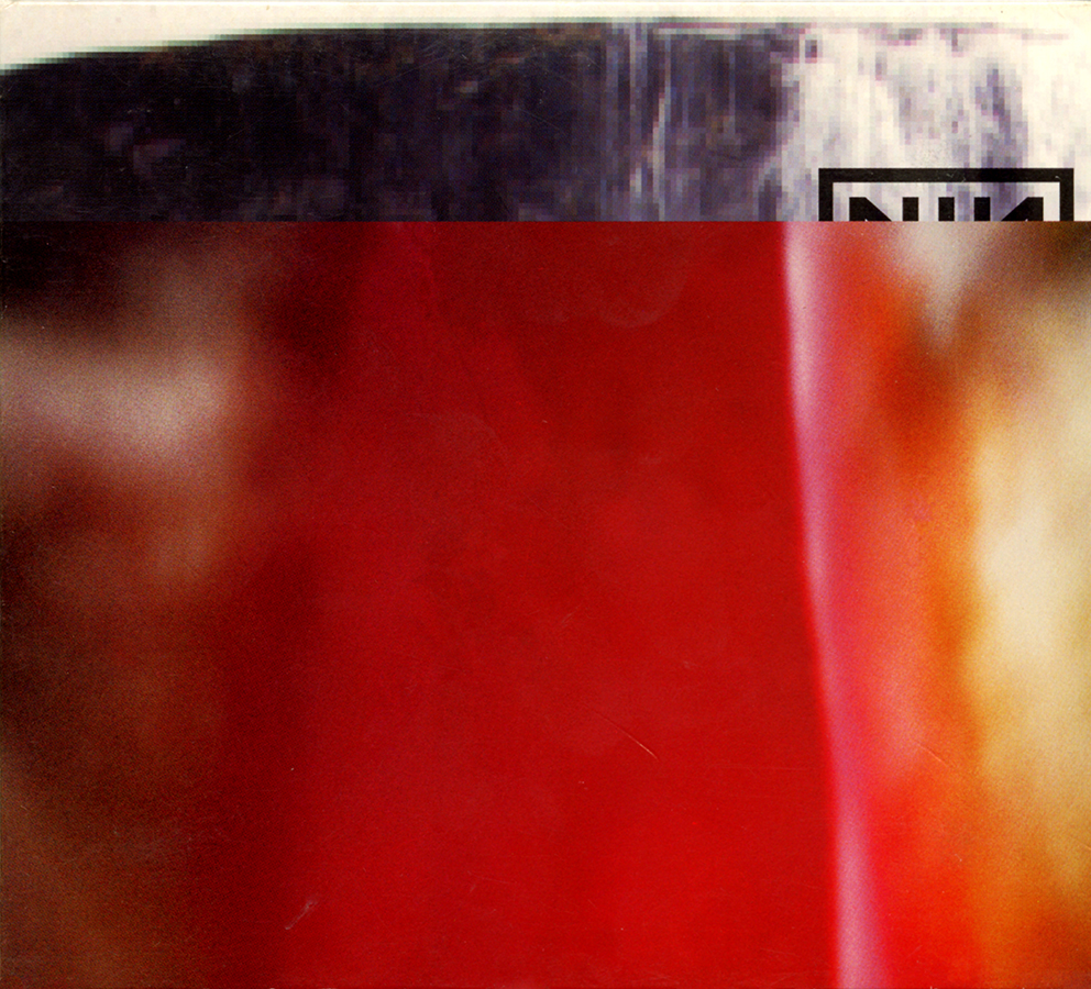
I was in college, flipping through Carson’s The End of Print, when The Fragile appeared in the record store. The logo was sliced, interrupted. WTF? But that’s Carson: rupture as design, chaos as structure. A perfect mirror for Trent Reznor’s masterpiece. Art direction and sound both raw, yet immaculate. Recommended track: “No, You Don’t.”
Pavement
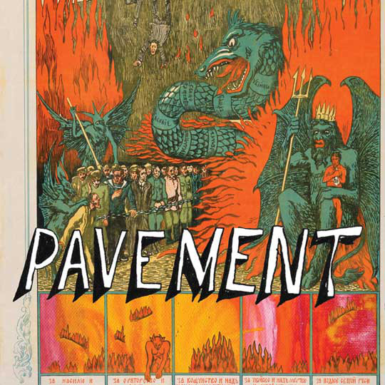
Wowee Zowee (1995) / Quarantine the Past: The Best of Pavement (2010)
AD: Steve Keene (WZ), Mark Ohe (QTP)
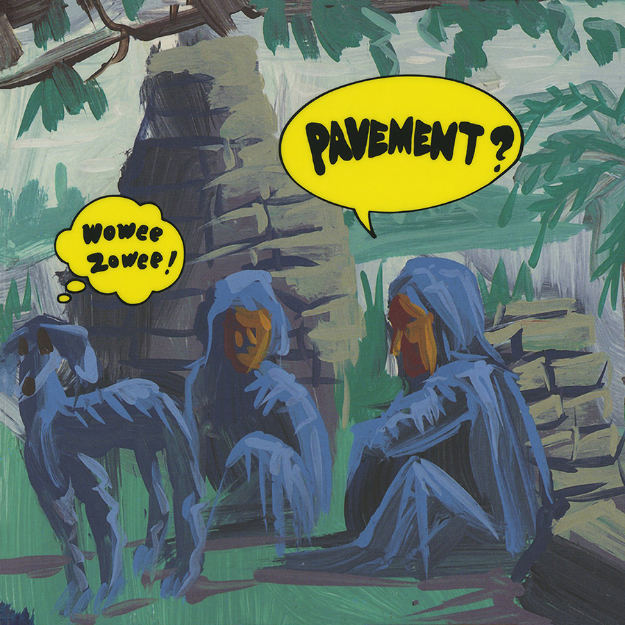
The first time I saw Pavement live in ’95, I was tripping my mind off and I didn’t understand anything. The last time, in 2024, clean as a whistle, I didn’t understand anything, either. That’s Pavement: chaos that refuses to resolve. Keene’s Wowee Zowee art (somewhere between Guru Guru, Zappa and a stray Life magazine image) nails the slacker-weird mythos. And then, Ohe’s Quarantine the Past sleeve folds the circle, showing almost the same spot I was standing at Lolla ’95 in The Gorge. Cosmic coincidence? Always. Recommended track: “Half a Canyon.”
Jane’s Addiction
Ritual de lo Habitual (1990)
AD: Casey Niccoli / Perry Farrell
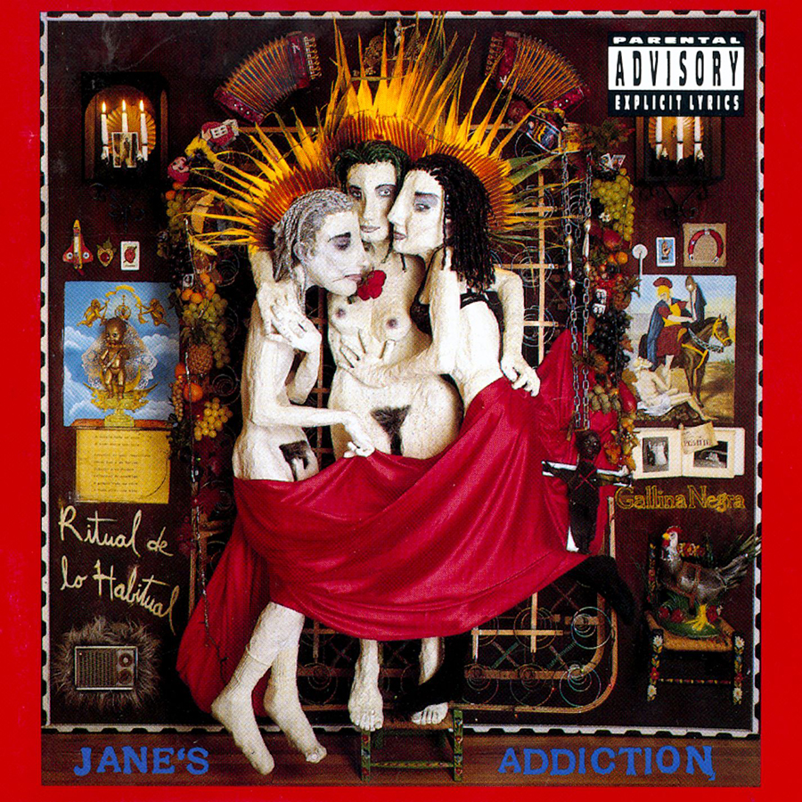
This sleeve is a landmark for the alternative nation; what Dark Side of the Moon was for Pink Floyd, Ritual was for us. The art and the album are inseparable: Provocative, surreal, spiritual, censored, and therefore more powerful. Punk, new, artsy, eternal. Recommended track: “Stop!”
Art of the Album is a regular feature looking at the craft of album-cover design. If you’d like to write for the series, or learn more about our Clio Music program, please get in touch.


 Events