Newsletter
 Events

Women’s Professional Baseball League Names First 4 Teams After Trailblazers
Plugging into pop culture, sports lore and history


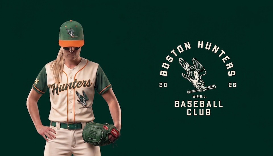
Slide over, Yankees and Red Sox. There’s a new NYC vs. Boston baseball rivalry launching next month that puts a fresh spin on America’s pastime.
Cue the Women’s Professional Baseball League, which starts its inaugural season on Aug. 1 with these four teams:
- The New York Heights: Named after civil rights icon Dorothy Irene Height.
- San Francisco Firebells: Named for the city’s first female firefighter, Lillie Hitchcock Coit, aka “Firebelle Lil.”
- Boston Hunters: Named after physician and women’s rights activist Harriot K. Hunt.
- Los Angeles Queens: Named for baseball pioneer Lizzie Murphy, known as the “Queen of the Diamond” and the first woman to compete against Major League players.
This marks the first notable women’s pro startup in North America since at least 1954.
When the WPBL approached Toronto agency Arrivals + Departures to develop logos, uniforms and each team’s visual identity, “They weren’t interested in creating just another set of sports brands, but rather a league that stands for something bigger,” CCO Jeff MacEachern tells Muse.
“We asked ourselves: What if the team names could tell these powerful stories?”
By aligning each franchise with the legacy of a trailblazing woman, “We moved beyond generic sports tropes. It gave each team an authentic narrative and the league a deeper cultural meaning from day one,” MacEachern says. “More importantly, it creates an emotional bridge between today’s communities and players and the pioneers who paved the way, ensuring those stories continue to inspire future generations.”
WPBL imagery and merch are designed to please sports fans old and new.
“When people see the brand, we want them to feel the energy of a classic in the making and think, ‘This league belongs on the big stage.’ Ultimately, we want that pride and excitement to turn into engagement, whether that’s tuning into games, repping the merch or becoming lifelong fans,” he says.
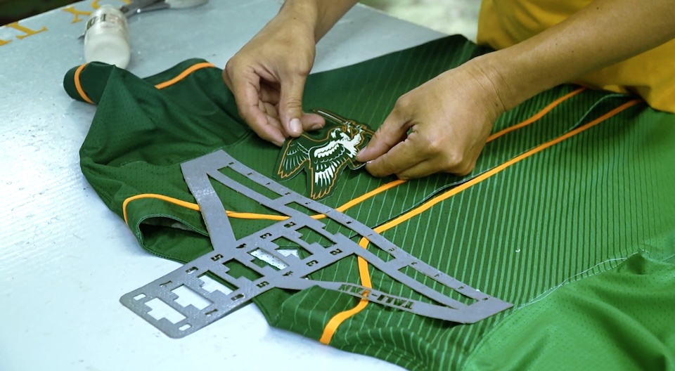
Across the visual ID and uniforms, “the vibe is modern heritage—bold, confident and rooted in the history of the game, while designed for a new generation of players and fans,” MacEachern says.
“We designed a brand system anchored by confident typography, high-impact colorways and bespoke design details that feel built to scale—whether scaled up on a stadium Jumbotron or down on a phone screen.”
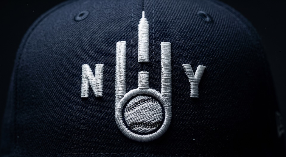
High-contrast aesthetics and streetwear vibes are the order of the day. They feel classic but contemporary, timeless but far from old-fashioned. Hopefully, fans will wear the styles around town and integrate the caps and jerseys into their wardrobe mix, helping the league gain a foothold in the culture, he says.
CREDITS
Client: Women’s Pro Baseball League (WPBL)
Agency: Arrivals + Departures
Chief Creative Officer: Jeff MacEachern
Creative Director: Jeff Collins
Designer: Stephen Tasker
Designer: Kimberley Pereira
Designer: Ashley O’Driscoll
Illustrator: Geoff Mack
President, Partner: Mike Bevacqua
Chief Strategy Officer: Dustin Rideout
Group Account Director: Alli Zakoor
Account Coordinator: Alessia Price
Agency Producer: Claire McRae
WPBL Chief Marketing Officer: Kelly Gianopoulos
WPBL Strategy & Operation: Jeremy Berman
WPBL Project Coordinator: Paige Thompson