Newsletter
 Events


The Things That Make a World Real
How American Haiku deploys images, language and objects for itself and brands


Years ago, I found a weathered WWF sticker of the Ultimate Warrior stuck to the back of a bunk-bed frame in an old childhood bedroom. It unlocked a whole world I associated with my older cousins: their tastes, their obsessions, the things they introduced me to, the particular glamour older kids have when you’re very young. The sticker hadn’t just reminded me of that world. It had somehow stored it.
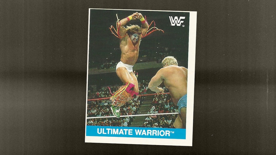
Our approach to worldbuilding starts there. Images, language and objects can acquire meaning through repetition, then become containers for memories the brand itself could never have anticipated.
An example we talk about a lot at American Haiku is the Wu-Tang Clan. The draw isn’t just the music, but the completeness of the world around it: the yellow W, the scratched, “dust on the needle” quality of the samples, the myth of Shaolin/Staten Island and the distinct identities of each member. The same language ran through their records, videos, clothing and merchandise. Even the timecode burned into the “Protect Ya Neck” videotape sent to television stations contributed to the world, an intentional technical imperfection that brought viewers closer to RZA’s vision.
Nothing felt incidental. Every choice told you where you were.
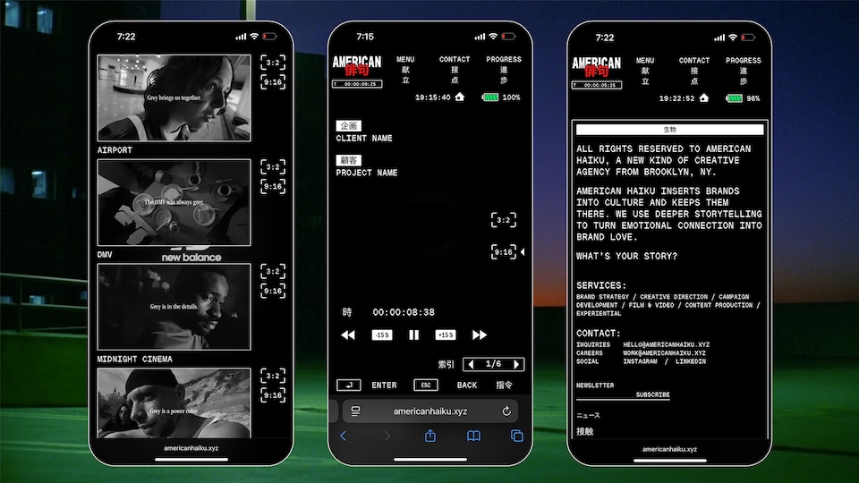
With our longtime collaborators Studio Temp, we built our own identity around the discipline of the haiku form, a palette of black, white and red and a reverence for moments in time where technology felt full of possibility rather than crushingly bland. Our website resembles an old video-camera interface from an era when consumer electronics were magical machines from the other side of the world.
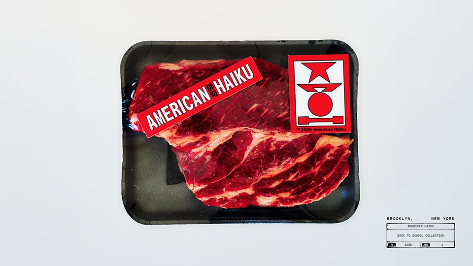
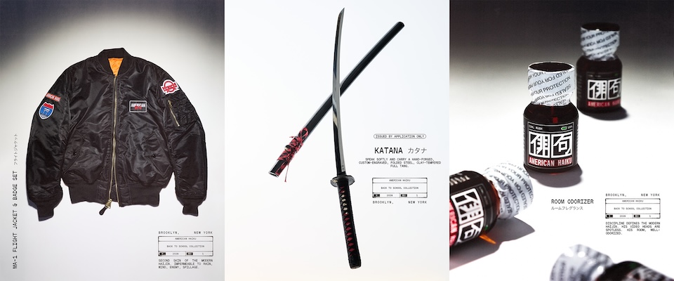
Our new back-to-school collection takes that identity off the screen. There’s a notebook, T-shirt, flight jacket and badges. Then there are the objects that make the point: a katana hand-forged by a Japanese swordsmith and a bottle of “room odorizer” that anyone who has spent time in clubland will recognize.
We didn’t just want to slap a logo on something generic. Each product came from asking what might exist inside the American Haiku world, and what somebody inhabiting it would need: equipment for discipline.
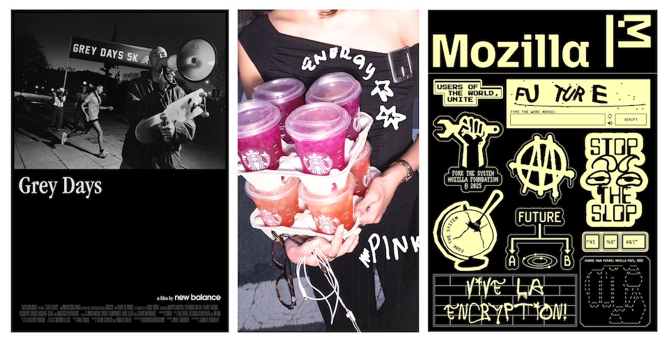
The same principle informs our client work. “Grey Days” gave New Balance’s history a recurring vocabulary of grey, coffee and conversation. “Choose Your Future” turned a Mozilla annual report into zines, protest flyers and stickers that proposed a referendum on Tech, and still appear on the laptops and lampposts of New York. Starbucks’ “Pink Energy Summer” reinterpreted and expanded the visual language Pink Drink fans had created on TikTok.
It also applies to new technology. In “Awful Dreams,” we used the glitches and hallucinations of generative AI as the visual language of horror, rather than treating them as defects to conceal.
Brands tend to talk about culture as something to squeeze themselves into. We’re more interested in what gets left behind: the objects, words and small repeated details that people quietly attach their own memories to.
The WWF sticker lasted because it contained much more than its design. That’s the ambition: to make things capable of holding a world.