Newsletter
 Events

How Design Studio Manual Crafted a Visual Identity for the Obama Presidential Center
It took 3 years to devise a bold, enduring system


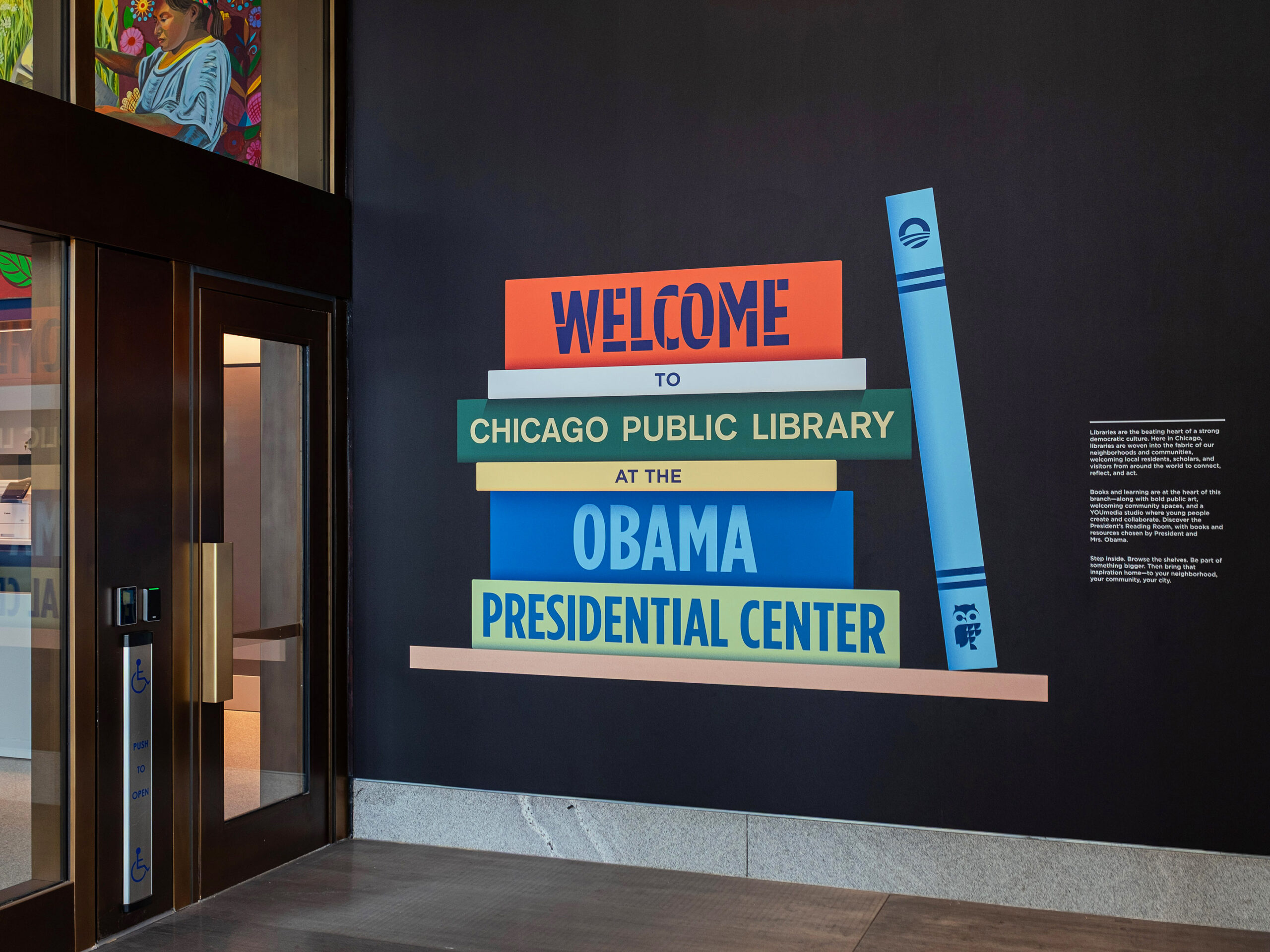
One of Manual‘s biggest commissions ever came to life with the June opening of the Obama Presidential Center.
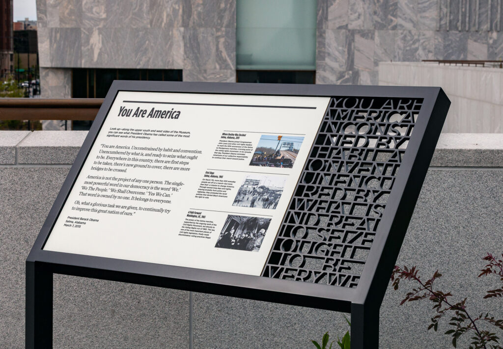
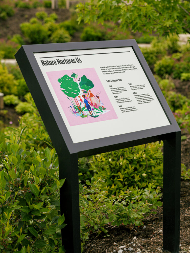
Collaborating with the Obama Foundation, Manual oversaw the creation of the visual identity for the Center, which is seen in everything from physical and digital signage to printed guides and merch.
“The challenge was to honor the weight of the Obama name without making the system feel overly formal, static or institutional,” says Manual founder and creative director Tom Crabtree. “It had to feel presidential but not frozen in presidential history.”
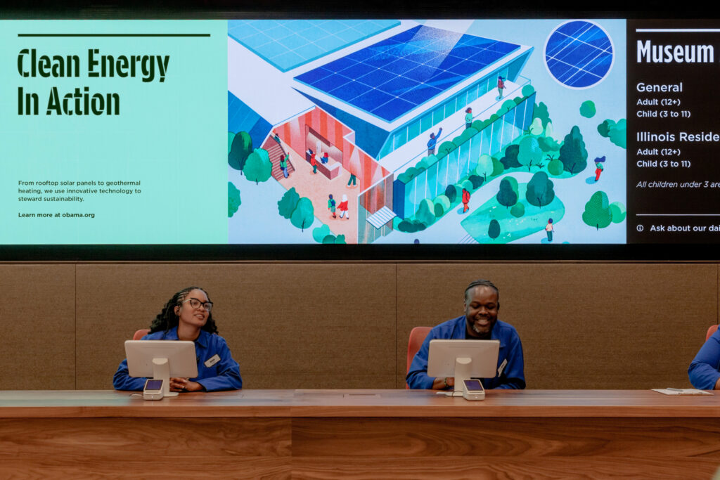
Located in Chicago’s Jackson Park neighborhood, the 19-acre community-oriented Center is home to a museum, a branch of the Chicago Public Library, an athletic center, community gardens and green spaces for the public to enjoy.
Given its scope, the design needed to feel welcoming and inclusive while helping visitors find their way with ease. Supporting the venue’s architecture and programming was also a must. Manual strove to create moments of storytelling and delight to leave visitors with a clear and lasting impression.
Here, Crabtree and Manual managing director/co-owner Patricia Callaway delve into the process behind this ambitious project:
MUSE: I understand a LinkedIn message led to you working with the Obama Foundation.
Tom Crabtree: It’s pretty rare that a direct message on LinkedIn leads to anything meaningful. But in this case, it was the best business DM I’ve ever received. The Obama Foundation had hired its first chief creative officer, Hashem Bajwa, in 2023. He was familiar with Manual’s work and also knew of me because we had both worked at Apple, though we had never met. I responded within minutes. We quickly moved the conversation to email, then to a video call, and things moved from there.
Why was this a creative opportunity you wanted to take on?
Tom Crabtree: Patricia and I both have enormous respect for President Barack Obama and First Lady Michelle Obama and for what they represent. But beyond that, this felt like a deeply meaningful commission. I moved from the U.K. to the U.S. 20 years ago, and America has given me so many opportunities. To contribute, even in a small way, to a place that celebrates democracy, diversity, community and who we can be at our best felt like a real honor.
Patricia Callaway: More than anything, we were inspired by what the Obama Foundation is doing. It is a difficult time in the U.S. and in the world more broadly. It can be easy to feel pessimistic or powerless. But the Foundation is built around the opposite idea: that people have agency, that change is possible and that communities can come together to make things better.
Tom Crabtree: It felt like an amazing opportunity to help define the next era of the Obama story and how the organization would connect with the local community and the broader public. From our earliest conversations with their team, it was clear there was a real appetite for good design, which was already evident in the architecture of the Center. So, the opportunity to help connect their mission to the world through visual communications and physical experience felt like the opportunity of a lifetime.
What did you need to learn to move forward to create design concepts?
Patricia Callaway: The research phase for the brand identity was thorough but fast. We needed to get smart quickly: understanding the Foundation’s programs, initiatives, audiences, mission and values and how all of those things connected. Our work was also running in parallel with a strategy and messaging phase led by Myself and Others. Their work provided a strong strategic foundation for our brand identity work.
There was also a lot of in-person research in Chicago: attending the annual Democracy Forum event, meeting with Obama Foundation leadership, spending time with the communications team and understanding all the ways the identity would need to work across digital and physical contexts.
The key thing was understanding the breadth and evolution of the organization. This was not just a museum identity, or just a nonprofit identity, or a signage project. It had to support leadership programs, community engagement, digital content, public programming, the website, the museum experience, maps, ticketing, signage and the wider Presidential Center campus.
Tom Crabtree: For the second phase, the signage and wayfinding program at the Presidential Center, the research became much more architectural and operational. We reviewed building plans, campus plans, visitor flows, donor recognition needs, exhibition plans and how people would move through the 19-acre site.
I also undertook a signage research trip, visiting museums and civic institutions in New York, Chicago, Washington, D.C., and London to study how other systems worked with architecture, visitor experience and public space.
And what was the creative process like?
Tom Crabtree: In the early phase, the process was refreshingly fast and creative. Hashem encouraged the Foundation to work in a more agile way, more like a startup than a slow-moving institution. So, we were able to get into the creative work remarkably quickly.
We also built trust early by authoring a creative brief that outlined the qualities we saw in the Foundation and the possibilities we saw at the Center. We translated those ideas into creative principles, with visual stimulus to help make the ambition tangible. The Foundation felt that we understand them, and there was clearly a lot of appetite and pent-up demand for a more modern, expressive brand.
They put a lot of trust in us to show them what could be. We moved through a series of design sprints and weekly shares with Hashem and the core client team. Once we had two strong design directions, we brought in key leadership and met with various program leads.
Once there was leadership buy-in, the work was shared with President Obama, who enthusiastically endorsed it.
From there, we went into execution mode, building out a comprehensive digital brand standards portal that would serve as the basis for the redesign of Obama.org, which was handled by Work & Co.
Patricia Callaway: The second phase—the two-year signage and wayfinding program—was a very different kind of process. It was slower, more complex, and more iterative, which makes sense. We were designing permanent signage for a major public institution, across a large campus, with many different needs and stakeholders. A lot of the work was about patience and precision: making decisions that would hold up architecturally, operationally and experientially. There were many voices in the room, as you would expect, so moving the world forward required a lot of listening, testing, revising and steady decision-making. It wasn’t always easy.
But given the scale and importance of the project, we were pleased with how the process unfolded. At the end of the day, it comes down to trust. You need a client and design team who can push and pull each other but always in the service of making the work better.
How would you describe the visual system you ultimately designed?
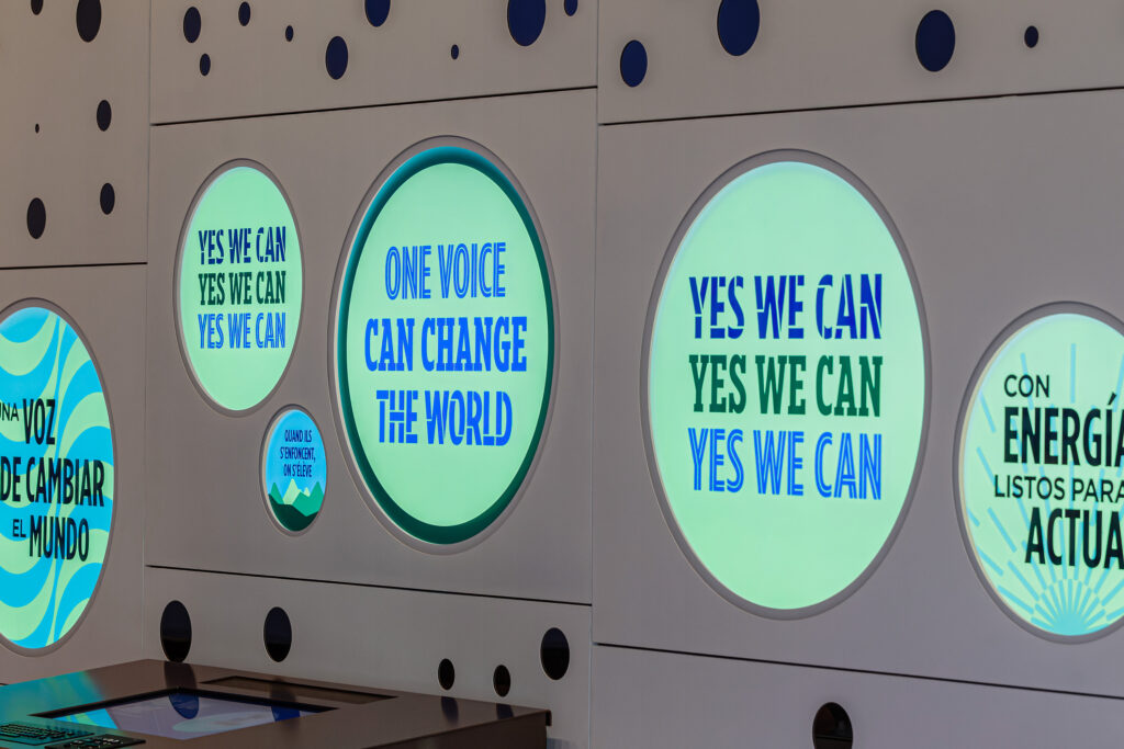
Tom Crabtree: It builds from the recognizable elements of the Obama visual language but expands them into something with much more range. It can be calm and clear when it needs to help people navigate and more expressive when it needs to support programs, campaigns, events and storytelling.
Typography is a big part of that. Gotham Medium gives the system a calm, clear, timeless voice. Gotham Bold Condensed gives it a more direct call-to-action voice. And the custom Gotham Condensed display typefaces we developed give the Foundation a wider range of expression.
The goal was not to create a fixed, monolithic identity. It was a to create a living system: cohesive enough to feel unmistakably connected but flexible enough to reflect the many programs, voices, stories and communities that make up the Obama Foundation.