Newsletter
 Events

These Album Covers Captivated a Generation at the Dawn of the Century
With Wilco, Death Cab for Cutie, Guided by Voices and more


In 1999, I was studying film at Emerson College in Boston. Y2K hysteria was just around the corner, and we were still a few years out from Napster upending the music industry. Some would argue that this era was the last hurrah for the art of the album cover. That’s not to say there haven’t been great sleeves since, but we absorb this type of art much differently now than we did back then. At the turn of the century (and a few years beyond), we had Tower Records, listening stations, headphones and, most importantly, imagination. “Who is this band?” you’d think as you shuffled between albums late at night with other like-minded kids, each of you siloed off in your own world. It was quite lovely. The only thing between you and the artist was this cover staring back at you. It spoke volumes about the thing you were listening to. There was no greater influence on a record’s concept than the thing that introduced it to the world. When I think back to this pivotal time, these are the six record covers that had the most influence on me.
Wilco, Summerteeth (1999)
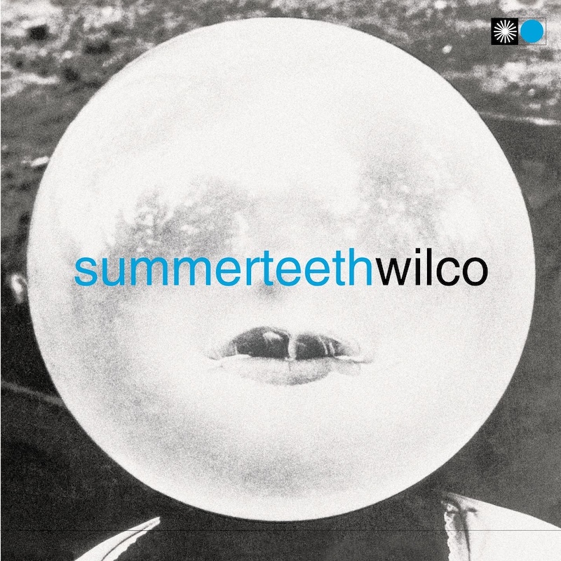
Some would argue that this record was the beginning of the end for Wilco. And while some endings tragically dismantle what was once beautiful, others reimagine what could be and birth something quite unimaginable. In the case of Summerteeth, this is the record that spawned Wilco’s masterpiece, “Yankee Hotel Foxtrot.” That said, Summerteeth deserves its due, if only for being so bravely reflective of its own circumstances. Here we have a record cover that’s approaching a mental breakdown. If you stare at it long enough, you’ll see the part of you that’s trapped inside, perfectly aligned with the tragedy of transformation. The cover has a striking resemblance to the mental fragility of someone on the verge. It’s a head, a moon, or a bubble being blown, waiting to burst, via Chicago.
Elliott Smith, Figure 8 (2000)
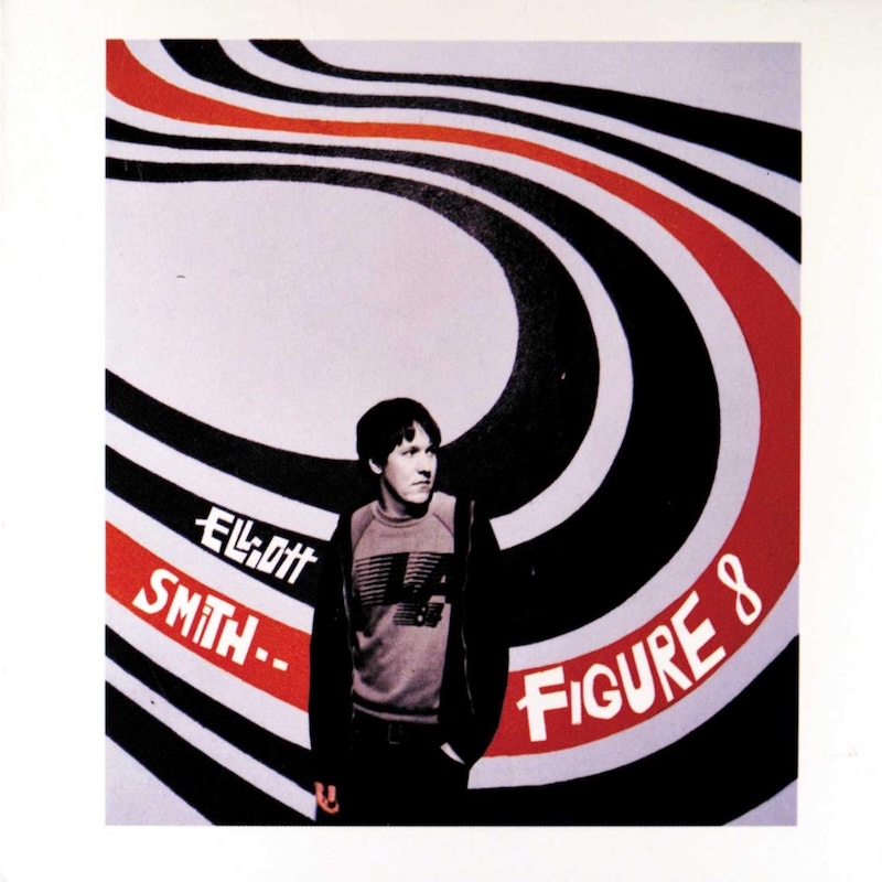
At the turn of the century, Elliott Smith had moved to cult-like status in my brain. Either/Or sketched a small groove into my soul, and it would go on to move me for years to come. His last and most ambitious album, Figure 8, would become my guiding light as far as visual aesthetics were concerned. This particular cover, a circular swoosh behind a formidable yet lonely hero, spoke volumes. It made me feel less alone. Was he in or out of balance? Is he the connecting knot or the obstruction? And does it matter if he doesn’t know? Autumn De Wilde’s photo, mixed with the visual cues, gained a heavier truth after Smith took his own life a few years later, down the street from where they captured this image. In hindsight, the visual and lyrical cues are all there. Since his death, many have made the pilgrimage, including yours truly. Next time you’re by the corner of Sunset and Fountain in L.A., look around. It’s still as beautiful as ever.
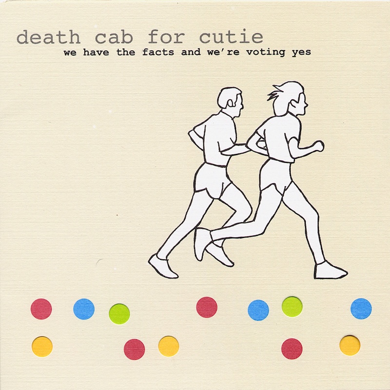
Death Cab for Cutie, We Have the Facts and We’re Voting Yes (2000)
When I first saw this cover staring down at me from a Tower Records store window, I didn’t quite know what to think. Two runners, Death Cab for Cutie, scattered polkadots—and I guess I’m voting? I went inside, found the listening station and put the headphones on. Suddenly, the soft-textured guitars came into play with that vulnerable vocal delivery, with emotionally charged word salad spinning into my brain. It was, uh, beautiful. Should I run? Because I want to run away with this band and find meaning. Slow, brooding, earnest without cringe. It’s an afterparty winding down, or a relationship falling apart. Were they running away from or toward something greater? Finally, it came into focus: running from so much damage isn’t a bad idea. Sometimes it’s the only way to survive.
Guided by Voices, Isolation Drills (2001)
By the time 2001 rolled around, things were getting interesting, and Ohio’s beloved Guided by Voices were caught in the middle of a music industry shit show. Isolation Drills was their attempt to define an underground band as commercially viable. How many years could they stay underground? That said, there was always something wild and uninhibited about Robert Pollard’s collages that provided the visionary mark of GBV’s previous releases. Isolation Drills was one of the first and last GBV record covers designed by someone other than Pollard. Was it a collage? Well, yes. Was it art? Uh, I guess? Did it miss the mark? Yes! While it represents a shift in the band’s musical journey, it also shows how album art can become an afterthought. And to me, this cover always felt like the last gasp of an industry going to shit. GBV was inherently raw, yet this cover is overtly clean. The lines are nice. The planes are nice too. GBV’s previous covers had lo-fi depth, yet somehow this cover trades lo-fi love for perfectly placed planes. Was it a reflection of the band or the industry as a whole? Why were all these labels trying to keep us caged when we wanted to be free? Sometimes you have to see it to believe it. And I’m guessing that’s why Pollard went back to doing the artwork afterward.

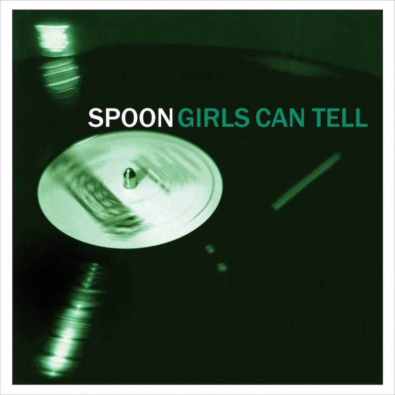
Spoon, Girls Can Tell (2001)
In 2001, Spoon’s story was a movie in the making. Three years earlier, they signed to Elektra Records, released one album and were subsequently dropped in the coming months amid a messy dispute with the label’s head, Sylvia Rhone. The band retreated to Austin, Texas, and in 2001 released their timeless gem Girls Can Tell. The cover, simple in its concept, says more about this record than any review I read. It’s blurred lines spinning as the record dances on a turntable, nearly over before the needle gives way. A vinyl disc when the world was going digital. A long player when the world was obsessed with a single. Elektra couldn’t find a hit, but the band stumbled upon something much bigger: a voice.
Interpol, Turn on the Bright Lights (2002)
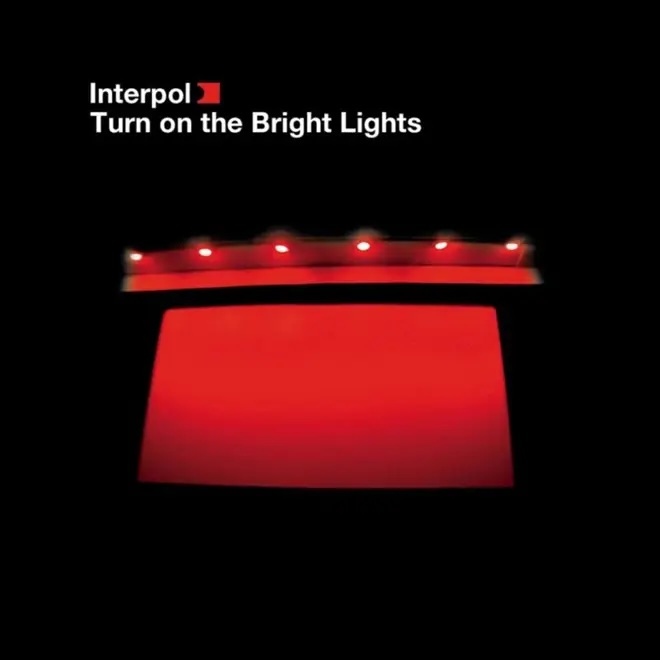
By the time this record hit in 2002, the tide in the industry had shifted. Turn on the Bright Lights came rushing into the world like a hazy beacon of post-punk angst and city-drenched dreams. The cover, a lonely structure illuminated in red, softly fading into the nothingness below, not only encapsulated the band’s vibe but infused a sense of spirit into the lyrical musings of its lonely singer. For anyone who thinks that nothing good happens after 11 p.m., you’ve never listened to this record from front to back. And many nights I did, staring at this cover, stoned and alone. While it didn’t necessarily make me want to move to the city and howl, it did make me yearn to drift quietly around the edges and listen for the burn.