


 Newsletter
 Events

Classic Album Covers Trumpeting Music That Takes Bold New Directions
With Tame Impala, Bruce Springsteen, Weezer and more


I’ve always been fascinated by album cover design. The notion of pairing a visual statement with a piece of audio art is no small task. I should know. I once designed an album cover for a band that was so divisive among the members that they ultimately broke up and the disc was never released. (Although, one member promised to get the art tattooed on his chest, so I guess that’s some sort of win.)
At minimum, an album cover has one main job: to attract the attention of whatever dork walks into a record store. If it’s a really good design, the art provides some sense of what that dork will experience once they play it. That’s where it gets intriguing.
The following five albums sound nothing like the artists’ previous work. And the designs on the front should serve as a warning to any dork walking into a record store.
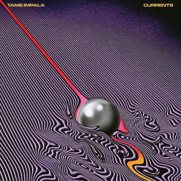
Tame Impala – Currents (2015), Designer: Robert Beatty
This now-iconic design left little question as to what was in store for the listener. The vibrant cover with an ’80s aesthetic felt both brand-new and nostalgic. Was it created by hand or digitally? Photoshop or airbrush? The metallic ball acts as a focal point while it shreds against the lines, turning them from calm static lines into turbulent waves. Anyone holding this album knows they are on the brink of something new. This design acted as the catalyst for Tame Impala’s migration from fuzzy psychedelic rock to trippy electro-pop. We were warned.
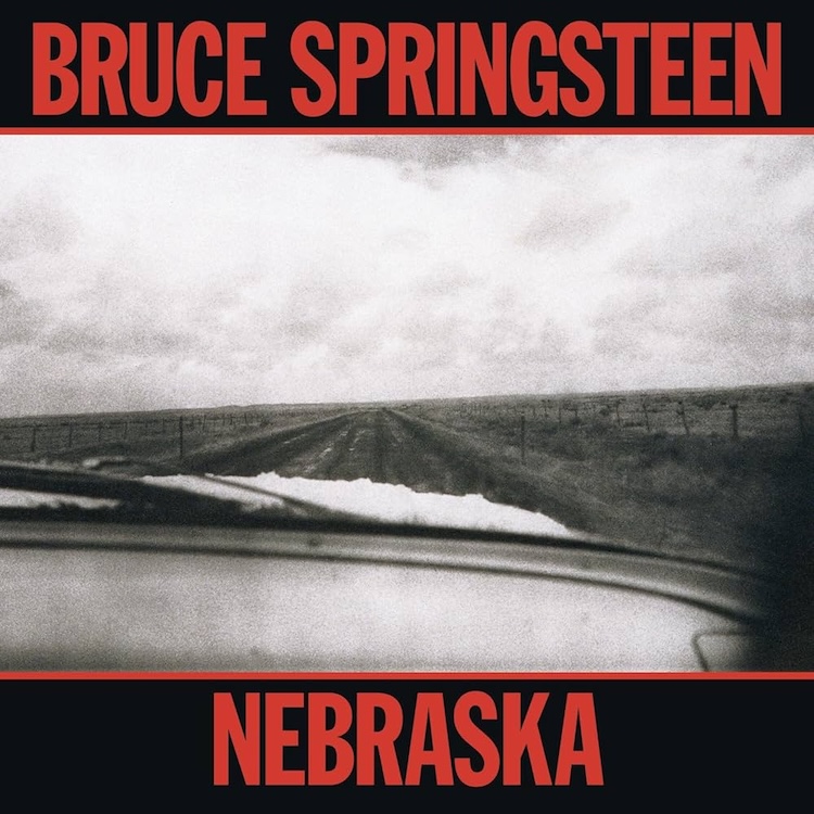
Bruce Springsteen – Nebraska (1982), Designers: Andrea Klein, David Michael Kennedy
Nebraska depicts a scene captured by landscape photographer David Michael Kennedy. It feels raw, unfinished and haunting. Combined with the bold red type from art director Andrea Klein, the layout resembles something one might see in a set of crime scene photographs. Nuanced and dark, the image matches the album’s sound and story. The Boss was embarking on a stripped-down, folky concept album, and the cover vibe matched it perfectly. (Side note: The Killers took a page from Springsteen with their 2021 album The Pressure Machine. The Las Vegas arena rockers traded their polished sound for a lo-fi exploration of a small Utah town, complete with documentary interviews from locals. The cover? It’s a black-and-white landscape photo with red accents. Highly recommend.)
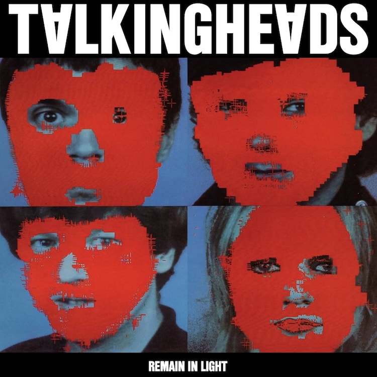
Talking Heads – Remain in Light (1980), Designers: Tina Weymouth, Chris Frantz, Tibor Kalman
By playing with funk, world music, punk rock and jazz, Talking Heads helped usher in the ’80s New Wave genre. But what made this band so intriguing was their mastery of visual aesthetic. From dance routines and stage costumes to liner notes, they were quite the brand. The fact that David Byrne met Tina Weymouth and Chris Frantz while attending the Rhode Island School of Design probably didn’t hurt. But when it came to this album cover, Weymouth and Frantz—who were inspired by the slow implosion of the group—worked with the MIT Computer Lab to blot out the faces of the band with red blocks. This process took painstakingly long in that early era of digital tech (the mainframe itself took up two rooms). The result was a crude yet powerful image of band members hiding from each another. It’s a great example of their ability to mash-up musical styles and the perfect set-up for the genre-bending music hiding inside.
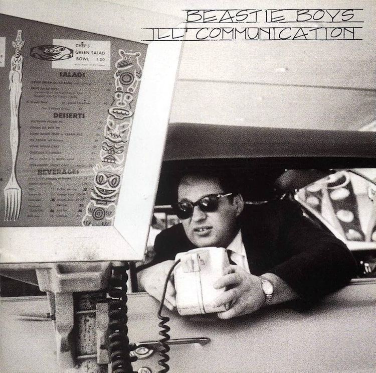
Beastie Boys – Ill Communication (1994), Designers: Mike D, MCA, Gibran Evans, Jim Evans, Bruce Davidson
This one saw the Beastie Boys firmly going back to their roots as a live band. They had moved away from their frat boy hip-hop image and cemented themselves as a punk- and jazz-fused rap trio. The Beasties wanted to find an image to set the tone for a grittier, lo-fi image of vintage Americana weirdness. They used a picture from the portfolio of Bruce Davidson found in a photography archive magazine. The boys felt the image perfectly captured the literal notion of “Ill Communication” while also lending itself to a more artful tone and intention.
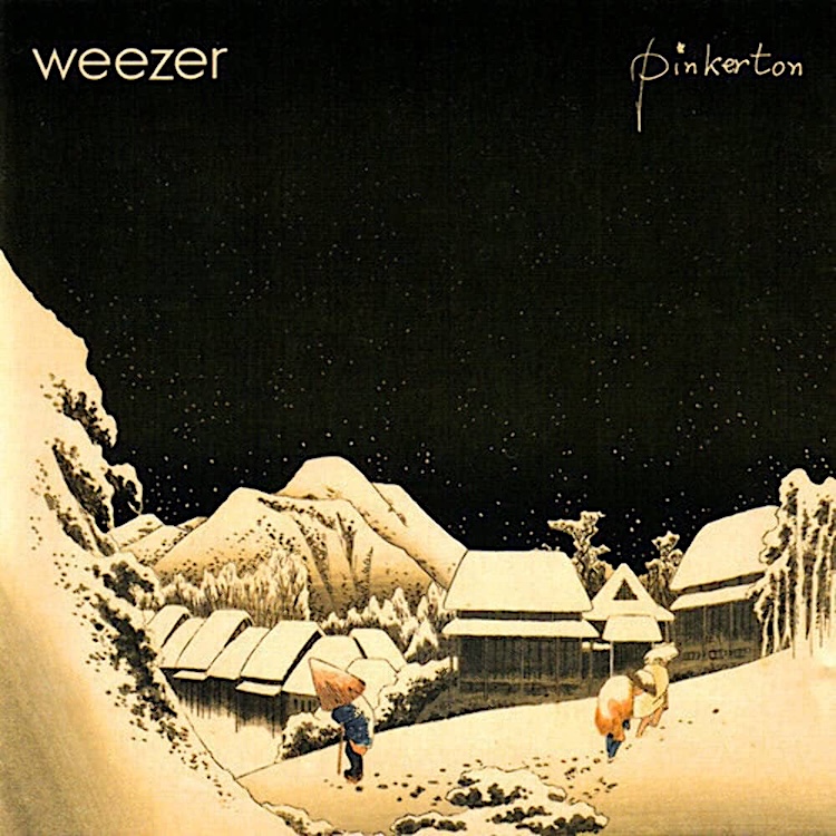
Weezer – Pinkerton (1996), Designers: Rivers Cuomo, Chris Bilheimer, Janet Wolsborn
One of the biggest visual contrasts from one album to the next must be Weezer’s Blue Album to Pinkerton. Just two years earlier, four clean-cut young men stood in front of a blue background to showcase one of the most iconic discs of the ’90s. The Blue Album featured fuzzed-out, yet glossy songs with sing-along choruses even your mom could nod along with. Pinkerton drew its main artwork from a Japanese ukiyo-e woodblock print that frontman Rivers Cuomo came across during a band hiatus to study at Harvard. This sets the stage for songs about isolation, sadness and dealing with internal darkness. If you picked up this album expecting the “Oooooo, eeeeee, oooooos” of “Buddy Holly,” you’d be sorely mistaken. Rivers is more interested in telling us how bored he is with sex. We shouldn’t be surprised, though; he tried to warn with the packaging.






#/media/File:Weezer_-_Blue_Album.png)