Events
Häagen-Dazs Gets Last Licks With Minimalist OOH
Will the approach stick with consumers?
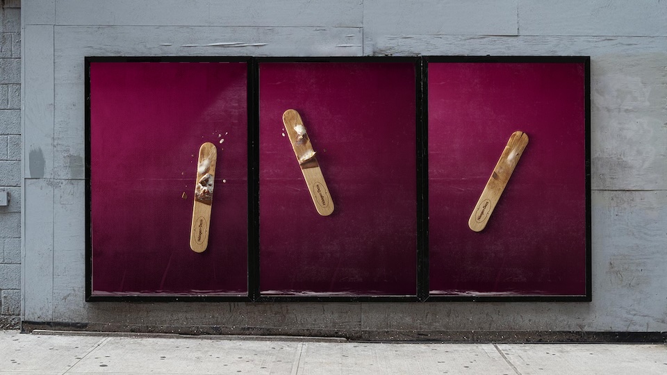
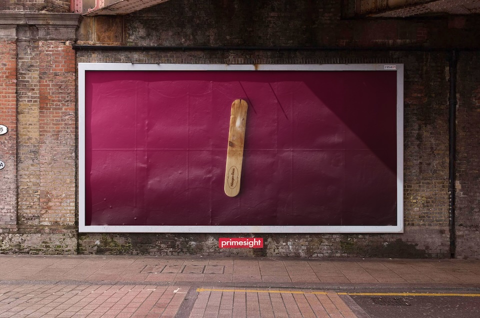
“We didn’t need to show the product, because the craving you get from looking at it says it all,” BBH global CCO Alex Grieve says of the agency’s OOH push for Häagen-Dazs. “That kind of confidence comes from a client that knows their product is just that good.”
Indeed, the work, titled “Devoured,” breaking now across the U.K. and Spain, shows licked ice-cream sticks with the brand name—and little else.
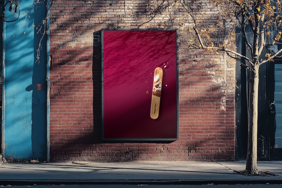
Adland’s tastiest use of spit in ages. Ew.
Though not as minimalist as McDonald’s—which often eschews overt iconography of any kind—Häagen-Dazs’ initiative should turn some heads.
Dan Tobin Smith shot the images, part of the run-up to a large-scale brand campaign scheduled for next spring.
During the shoot, to get several different looks, “We all ate them slightly differently, which was great, as it felt authentic” to how people really devour ice cream, BBH creative director Luke Till tells Muse. “With an idea like this, where you’re inviting people to imagine the full picture and giving them that craving you get from looking at it, having a visual close to the real thing is critical.”
“We did some early test shots to sell the idea,” he recalls. “I went to my local, picked up a box, ate three in one sitting—which was a bit much—and then shot them on my iPhone while there was some nice light coming through my kitchen. Then I added the iconic Häagen-Dazs color—and boom! It worked surprisingly well.”