These Album Covers Are Marvels of Art Direction
Prince, Bruce Springsteen, Michael Jackson and more
I never discovered great photography in galleries or museums. For me, it started in record shops, on bedroom floors and inside cracked plastic cassette cases. Album covers were my first art direction school: bold, intimate, sometimes clumsy, sometimes perfect. Only later did I realize that many of the images that shaped my teenage imagination were made by the same photographers I would one day meet on set.
Even now, in a world of thumbnails and autoplay, I still think in 12-inch squares. Those sleeves taught me more about framing, attitude and storytelling than any theory class. I didn’t end up designing record covers for long, but the sleeves never stopped designing me. Every time I brief a photographer, argue over a crop or obsess about a single frame in a film, I’m that kid again in the record store, judging an album by its cover.
Prince
Lovesexy (1988)
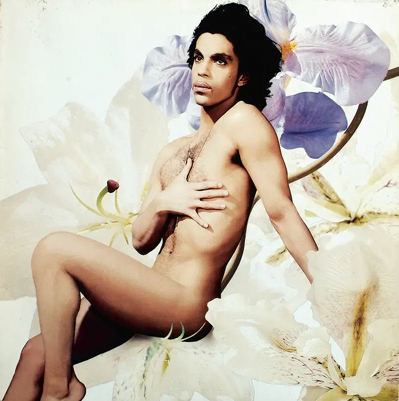
In 1984, I was 12 years old and visiting Los Angeles with my parents. On my first day, a girl handed me a cassette and said, “Listen to this, it’ll blow your mind.” She didn’t know me, we’d only just met. It was Prince’s Purple Rain. And yes, it blew my mind. I listened to it on repeat, and I still belt out “Purple Rain” while cleaning the apartment. That tape started my audio love affair with Prince and, without realizing it, my education in art direction. The Lovesexy cover by Jean-Baptiste Mondino floored me. Created before Photoshop, it was pure collage with a bit of old-school airbrushing. It was the first time I understood that music and images could be part of the same vision. Years later, I worked with Jean-Baptiste on a Kodak spot and he had a few NSFW stories about hanging out with Prince.
Bruce Springsteen
Born in the U.S.A. (1984)
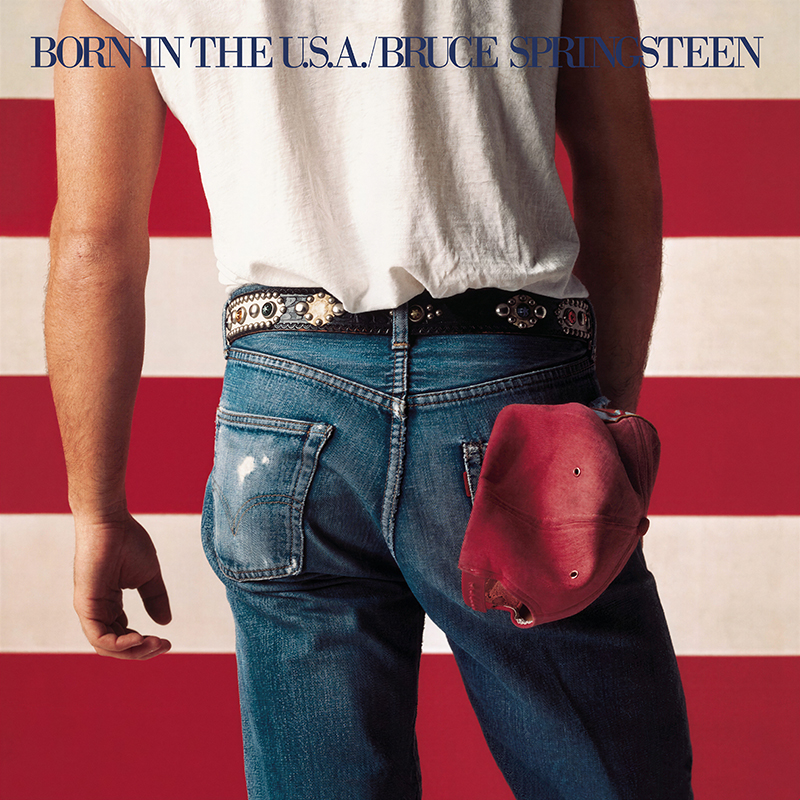
My brother introduced me to Springsteen while playing tennis. He didn’t want me on the court for some reason, so he handed me his Sony Walkman and a tape of Born in the U.S.A. The cover was iconic and subversive, especially since at the time our family was living in Syria and the American flag seemed to be burned every other week. I remember how powerful that image was. Stupidly, as a newly minted fan, I bought the T-shirt and wore it on a trip to Homs. At one point a guy stepped up, pointed an AK-47 at my stomach and told me to turn my Born in the U.S.A. T-shirt inside out. Which I promptly did. The cover was shot by Annie Leibovitz. Years later, I was lucky enough to be a junior art director on a Louis Vuitton campaign with her. It was a strange full-circle moment: From almost getting shot over an image of a flag and a denim backside, to watching the woman who made that image work on set, seeing how she builds her frames in real time.
Michael Jackson
‘Wicked Game,’ ‘Remember the Time’ (1992) – music videos
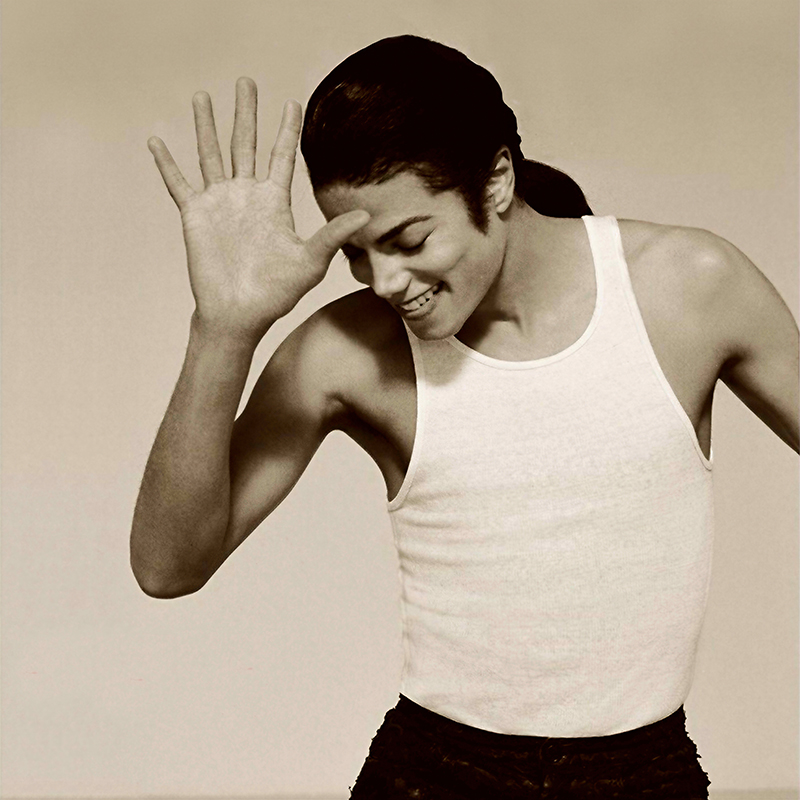
Growing up, I was an MTV junkie, and Herb Ritts’ music video for “Wicked Game” was on repeat all summer. That sepia, soft-light art direction was everywhere. Calvin Klein and Banana Republic were all over that look. When Ponds needed a visual identity, the agency hired Herb Ritts to give them his signature treatment. Back then, that was the logic: Get a great photographer and the art direction will take care of itself. With that same aesthetic, Ritts shot some incredible images for Dangerous, at a time when Michael Jackson was still a pop deity, before the tabloids tried to reduce him to “Wacko Jacko.”
Touloulou
The Theme of Guts (1999)
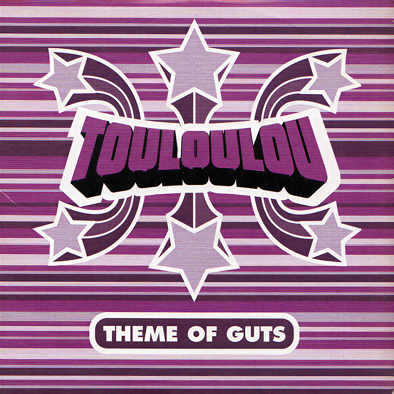
My first job out of art school was in a design studio making record covers. They’d done sleeves for Ray Charles and Vanessa Paradis, so I walked in starry-eyed. The excitement quickly turned to disillusionment when I realized how little input the designers actually had. The labels sent us the images, and our job was basically to stick a title on top. Most days, the “design process” boiled down to choosing a font and a point size. I remember working on a sleeve for Touloulou, a short-lived French funk band, and getting a call from the main record store in Paris, La Fnac. They told me where to place the album title so it wouldn’t clash with the “New” discount sticker they were going to slap on top. That was the day I quit and went into advertising.
Serge Gainsbourg
Love on the Beat (1984)
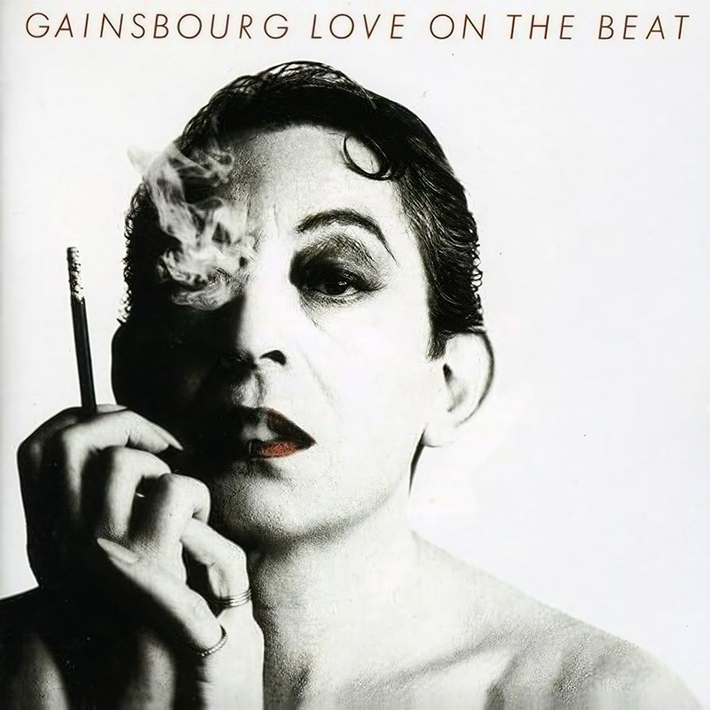
At 23, a wide-eyed young art director at Ogilvy, I had the opportunity to work with William Klein. He wasn’t a particularly pleasant fellow; he just seemed angry, swearing all the time. I remember how tall he was, and how small the camera looked in his hands. During the shoot, he was complaining about the bird shit on the side of a plane that was in shot, then grabbed a phone to call his airbrusher. That’s when I introduced him to Photoshop. Watching Klein discover Photoshop was like watching a kid with his hand in the cookie jar. I was able to talk to him about the cover for Love on the Beat, with Gainsbourg in drag, a huge deal at the time, and another moment where photography, music and provocation collided in one frame.
Art of the Album is a regular feature looking at the craft of album-cover design. If you’d like to write for the series, or learn more about our Clio Music program, please get in touch.


 Events