Newsletter
 Events

Album Covers That Push the Creative Envelope
Bad Bunny, Charlie XCX, Panic! at the Disco and more


Album covers have become one of the biggest creative influences in my life. Professionally, our studio, Frame48, has had the opportunity to help create graphics for recording artists, which has given me a firsthand understanding of how much thought goes into defining an album’s visual identity. Outside of work, I also sing and produce in the band, templuv. So I’ve experienced the relationship between music and design from both sides.
I’ve come to believe that an album cover is entirely part of the music itself. Sometimes an image sparks the first idea for a song before a note has been played. Other times, it becomes the final piece that defines the music’s message. When the artwork misses the mark, the entire creative vision feels less complete.
The six albums below have had the greatest impact on how I think about storytelling and branding.
Bad Bunny, DeBÍ TiRAR MáS FOToS (2025)
This is one of my favorite recent covers because of how honest it feels. There’s nothing flashy or overdesigned about it—just two empty plastic chairs sitting in a quiet Puerto Rican landscape. It perfectly mirrors the album’s themes of nostalgia, home, memory and the people and places that shape us. Bad Bunny described the album as a reminder to appreciate the people and moments while they’re still here. The artwork captures that beautifully. These are the plastic chairs you’ll find at family barbecues, birthdays, domino games and conversations that stretch late into the night. Their ordinariness is exactly the point. The cover quietly celebrates the everyday events, making it a perfect visual companion to an album built on nostalgia, gratitude, and home.

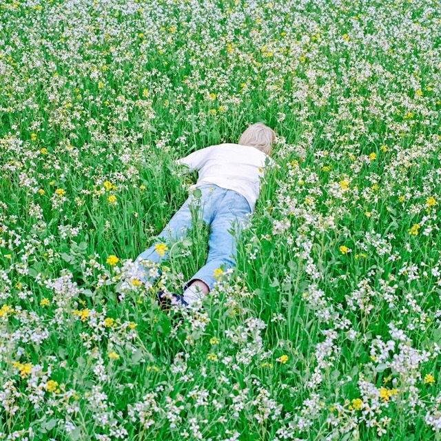
Porter Robinson, Nurture (2021)
After releasing Worlds, an album that redefined electronic music, one of my favorite artists, Porter Robinson, spent years battling creative burnout and the pressure to top what he’d already made. Nurture became his way back to reality. He embraced birdsong, piano, field recordings of nature and the beauty of ordinary life instead of creating another digital fantasy. I love this cover because it reflects that shift. Rather than something elaborate or surreal, it’s just Porter lying in a field, surrounded by nature. It quietly reinforces the album’s philosophy that beauty can be found in the real world, if you’re willing to slow down and notice it. Sometimes the strongest album art isn’t about transporting you somewhere else. It’s about helping you see and appreciate the world you’re already in a little differently.
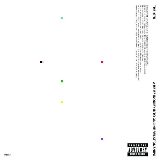
The 1975, A Brief Inquiry Into Online Relationships (2018)
This is one of my favorite examples of restraint in album art. Instead of filling the cover with images of phones or social media, it communicates the digital age through absence. Vast white space, tiny colored squares that resemble pixels and Swiss-inspired typography create a design that feels clean, almost clinical. My own text and graphic design is heavily influenced by this very direction. I love how the artwork mirrors the album itself. Beneath the minimal surface is an overwhelming amount of emotion, information and human connection. It’s a reminder that the internet isn’t really about technology—it’s about people. The cover leaves room to breathe, making it the perfect visual counterpart to an album exploring what relationships look like in a constantly connected world.
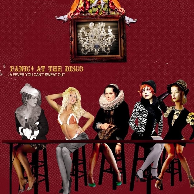
Panic! at the Disco, A Fever You Can’t Sweat Out (2005)
A Fever You Can’t Sweat Out is one of those album covers that immediately transports me back to my teenage years. The vintage circus aesthetic, theatrical costumes and scrapbook-style sepia-toned photography capture the dramatic, over-the-top world the music lives in. Many, myself included, would argue that it helped kick-start the visual identity of the emo scene. This record was hugely influential for me growing up. It helped define the early emo and theatrical pop-punk era that shaped so much of my artistic taste in music and graphic design. The cover feels like an invitation into that world. And for me, it’s impossible to separate the imagery from the impact the album had on a generation of artists and fans in the 2000s.
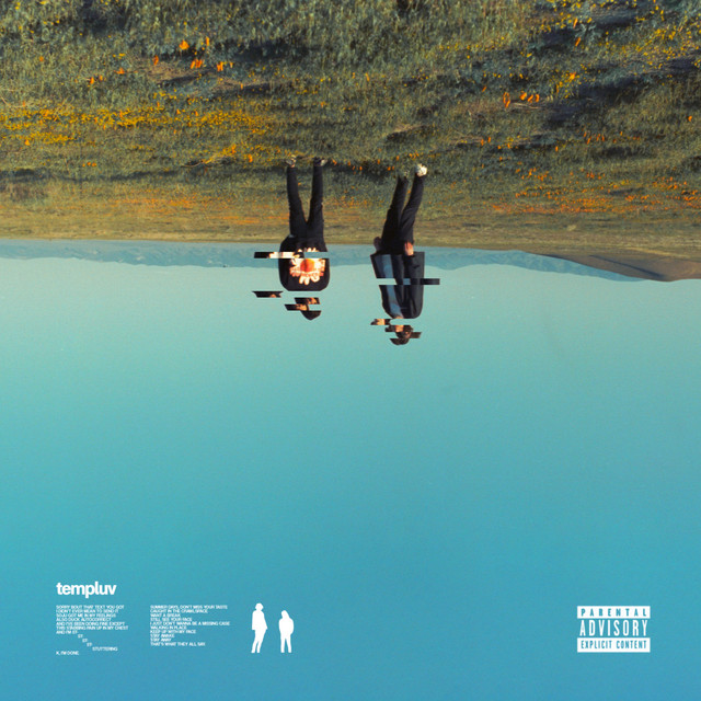
templuv, bleachers (2022)
This one’s a bit of a selfish pick—it’s the album art from my own project, bleachers, that unexpectedly took off for my band. Our friend, the incredibly talented cinematographer Nico Aguilar, had a few leftover rolls of 35mm film from Euphoria season two, so we used them to shoot the music video. We drove out during California’s superbloom, expecting endless fields of flowers, only to find one tiny patch in the middle of an otherwise empty landscape. We spent the next hour shooting every frame we could around that little pocket of color. We considered cloning the flowers in post to make it feel grander, but ultimately decided against it. Keeping the scene exactly as we found it felt more honest and, in a way, made the image even more memorable.
Charli XCX, Brat (2025)
Adding it as the last one on my list so I don’t get flamed. I love this cover because it became a cultural reset. Charli claimed a color, a typeface and an entire visual language that immediately became synonymous with Brat. Overnight, that unmistakable shade of green and its intentionally awkward, low-resolution typography became instantly recognizable across fashion, social media and design. She worked closely with creative director Imogene Strauss and designer Brent David Freaney to develop the visual identity. The green wasn’t chosen randomly; they nixed countless iterations searching for a hue that felt slightly unpleasant, something that would cut through a sea of polished pop artwork. Ultimately, it all feels effortless and low-fidelity. It’s the definition of “less is more,” making it the ideal counterpoint to the album’s maximalist hyperpop soundscapes.