13 Album Covers With a Focus on Photography
David Bowie, Talking Heads, The Who and more
For those of us who grew up with (or now love) vinyl, the album cover is an important part of the listening experience. It’s often an extension of the concept or story involved in the music. Or at minimum, it represents a new piece of artwork to pore over while listening. I love album art photography. I was a kid with a camera who went to school for fine art photography. I even thought I might become a rock photographer, but ended up in the recording studio and other music business roles.
There are many iconic photo-based album covers that easily pop to mind. Here are a baker’s dozen of my favorites:
The Rolling Stones
Exile on Main St. (1972)
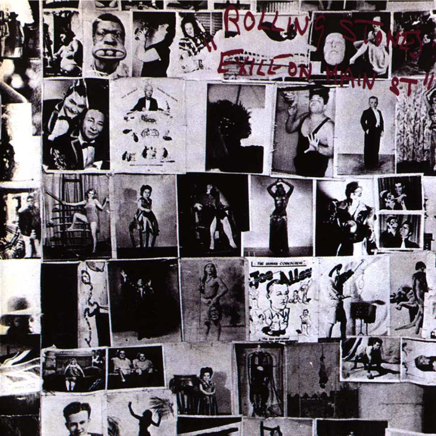
The main shot looks like a collage, but it’s actually an existing Robert Frank photograph, an outtake from his 1958 book The Americans. Named “Tattoo Parlor,” the image shows circus performers, such as “Three Ball Charlie” from 1930’s sideshows. To underline a key point of the album—that the disreputable, drug-addled, tax-exiled Stones were outsiders and freaks—the reverse of the sleeve presented shots of the band in a similar style. It’s a cover you can look at repeatedly and still see something new. John Van Hamersveld served as the designer.
The Who
Quadrophenia (1973)
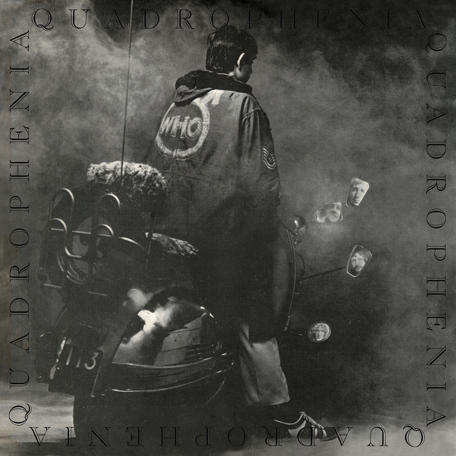
Quadrophenia was a Pete Townsend rock opera ostensibly about a ’60s mod at the crossroads of his adolescent life. Quadrophenia was an ambitious double-album project that included a 44-page booklet containing photographs by Ethan Russell to illustrate the story. Done in grainy black and white, these images conveyed the rainy English grays depicted in the songs. It is a tremendous piece of work on so many levels. Graham Hughes served as cover photographer.
David Bowie
David Live (1974)
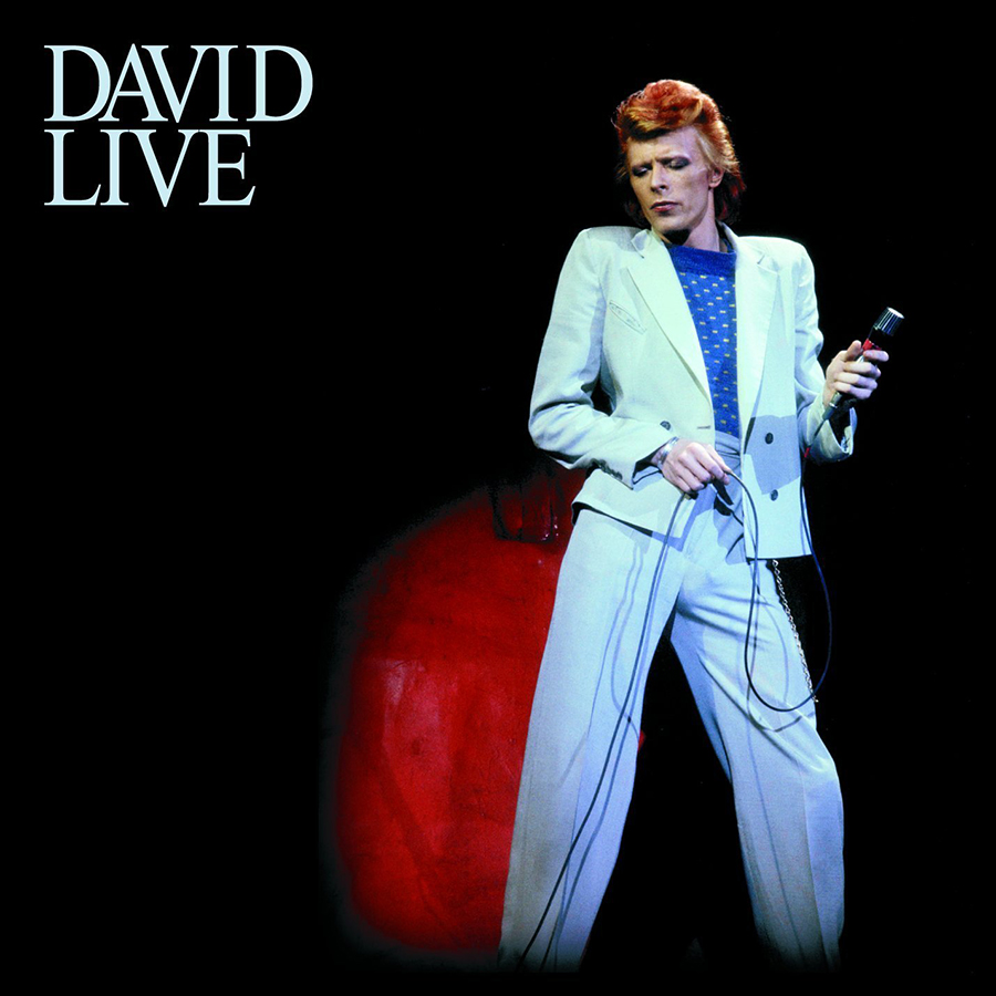
The cover is a simple but dramatic image of a stylish Bowie. By all accounts, David chose this photo, but it was reproduced so poorly that he believed it made him look like he’d “just stepped out of the grave.” His emaciated figure is likely a sign of his cocaine addiction at the time. The coloring of the Dagmar photo originally made him look as blue as his suit. Thankfully, a re-release properly color-corrected the image. But Bowie still had the pale pallor of a recluse and the emaciated frame of fragile health.
Peter Gabriel
Peter Gabriel (Car) (1977)
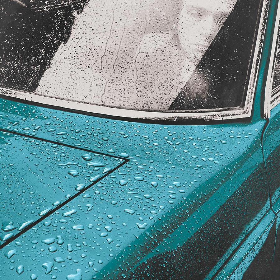
For his first solo album, we see Peter Gabriel in the windshield, raindrops so clearly defined they become a texture of their own. Hipgnosis designed the cover. “I was sitting in a cab in a traffic jam in Trafalgar Square in the rain,” Storm Thorgerson said, “with little to do but watch the cab next to me. On the bonnet of this vehicle were myriad drops … each drop seemed to have a quality and a life of its own. I thought, ‘That looks cool, I can duplicate that one day.’ Which is how Peter Gabriel came to be sitting, looking furtive, in the front seat of my beloved Lancia Flavia, which had been heavily doused with a garden hose.” Photographer: Richard Manning.
Talking Heads
More Songs About Buildings and Food (1978)
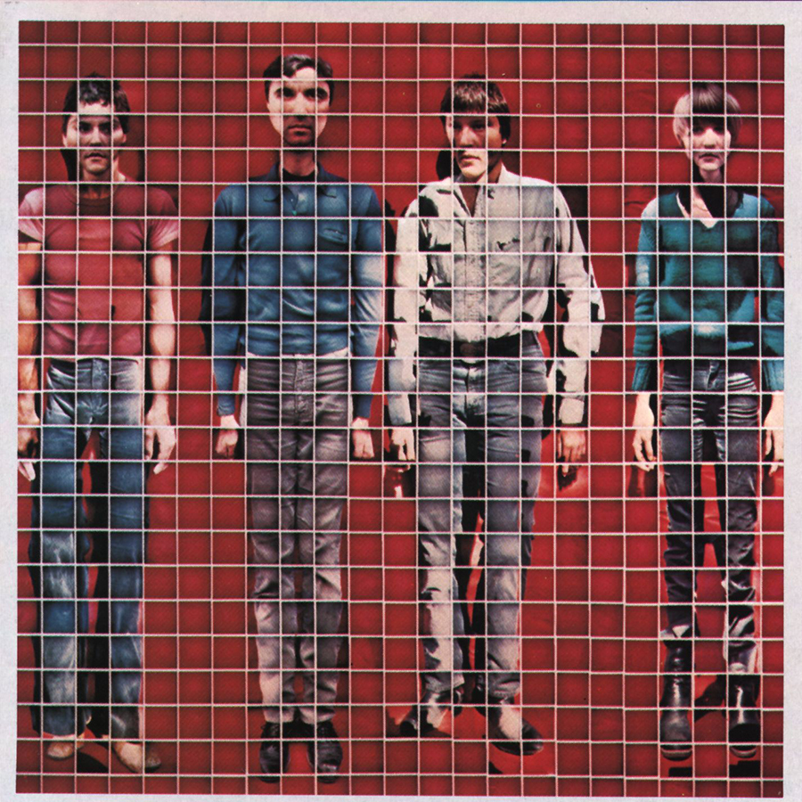
David Byrne was responsible for this distinctive concept. He’s a photographer in his own right, but he reached out to Jimmy De Sana to shoot the 529 close-up Polaroids that make up this mosaic.
Joe Jackson
Look Sharp! (1979)
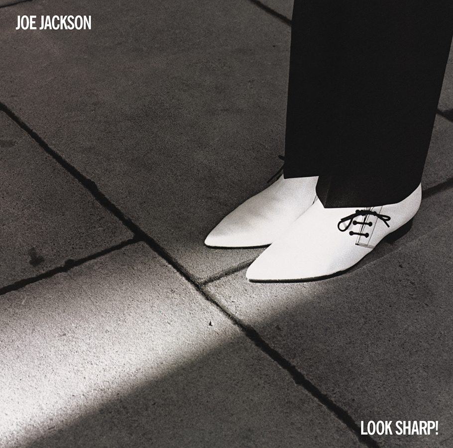
This simple and elegant image summed up Jackson’s early recordings, evoking the sleek lines and bracing urban wit throughout the music and lyrics. Brian Griffin—photographer.
The Who
The Kids are Alright (1979)
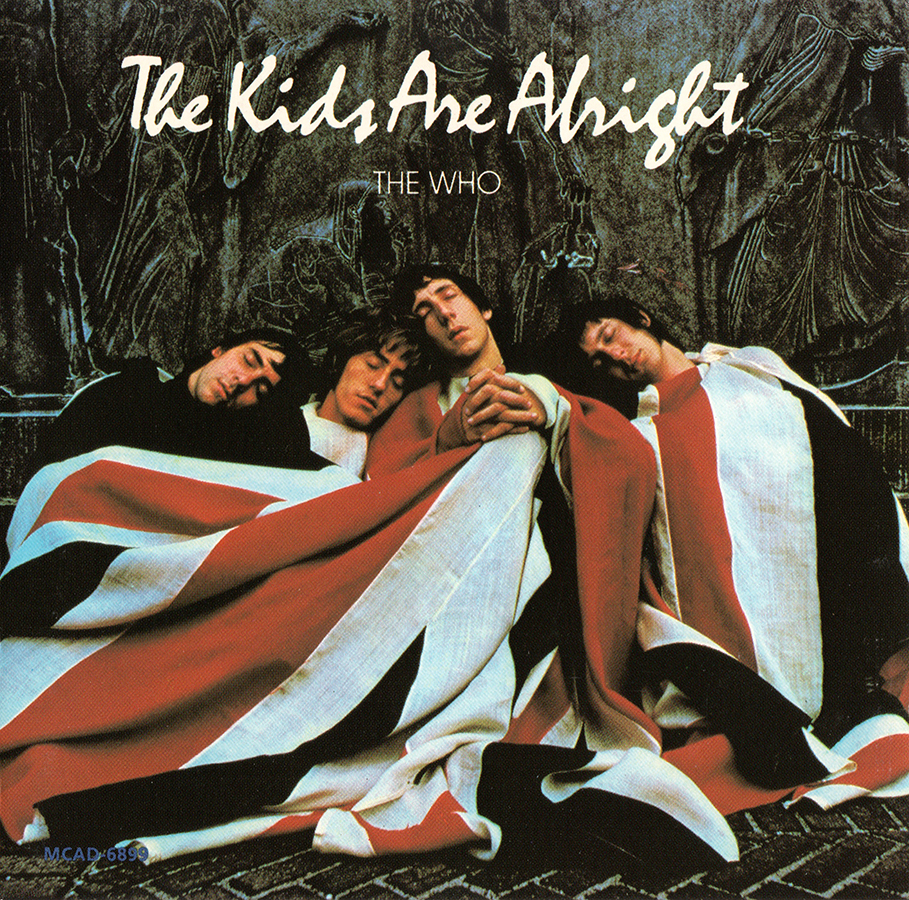
A 1968 photograph by Art Kane features the band wrapped in a Union Jack at the base of the Carl Schurz monument in New York. Kane was inspired by the “cute little ruffians” and the idea of portraying them as “lovable in a devilish way,” like Dickens’ Fagin gang. The pose was also a reference to a photograph by Henri Cartier-Bresson.
The Clash
London Calling (1979)
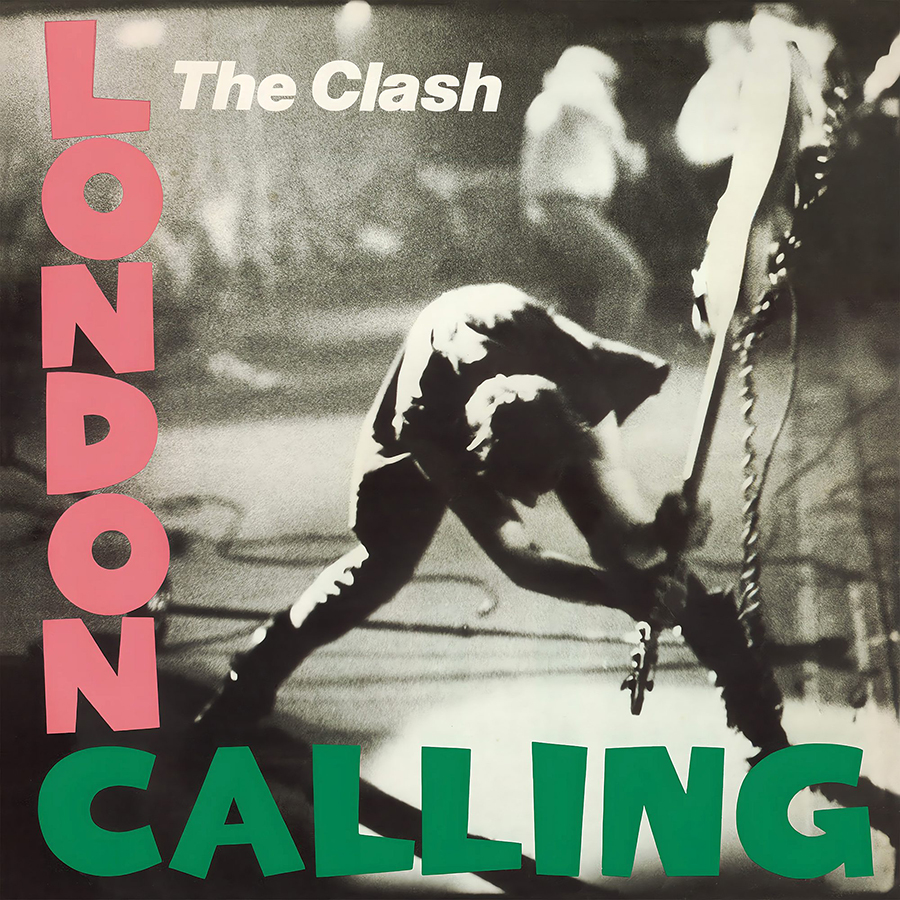
Probably the most rock ‘n roll photograph on any album cover. The image of Paul Simonon smashing his bass was taken by Pennie Smith during a 1979 show at New York’s Palladium. It’s raw, a touch out of focus and you can just about feel the impact of the instrument slamming the stage. The layout and script form a clear homage to Elvis Presley’s 1956 RCA debut.
Talking Heads
Speaking in Tongues (1983)
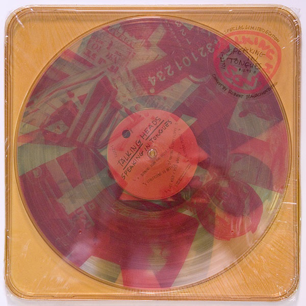
Robert Rauschenberg created a transparent plastic case with artwork printed on three 12″ circular transparent collages, referencing the three-color printing process: cyan, magenta and yellow. Each disc sported a collage of images—including a wrecked car, a highway billboard and a suburban bedroom—that could be spun to produce different effects.
The Police
Synchronicity (1983)
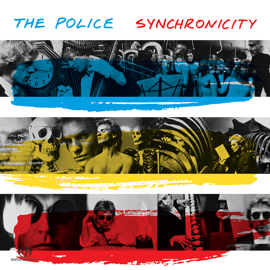
Duane Michals has shot everything from fashion spreads for Vogue Magazine to the 1968 Summer Olympics and this cover for the final Police album. The design incorporates three rows of black-and-white photographs, each overlaid with transparent horizontal stripes of red, yellow or blue. It was released in a number of variations, all containing the same photographs in different arrangements and with different stripes. One picture shows Sting reading a book: Carl Jung’s Synchronicity.
U2
All That You Can’t Leave Behind (2000)
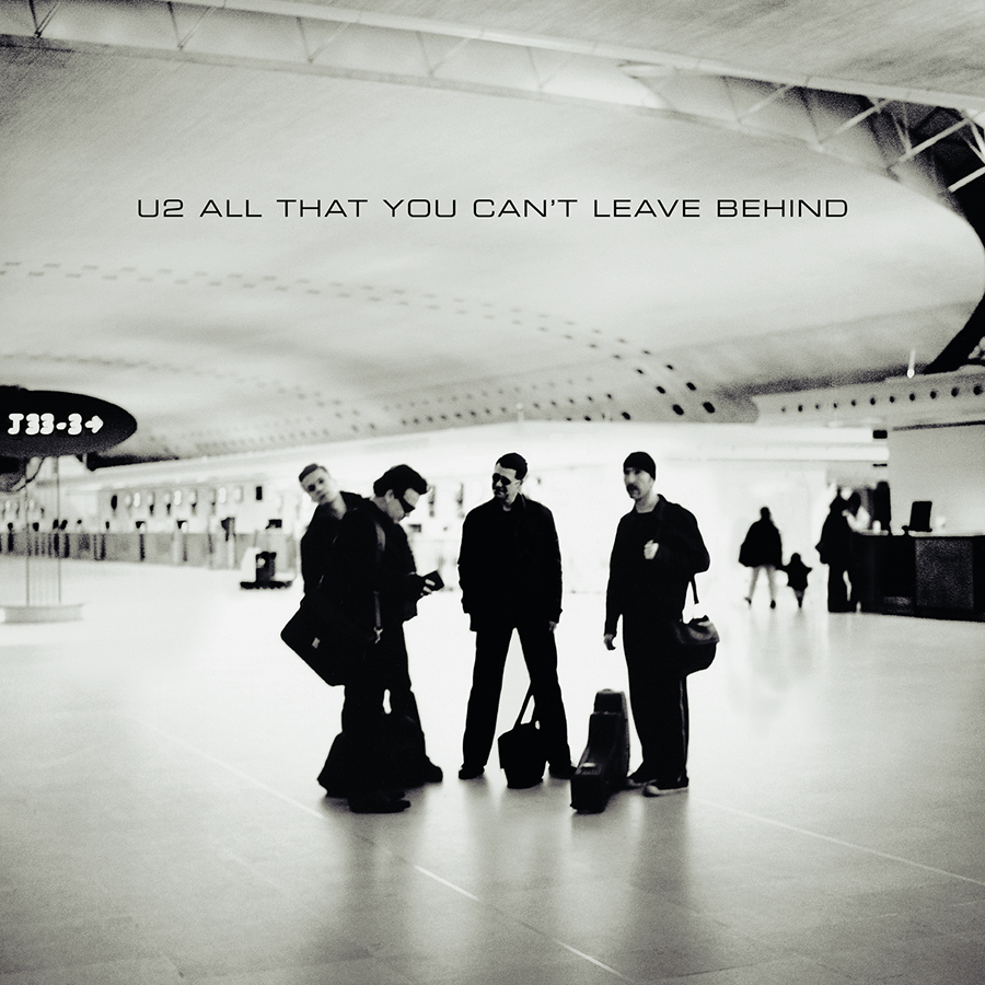
U2’s tenth album, and their sixth with Anton Corbin as photographer. It features Corbin’s trademark style and marks a return to the serious and monochromatic artwork of the band’s ’80s albums. It was shot at Charles de Gaulle Airport in France, known for its futurist, brutalist look. In the original photograph, the airport sign reads “F21-36”, indicating the direction of check-in desks. Per the band’s request, the sleeve designers changed this to J33-3, a reference to the Bible verse Jeremiah 33:3.
David Bowie
The Next Day (2013)
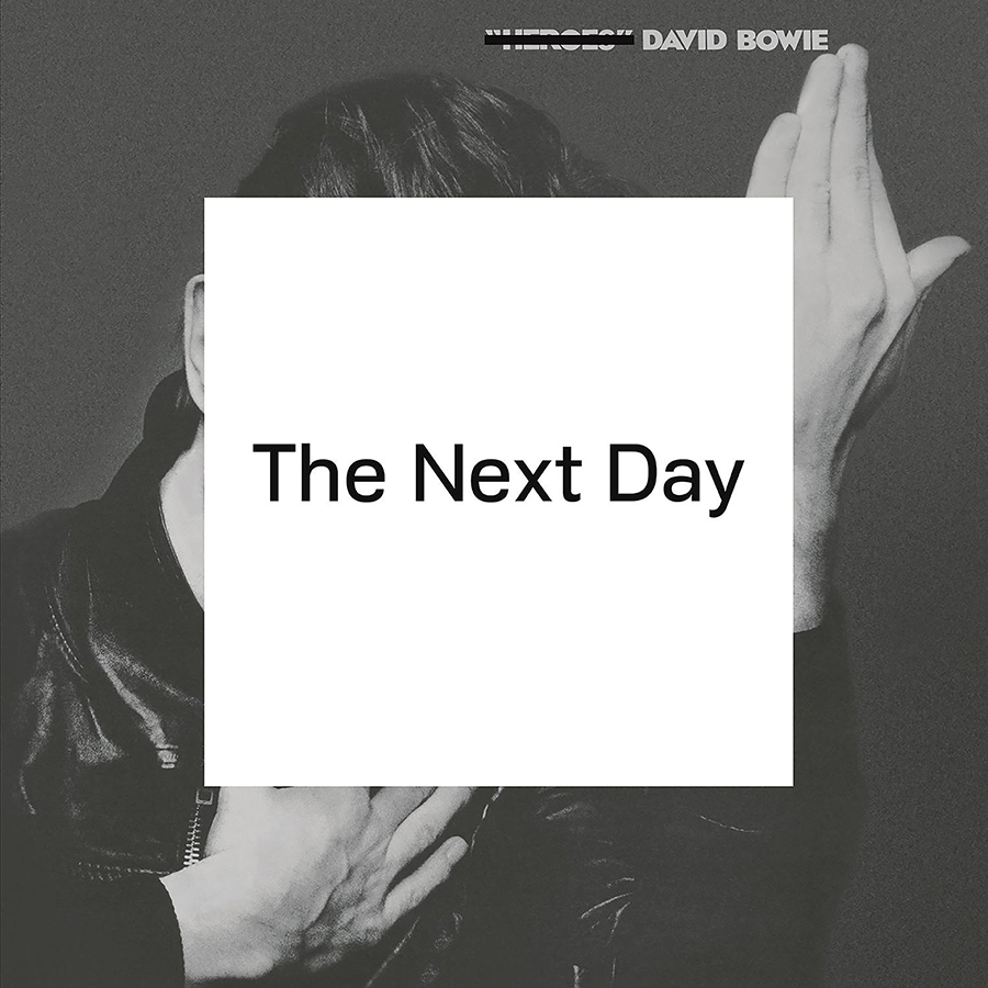
Designed by Jonathan Barnbrook, the cover is a white square with the title in very simple text dropped on top of Bowie’s 1977 Heroes cover photo. That image was taken by Japanese photographer Masayoshi Sukita. It represents a nod to Erich Heckel’s paintings.
Kendrick Lamar
To Pimp a Butterfly (2015)
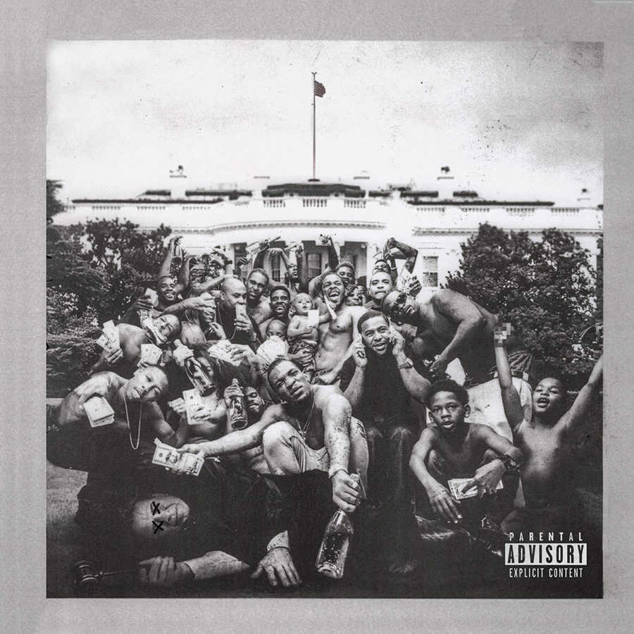
The grainy, distressed black and white photograph on Lamar’s third album cover captures a spontaneous moment during a trip to Washington. A lot can be read into the images—it’s seemingly a celebration, but on closer inspection you see a bound judge with eyes X’d out at the bottom. A provocative and evocative image that reflects themes of economic disparity and cultural identity heard throughout one of the best rap albums of the 2010s. Denis Rouvre—photographer.
Art of the Album is a regular feature looking at the craft of album-cover design. If you’d like to write for the series, or learn more about our Clio Music program, please get in touch.


 Events