10 Classic Album Covers to Spark Your Imagination
Ennio Morricone, The Shirelles, Buck Owens and more
We’ve all been there: Your client’s brief is trite, ordinary at best. You’ve done the work a hundred times. Over and over, day after day … you’ve grown weary of endlessly recycling the same tired formulas. Eventually, frustration takes a toll on your imaginative capabilities.
Compiled here are 10 examples of captivating art to get your creative juices flowing again. Album covers are an inexhaustible source of inspiration and a great remedy for creator’s block. It’s my pleasure to share these classics with you all.
Gabor Szabo
Faces (1977)

Less is more, part one. A photograph of the artist at his most pensive. Dreamy, pastel hues abound. Full yin-yang. Szabo at his most crepuscular. Shaped like a door, the blue frame is a bridge that connects night and day. The thin-lined art-deco font adds an Asian vibe to the vertical lettering.
Thelonious Monk
Genius of Modern Music (1952)
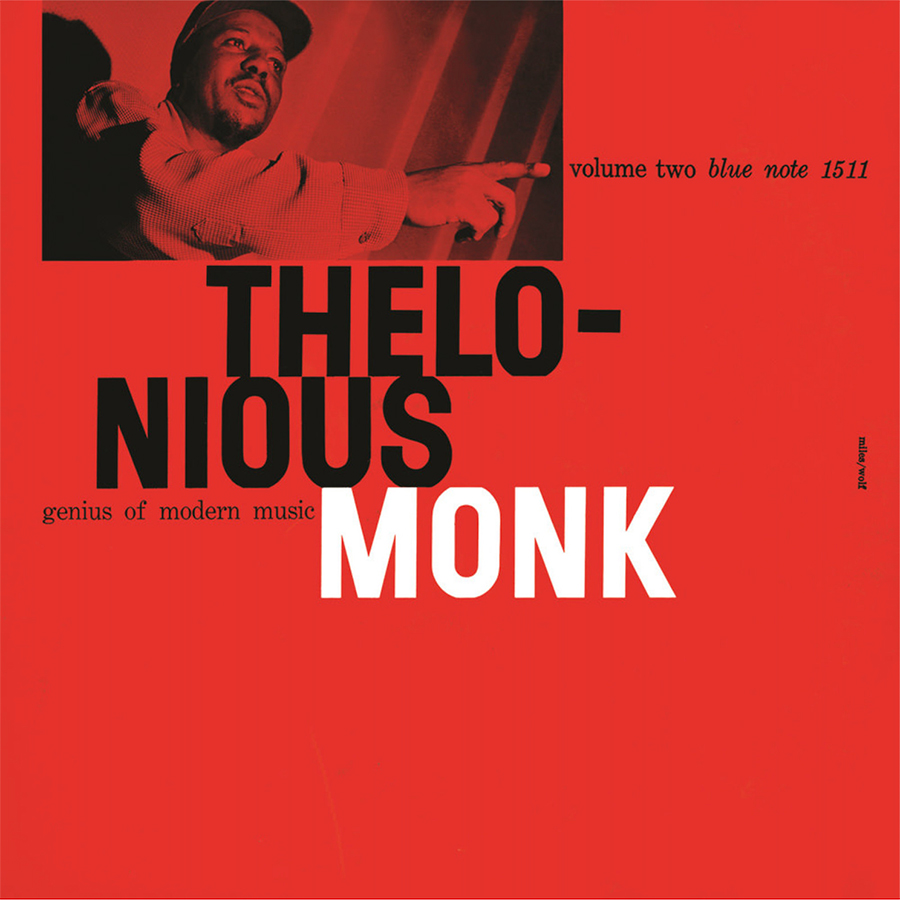
Less is more, part two. Nothing superfluous, nothing to spare; only the essentials are displayed. Reid Miles’ use of contrast conveys power. Big, bold letters vs. small text and serif. The red background adds an exciting tang. The font is tastefully cropped and arranged. Zen monk all the way—nothing in excess, all in balance. Ask yourself: What can I take out? Giving some breathing room to each of your elements allows them to pop. “It’s not the notes you play, it’s the notes you don’t play.”
Ennio Morricone
San Babila Ore 20 (2020)
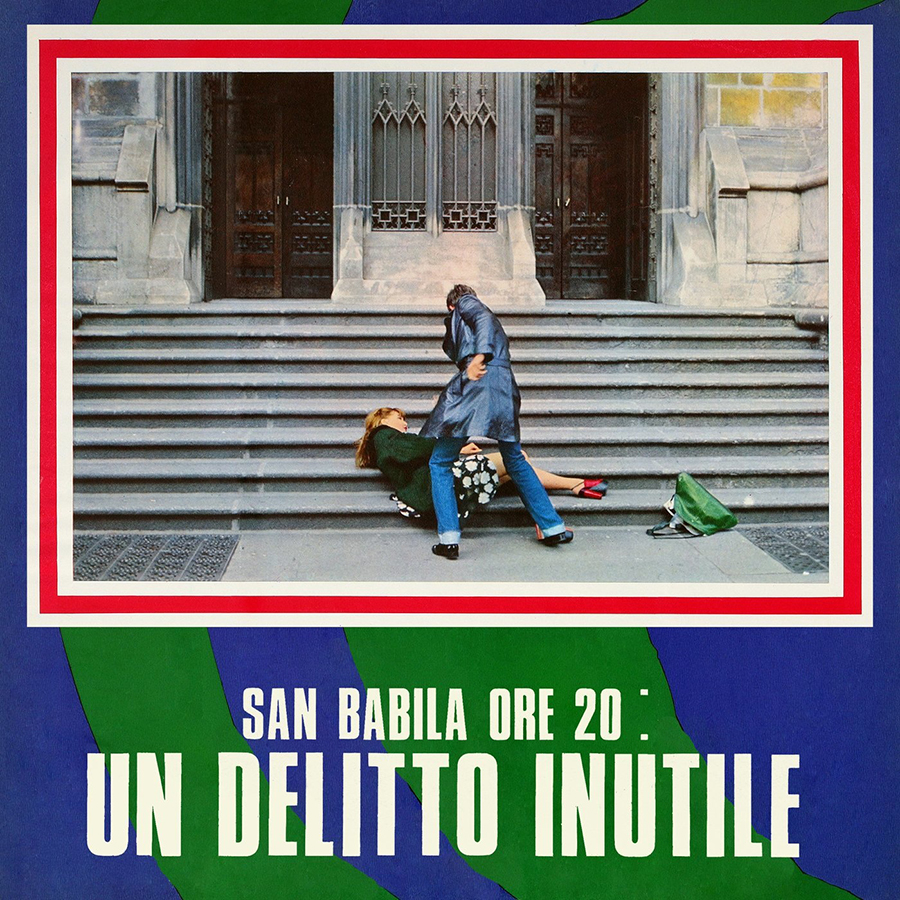
Referencing the medium. A still from the movie San Babila carves the space into a television set, screen on top. A fitting proposition for a soundtrack. Telegenic art that directs the eye to a crime. The red frame suggests violence as the main theme of the film.
Marvin Gaye
In the Groove (1968)
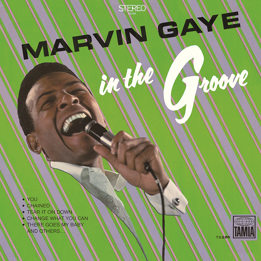
Green and lilac stripes from a shirt you might find in a thrift shop. Exuberance in more conservative times, when one was expected to dress with cufflinks to perform for a ballroom audience. Marvin Gaye is literally in the groove, inserted into a repeated pattern of diagonal lines, forming a beat, a rhythm…
The Shirelles
The Shirelles (1972)
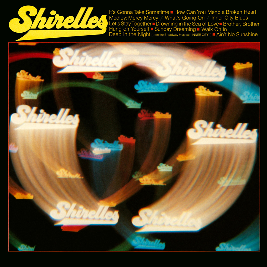
How to compose a picture when given close to zero to work with? The information you have: The band is called the Shirelles; the album is also called The Shirelles. OK, where do we go from here? Let’s suggest a path. Agree on a font that’s fitting for the genre. The name appears as if projected onto the dance floor. “And now, ladies and gentlemen … the Shirelles are about to light up the stage!” The cover suggests songs to set your hands and feet in motion. Feels exciting despite the modest embellishments.
Donovan
7-Tease (1974)
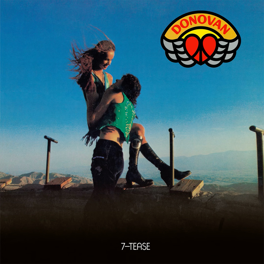
The power of the brand. A young couple expresses their love, away from the political turmoil and uncertainties of the early ’70s. At the top right corner, a stylized peace and love symbol represents an artist filled with the idealism of years before. It’s Donovan’s nod to his audience acquired in the flower-power era. Although the times have changed, he remains the cosmic poet who earned their support.
Penguin Café Orchestra
Music from the Penguin Café (1976)
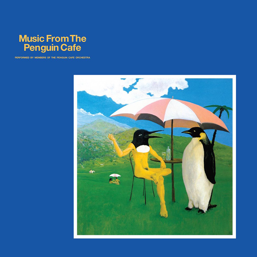
Form follows function and function follows form? Like a poster on a wall, a stamp on an envelope, the frame allows for a high level of information without saturating the space. This one has a bit of a mise en abyme that I think has been fully intended since I love the thought process. A distant mountain, a palm tree … the scene takes place on an island somewhere. A cute pastel drawing of anthropomorphic birds, framed within an ocean. The picture becomes insular, set on the bottom right, drifting away…
Buck Owens
Tall Dark Stranger (1969)
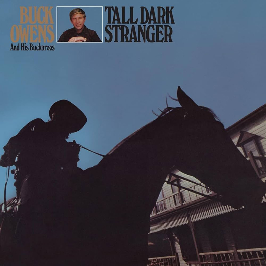
Black as night, a mysterious silhouette gains stature through the low angle POV. The phantasmagorical figure absorbs all light. The rider and his horse become a canvas for mental projection. What are his intentions? “Beware of a tall, dark stranger,” says the song “Danger.” A classic movie trope a la Sergio Leone. The script unfolds without effort.
Waltel Branco
Meu Balanço (1975)
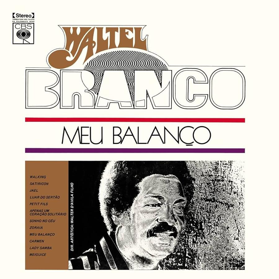
Organizing the space. An amalgamation of a good many techniques. Indeed, this example is all about harmony. A free-form approach for the seasoned artist. Yet, once broken down, it’s not too difficult to replicate. Start with a familiar formula: name, title and setlist unfolding from top to bottom. The elements are sized and arranged so that the space is equally divided. The title of the work sits in the interstice. The fun begins once your space has geometrical reasoning. Find a groovy and compelling way to introduce your artist. Add effects to a photograph of your subject for heightened impact. Experiment with unusual fonts. Success is guaranteed.
The Books
The Lemon of Pink (2023)
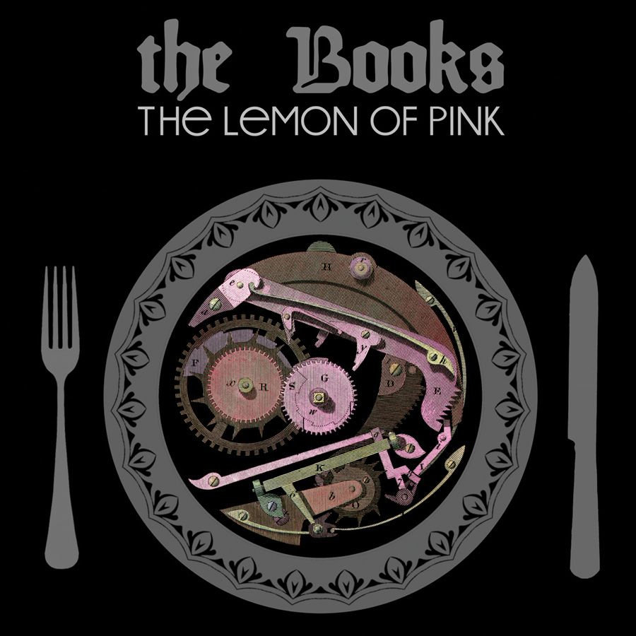
The art of the charade. What’s on the menu today? Cogs and gears, bits and pieces, separate elements, samples, all diligently classified. Does this reference the duo’s mastery of collage technique? The Lemon of Pink’s musical process is one that heavily relies on technology, which the mechanism pictured on the cover suggests. With a little imagination, what’s on the plate takes the shape of a rotating disc. Samples, CDs, food for thought … eventually, the puzzle starts making sense.
Art of the Album is a regular feature looking at the craft of album-cover design. If you’d like to write for the series, or learn more about our Clio Music program, please get in touch.


 Events