My Best Friend Akira: How the Iconic Manga Got Me Through 7th Grade
Lifelong lessons from Katsuhiro Otomo
It was sometime in 1990. I was living with my dad when he was called out to the Gulf War. Suddenly, I found myself living 30 miles away with my mom, ready to go into 7th grade at a brand new school. This is a nightmare scenario for an introvert, not to mention the culture was a total 180 for me—not a single skateboard or Robert Smith hairstyle in sight. Not to dwell on being an outcast (aka, nerd), but most nights were spent eating pizza rolls and drawing, not much going on in the ol’ friend department.
My escapism came in the form of a graphic novel. One day as I’m waiting for my mom to get off work, I find myself browsing the shelves at Heroes and Dragons, the comic store a few doors down. Row after row of Spandexed superheroes disappeared into the background as I came across issue 25 of Katsuhiro Otomo’s Akira. Looking back on that moment now, that book was as much of an outcast as I was—kindred spirits, I thought.
The visual presentation of the cover felt like a punk flyer—big black type set over a solid red header bar, contrasted by an ultra-detailed cover illustration of a boy standing over a motorcycle holding a rifle. Maybe it was due to my life circumstances at the time, but it resonated with me deeply. It was serious and melancholic. The character seemed lost and angry but with a hint of empathy, fear, or maybe determination. It looked as if he was on his way somewhere. The background hinted at the massive scale of the environment, composed of giant crumbling skyscrapers that extended off frame from behind plumes of smoke. This single drawing created a sense of mood, emotion and spacial awareness like I had never seen before.
Akira became my world that year. I’d read each new issue immediately, then skim through again just to analyze each panel. Any interest I had in making new friends was replaced with my constant need to draw. I spent my time sketching motorcycles, cityscapes, guns and explosions. I remember practicing constantly, attempting to perfect human anatomy, perspective, contrast and layout, all through the lens of a post-apocalyptic future full of orphaned teenage gangs on motorcycles with psychic powers.
It’s hard to fathom the skill level and technical precision that Katsuhiro Otomo is capable of, and the sheer amount of work he singlehandedly put into Akira seems impossible (over 2,000 pages created from 1982 to 1990). Needless to say, I never reached that level of mastery as an illustrator, but I can’t deny the influence that Katsuhiro Otomo and Akira have had on my own work and life since that day almost 30 years ago.
First, there’s the ambition. I remember thinking that if this one person could write and draw thousands of pages of the same story over eight years, then anything was possible. I haven’t even mentioned the feature-length animated film yet. Hailed as a masterpiece by many, it consisted of 150,000 drawings at 24 frames per second, and Otomo provided the storyboards and layouts for all 783 scenes himself. Akira took away any fear I might have had that I couldn’t achieve something if I just put in the effort.
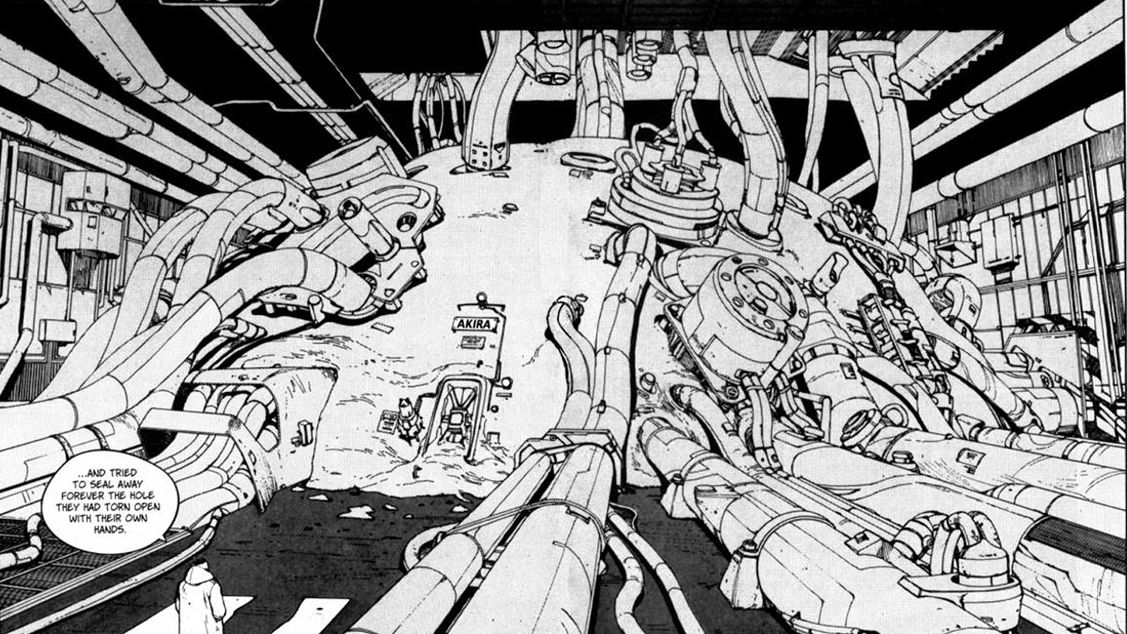
Then we have the details. I’ve heard people say that some details are too small to notice and are unnecessary. I believe in most cases that’s wrong. I do agree there can be details in art that someone might not be consciously aware of, but I bet if those details weren’t there it wouldn’t feel complete. Katsuhiro Otomo’s attention to detail was masochistic, no doubt, but the time I spent analyzing every little line, scuff and shadow in Akira has definitely influenced how I work today. It trained me to obsess—within reason—about the details in every project we release. It can be the smallest detail that takes a piece from OK to great.
As I’ve been looking back at my history with Akira, I realized another point of inspiration was design. Long before I knew anything about the graphic design industry, I was getting a lesson in brand consistency from collecting the Akira books. The story originally ran as a series in Young magazine, but from 1984 to 1993, Akira was collected into a six-volume paperback set. Since then the series has been republished in various formats in multiple countries—from the original Kodansha volumes, to the 38-issue Marvel trade paperbacks, the anniversary box sets, and even a Barnes & Noble exclusive release—each one dressed in that recognizable masthead and those small graphic details.
While the elements and layouts of each re-release are slightly different, they all follow guidelines with typography, hierarchy and composition. Each book varied only through a unique spot color and an issue-relevant cover illustration. There’s nothing more satisfying than lining up my collection to view the repetitive consistency. For better or worse, I have a compulsion for this kind of consistency in my work. It can be the smallest thing, but if there’s no repetition, visual categorization or tie-together, I’ll stress about it until there is.
So I made it out of 7th grade alive. I even made it out of college, and later my friends and I started a creative studio and we’re still going strong 11 years in. Some days I imagine I narrowly avoided the stereotype of becoming a high-school dropout skateboarding delinquent, living in a basement apartment surrounded by stacks of comics. Then I remember that’s an antiquated mainstream stereotype, and in actuality, it was skateboarding and comics, specifically Akira, that motivated and inspired me to try harder.


