How TBWAChiatDay New York Is Putting Design at the Core of Its Breakthrough Work
From Adidas to CJR to Thomson Reuters
CANNES, France—TBWAChiatDay New York is on a hot streak. And it can thank its design department, and getting design into the creative process earlier more generally, for a number of recent notable successes.
The agency’s “Billie Jean King Your Shoes” campaign for Adidas has been a favorite at the award shows this month, picking up a Gold Clio and two Silver Clios at Clio Sports and a slew of Lions (including two golds) at Cannes.
That project hinged heavily on sneaker design, including bringing back King’s old blue sneakers with white stripes—with a custom illustration of the tennis legend on the tongue—and having sneaker artists turn anyone’s shoes, of any brand, into BJK shoes during a one-day activation at the U.S. Open last August.
The agency did a more sobering sneaker design project for Thomson Reuters, in which it created custom shoes—and other products—with facts hidden in the designs about forced labor in fashion and electronics supply chains. They were sent to professional unboxers, who “unboxed the truth” on camera.
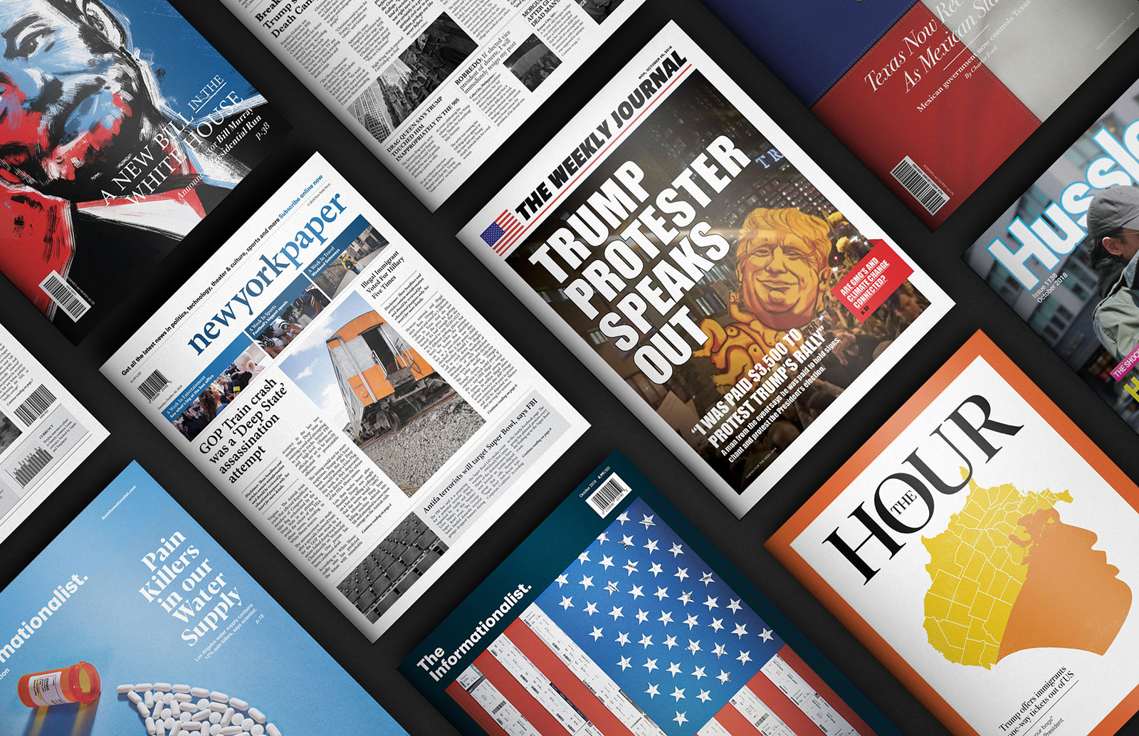
Finally, the Fake News Stand project for Columbia Journalism Review, unveiled last October, involved designing a slew of physical magazines emblazoned with headlines grabbed from fake stories on the Internet. They were displayed on an actual news stand in New York and received widespread praise in extensive media coverage.
Chiat NY recently launched a design practice, Design by Disruption, or DxD, to expand on the agency’s history of great design.
At the Cannes Lions festival, Muse sat down with Chris Rowson, the head of D&D, and Chris Beresford-Hill, Chiat NY’s chief creative officer, to talk about all three projects mentioned above, as well as design’s unique role in the creative process at the agency.
How did the Billie Jean King campaign come about?
Chris Beresford-Hill: We have an amazing client at Adidas named Eva Barrett. She came in with her crew from Amsterdam for a day to brief us orally herself and tell us what she’s looking for. She wanted to disrupt the U.S. Opens, and told us Billie Jean was an asset we could use. We actually left the meeting with the Billie Jean King shoes activation, all of us talking about how excited we are about it. That’s really unorthodox. Brainstorming with the client directly, getting her involved in actually building out the idea verbally as we had it.
It was a one-day live concept with the client, and then it was, how the hell are we going to pull this off? It was really about sorting out the craft of it. Can we get spray paint that will dry fast enough? Can we get enough sneaker artists? How many should we pre-spray? Should we bring a PR person in? Soup to nuts, we had the idea in four hours. Then we spent 60 days trying to pull it off.
Chris Rowson: The biggest design challenge was how we represented Billie Jean King. I think the original plan was just to use an illustration, similar to the Stan Smith, from when she was actually playing. But then the push from the team—Amy [Ferguson] and Julia [Neumann]—was to really modernize it and just embrace who she is now. That was probably about 20 rounds back and forth, trying to get her likeness just right.
Chris Beresford-Hill: She wasn’t super excited about being aged up. That was our biggest dialogue with her. But our point was, as the sum total of everything you’ve done, this is the more powerful icon than your young, tennis-playing self.
Why do you think, deep down, it was so compelling?
Chris Beresford-Hill: What we’re most proud of is that Adidas’ global platform is “Here to Create.” This is the first time we’ve built on it. Our campaign is called “Here to Create Change.” Through this campaign, our extension is that creativity in sport is a beautiful thing but creativity that leads to social change is ultimately really powerful.
Chris Beresford-Hill: The reason I loved it is the spirit and the attitude of it. Number one, selfishly, it’s very ChiatDay, it’s very disruptive. But the other thing is, there’s a lot of campaigns now about equality. There’s something about celebrating someone who just got what she wanted. I just love the idea of—she can change sports, and you can change the shoe on your foot into another kind of shoe. I love this steamroller change-agent belief that through creativity you can change what’s in front of you. For her, it was the establishment. For this campaign, it was literally people walking in wearing Air Force 1s and leaving wearing Billie Jean Kings. I just thought it was an artful, well-crafted, well-designed sledgehammer.
The Fake News Stand was also highly designed.
Chris Rowson: That was the single idea we went back to them with. Within minutes they agreed, which is pretty exciting. That was when we flipped our design team into mini publication studio. Or more like 20 publication design studios.
Seems like it was a crash course in magazine design.
Exactly. We had to look at all the visual conventions of publications out there, from the cheap and nasty gossip magazines to tabloids to the broadsheets to the more highbrow Economist style work. There’s actually such a mixed media of execution out there. Everything from illustration to paparazzi-style photography, studio photography, portraiture, prop making, tons of illustration approaches, 3-D modeling. We pulled the Design By Disruption team into this. The creatives and the client helped us do the research into finding the most shared fake news headlines online over the past 12 months or so. And that was our brief: How do we turn these headlines into a magazine or a newspaper cover?
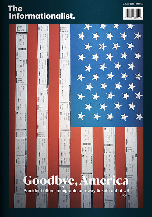
Chris Rowson: We probably concepted about 10 ideas for each of the headlines. And then set up our little production calendar. Everything we produced was created in-house—not one external partner. Photographers, filmmakers, we’ve got some model makers in our team. Several of our illustrators got their hands dirty and built some huge props. One of the most ambitious ones was the Informationist cover, where we designed and printed out about airplane tickets and built this big U.S. flag from them.
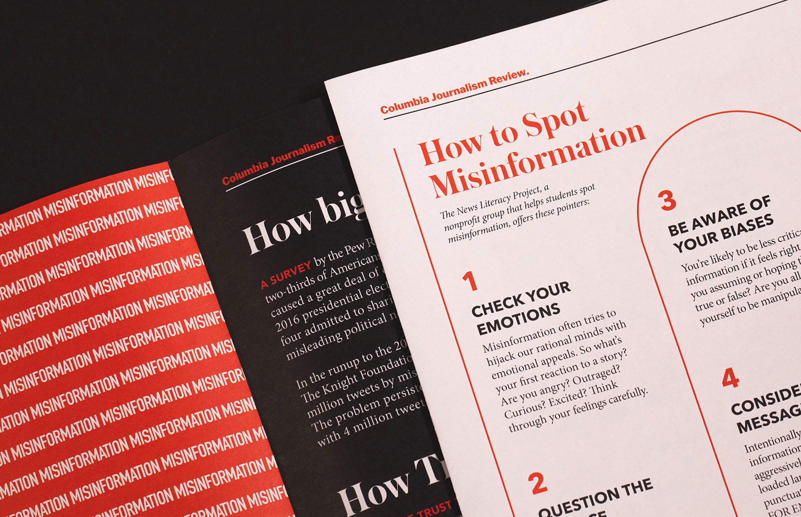
Chris Rowson: There was a lot of love, a lot of craft, a lot of thinking. And then the artworking itself was super time intensive. And that was just stage one, because then we had to design the insert. There were some CNN journalists involved, Columbia Journalism Review, and they gave us the context of how to spot fake news. And we transformed it into this insert. But then one of the big problems we had was that we had to reformat it for all the different paper sizes, so that was one those wonderful last-minute challenges. It was several rounds of trying to make them look as authentic as possible.
What do you think that project represents in terms of how Chiat NY approaches problem-solving today?
Chris Beresford-Hill: That’s a good question. Well, to back it up, the vision, creatively, is to be the most consistently interesting agency in New York. So disruption is a big part of it, but the work can be in any shape possible. I think there was something really smart and somewhat subversive about the Fake News Stand project that I liked. You always aspire to do something that has a strong intellectual aspect. But I also think there’s a subversiveness in taking over a newsstand and watching people discover these messed-up headlines and screwed-up stories. I think intelligence plus edge makes it special.
How important is it, to you guys, to take work into the real world like that?
Chris Beresford-Hill: I think it’s always the dream. Even when a television campaign launches and you get metrics back that it’s tracking, I feel like it doesn’t quite count until Twitter starts talking about it. Until any project you do has some resonance in the real world—the satisfaction starts amplifying then. Things like Fake News Stand are designed for that. We’ve chosen the exact location with the most traffic and the most proximity to New York journalists. You’re going, “Please, let it get picked up.” And when it does, it’s ultimately the most satisfying thing. That was completely designed for news aggregation.
A lot of your work is very PR friendly that way.
Chris Beresford-Hill: It’s fun because the agency is at a size where design is incredible, and production is also incredible. Our head of production, John Doris, in the 18 months he’s been there, he’s never said no. He’s always just said, “Give me a little more time.”
These ideas that have a really juicy hook not only tend to do well outside our walls, but internally that hook is going around from account to production to design to creative to strategy. We end up kind of PR-ing the ideas around the agency, and we have a ton of ideas floating around for every different assignment. We bring production and design in at the very beginning. So the ones that become easy to explain, or the ones that people are most eager to share back and forth, wind up being the ones that go to the meeting. There’s something about the Fake News Stand, when it’s stuck on the wall—that’s kind of unignorable to us. We have to do it.
It’s about combining two things that are not expected. So many great ideas are like that, combining two things you wouldn’t expect.
Chris Beresford-Hill: Someone early in my career once told me advertising is really just finding interesting connections between things and then articulating them.
Now, you just have more platforms to do that in.
Chris Beresford-Hill: Yeah. Makes it way more confusing.
Can you talk about the “Unboxing the Truth” project?
Chris Rowson: That was a really interesting project. I think that was my first week in the agency. It was just a great way to have design make a stamp on the agency. It was showing the power of design in the beginning of the creative process. One of the struggles I’ve had with other agencies in the past is having respect for design, and seeing design as a creative partner and a creative output as well. The Unboxing idea was really brought to life through the design team and through this variety of maker skills that we have.
We had everything from conceptual designers to graphic designers, information designers, working on it. We had an illustrator, a product designer. We had our 3-D modelers starting to build little protoypes of what it could look like. One of the most interesting parts was when half the room was filled with creative and design and we were working out the narrative of the project. Where was the best place to reveal these facts? How are they going to come to life?
One of the really interesting parts of the project was where we drew that parallel between modern slavery being hidden in supply chains, and turning the unboxing into a wild goose chase. We did these shocking facts within the details, within the seams, within the insoles of the sneaker, for example. It paired really well with the unboxing experience—they labor over discovering the details. It was creative and design partnering all the way through, then a real partnership with production. There were literally days where we were running down to supply shops to find ethical materials for the packaging. We were down in Greenpoint at one point. It was just a great project to make that stamp to show how all these departments should just partner together.
Chris Beresford-Hill: What I love about that one is, usually we are given a product and we try to tell a story about it. There’s something nice about creating a product, when you experience it, that actually becomes the story. I sometimes struggle to describe it, but there’s a very interesting storytelling technique in the project.
Can you talk broadly about why design is important to the agency?
Chris Beresford-Hill: Well, number one, while we have aspirations to be the best agency in New York, we’re also the global hub. As the New York office, we handle global businesses. And design and simple visual solutions scale and translate. If the future is “Words or pictures?” for us I think it’s visuals. Design is essential because the more global clients we take, the more visually driven solutions we can put in the market, the better our life will be. That’s where I see the future, at least for us.
Number two, the only time I’ve seen in the last two years you can still get a pure and legitimate emotional response to work is design. Because it’s still untestable. When people on the client side are stimulated by it, when they love it, when they spark to it, where’s no, “Well, how are we going to test this?” It’s approved. You can still win the client’s gut on design, which is wonderful.
And then number three, for me, very personally, working with Chris has been a little bit of a professional revelation. I come from agencies that are maybe a little more writer driven. Certainly design has never been as big a component of the department as it is at Chiat NY. And for me, seeing Chris and his vision and his team, and how great design can elevate every idea, it’s shown me the power and the amplifying effect of great design. It’s made everything I’ve been involved in better.
Chris Rowson: Specifically why design is important to our agency—to TBWA and to Chiat—you look at the history of all of the work they’ve produced, from the Pepsis to the Apples and so on. Design has been so central to some of the most iconic campaigns that the network has ever created. That was a big draw card to come to the agency. So I think actually building a legitimate design department for Chiat, for TBWA, is necessary and super important.
I think the other thing is how we’ve twisted disruption. Obviously it’s in the Design By Disruption name, and everyone’s quite familiar with the Disruption roadmap and methodologies that TBWA uses. We’ve now kind of twisted that and we use that for design. We’re not just using design like a lot of agencies do, which is the final product and the polish on it. We’re actually giving it a strategic point of view and a strategic value, and I think that’s why design has now come in the process much, much earlier, and it’s added so much more value.
We’ve got creative thinking, and then we’ve got real design thinking in terms of “What is the utility?” “What is a visual way of solving this brief?” “Is there a branding idea that can actually solve a creative brief?” We’re starting to get more and more of those projects through, based on client briefs. It’s exciting.
Another reason why design is important is in building relationships with clients. It gets you further down the process much earlier on, and it really is a partnership and a journey when you’re developing brand identities. It’s not like getting a brief and having to sell, sell, sell 10 ideas. It’s much more focused at times. It’s about really taking their guidance, listening to them, taking all of the research that they’ve done, and then actually building something with them. When you do that, you build their trust. And then, when it comes to the more campaign-led briefs that are brand platforms, you’re halfway there and you’ve already built this trust with them. That’s why it’s really valuable for an agency to have.


