This Visual Identity Motivates Politicians to Do More with the Office
Can design save democracy? We may find find out
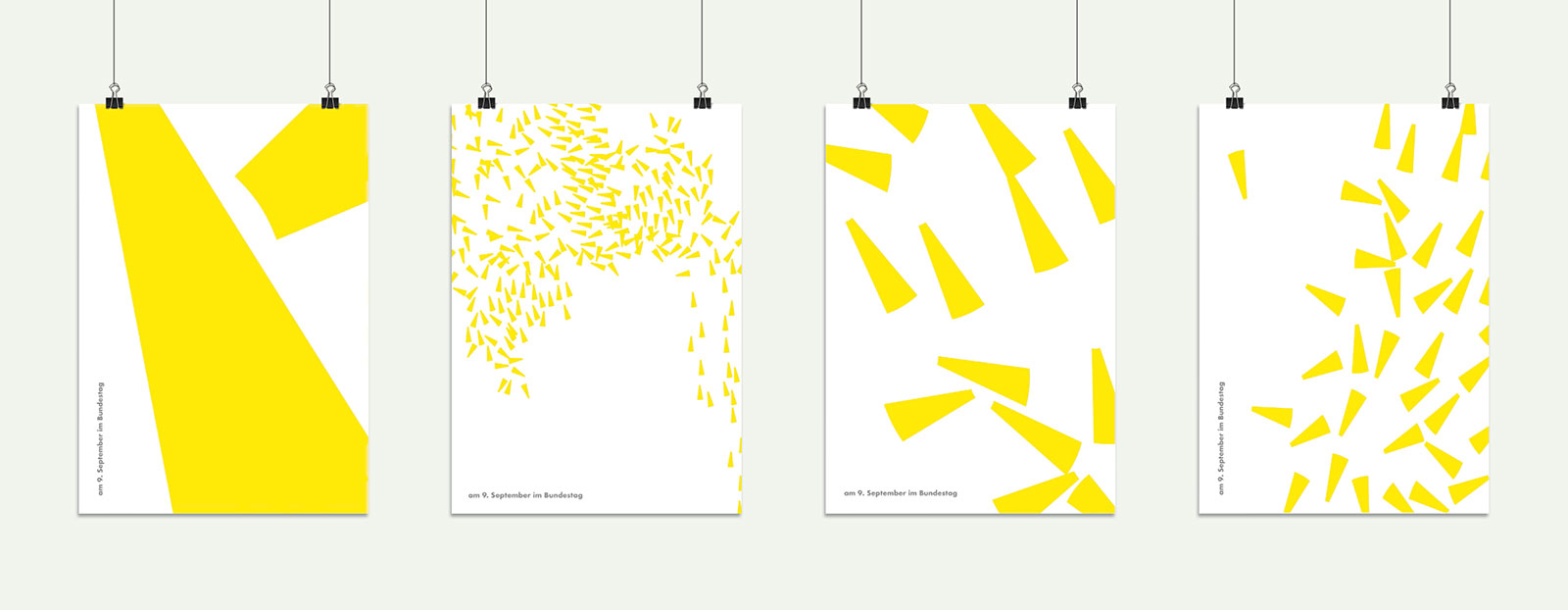
Heimat Berlin, the agency responsible for so many Hornbach ads we’ve grown to love, launched “The Moving Parliament,” a new visual identity for the Free Democratic members of German parliament.
Implemented by Field.io, the design is algorithmically powered, but the agency cautions that this is secondary: “It’s not designed by an algorithm; it’s designed by humans,” Heimat writes. “And powered by the ideas of humans.”
The “human-fueled brand design” evolves to reflect the activities of Free Democrats. A yellow triangle—representing the Free Democrats’ percentage of seats in parliament, and the party’s traditional color—serves as the design’s core. It was reproduced 80 times, once for each MP.
Every time one of them publishes a new idea online, the swarm of triangles moves faster; the more ideas and policies are published, the more frenetic that movement gets.
“Any kind of communication has to take a stand for democracy nowadays. This is also true for design,” says Heimat’s chief creative officer, Matthias Storath.
Heimat’s goal is to remind Free Democrats to “keep moving things forward.” The easiest critiques to levy upon “The Moving Parliament” are two things we know and wrestle with daily: Social media makes it easy to publish whatever you damn well please to a waiting audience (or no one at all). Social can also make intense emotions more contagious—negative emotions chief among them.
If the design determines “forward movement” by the number of publications an MP posts on social feeds, that doesn’t necessarily mean that person is taking more action; at worst, this model favors people who happen to be better at PRing their ideas than other Free Democrat parliament members.
A person who happens to publish more doesn’t have more worthy ideas, either. People latch on to the emotionally incendiary, which may incentivize MPs to lean more on feeling than on facts. We’ve already got way too much of that in our feeds.
Lastly, while snackable color-coding makes Free Democrats’ publications easier to recognize, the design would be even more useful if it were extended to all other parliamentary representatives. That way, people could see at a glance who’s publishing more, and which party’s opinions and ideas dominate feeds. That kind of visual information would be as useful to government as it would be to voters.
On the other hand, maybe training people to favor the dominance on social of a given political color would only exacerbate a problem we already have.
Still, it’s a step. Maybe once Free Democratic supporters can parse what their MPs really care about on a regular basis, it will also be easier to gauge the quality of each member. How can we know until we try?
“With code and algorithms, communication can become dynamic—thus a more and more complex world can be experienced in an intuitive way,” Field.io managing director and partner Vera-Maria Glahn adds.
We’ll see. In the meantime, it’s safest to judge “The Moving Parliament” for what it is—a compelling, modern and adaptive visual identity.
An accompanying tool enables each member to customize and design individual stationery, business cards, brochures, posters, light installations and information booths. No single design will be the same; each is a unique snapshot of the swarm in a moment in time.
CREDITS
Agency: Heimat Berlin
Implementation: Field.io


