HELLvetica Is a Hellishly Kerned Helvetica, Made for Halloween
The evil Zack Roif explains his creation
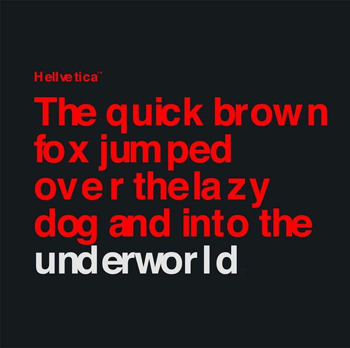
Designers looking to inflict pain on their own kind now have the perfect weapon—an evil new font called HELLvetica, which is a hellishly kerned version of the original classic Helvetica.
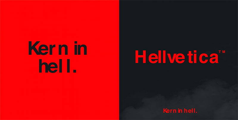
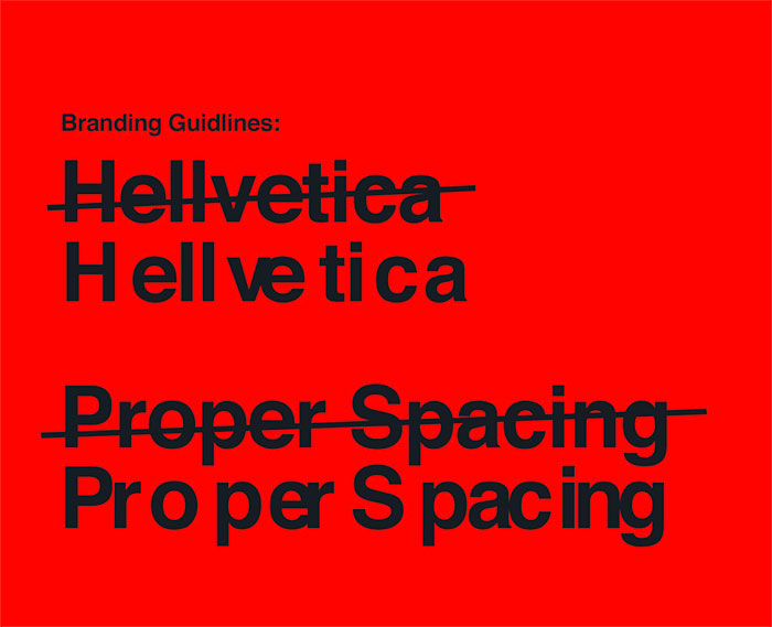
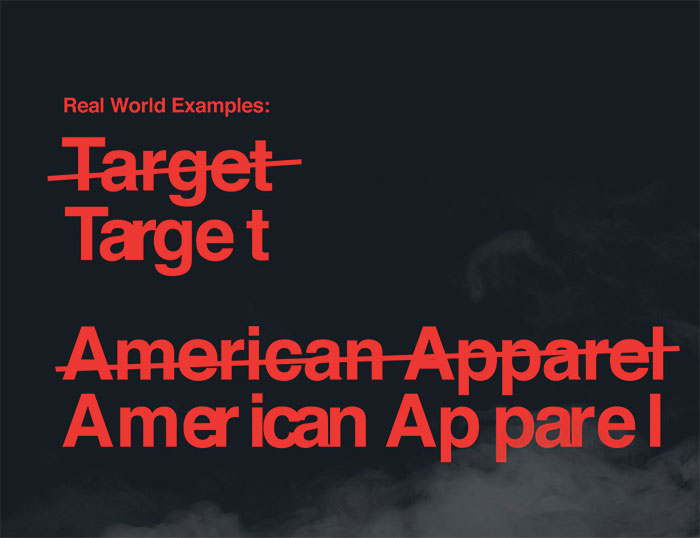
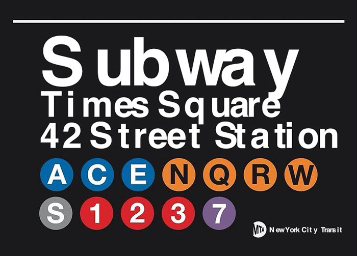
HELLvetica is a side project from Zach Roif, associate creative director at R/GA (who came up with the concept), copywriter Namwan Leavell, art director Emily Stetzer and designer Matthew Woodward. It’s free to download from the website, and is painful indeed on the eyes—as you can see from the uses below.
The slogan “Kern in hell” is just about perfect, though.
Roif tells Muse that the idea for HELLvetica came totally by chance.
“The inspiration actually came from a really unexpected source—an all-agency office email,” he says. “We actually got an invite to our office holiday party which had ‘Hellvetica’ written on the invite. I immediately thought it was a hilarious thing to read since I’d somehow never seen the font written that way before. By the end of the day, I decided it would be a huge missed opportunity not to turn this small joke into a slightly larger, more serious joke—an actual typeface. I quickly Slacked a designer at R/GA and recruited the help of some other co-workers to band together and brainstorm more ideas, then I built the site myself over the weekend.”
The HELLvetica letters were designed with built-in kerning with respect to common word and letter pairings in the real world “to look as awful as possible,” creating “a disgusting representation of Helvetica,” adds Roif.
Which projects would be good for HELLvetica? “Any project you would want to get fired from,” Roif says. And does HELLvetica out-evil the world’s previously most-reviled font, Comic Sans? Says Roif: “It’s very, very possible.”
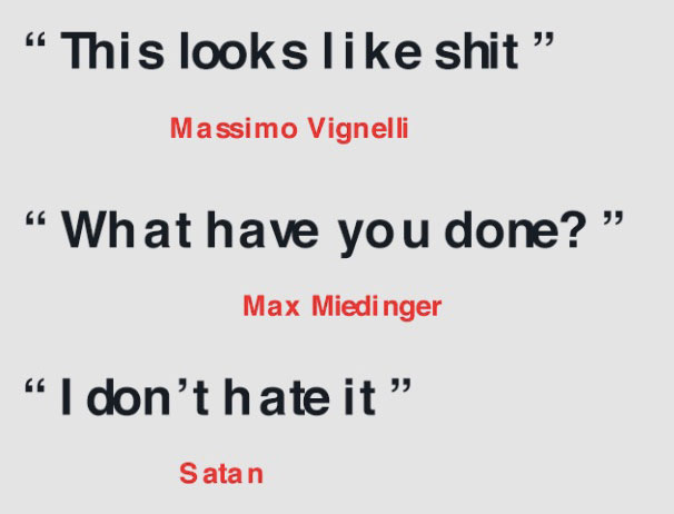
The faux testimonials are amusing, as well:
Follow HELLvetica on Instagram, too, if you’re a masochist.


