Events
10 Great Album Covers That Will Speak to Your Heart
The Raconteurs, The Who, Beastie Boys and more
I’ve had the privilege of editing dozens of videos over the years, refining my ability to craft a distinct visual language for music. The best album covers move people. They’re memorable and evocative. Whether a striking portrait or an abstract illustration, they speak directly to the viewer’s heart—just like great music. Here are a few of my favorites.
Florence and the Machine
Dance Fever (2022)
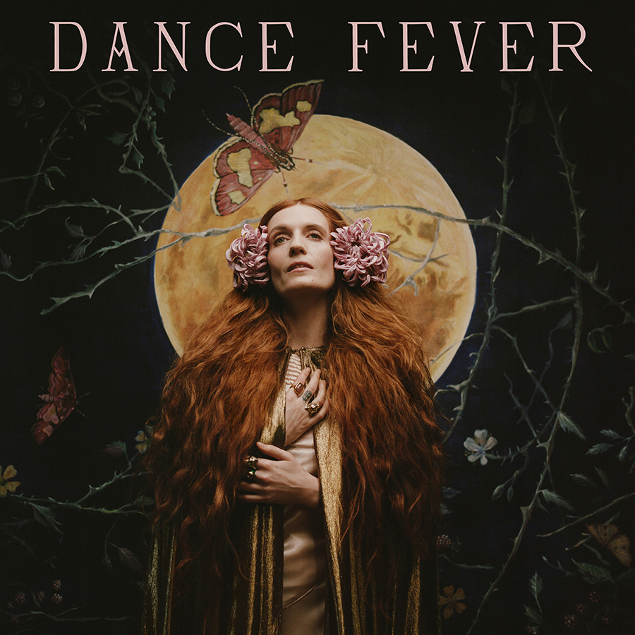
One of my dearest friends and longtime creative collaborators, Autumn de Wilde, played a vital role in bringing this album to life. She directed and I edited all three music videos released from Dance Fever. Autumn also captured the album’s striking cover photo of Florence, while design studio Thunderwing—Nic and J.B. Taylor—designed the key art. The result is nothing short of stunning. The cover not only captures the essence of the album and the spirit of Florence but also sets the stage for the musical journey ahead.
Bruce Springsteen
Nebraska (1982)
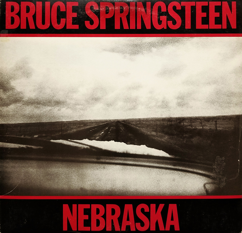
The lo-fi sound, combined with the folksy storytelling in each song, creates a deeply emotional album that unfolds like a film. The cover, shot by David Michael Kennedy, is a stark image of a barren road seen through a car windshield—striking in its simplicity. Bold red typography adds a touch of strength and urgency, making it all the more evocative. Bruce recorded the entire album alone in his New Jersey home on a six-track, a solitary process that mirrors the desolate imagery of the cover, enhancing the album’s raw and intimate atmosphere.
Sufjan Stevens
Illinoise, Cast Album (2024)
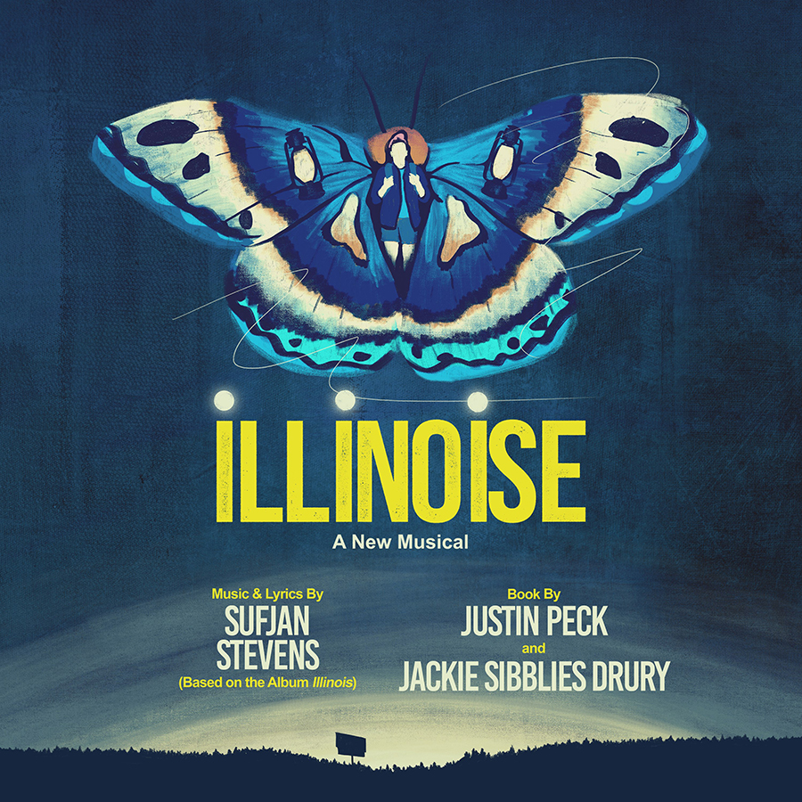
I worked with Robert Mathis to create the key art for this musical adaptation of Sufjan’s album, with direction and choreography by Justin Peck. The butterfly is a clear nod to Sufjan’s signature use of wings in his stage performances. But we took it a step further, adding symbolic details to enhance the storytelling. When people talk about making a lasting mark for a brand, this is about as strong as it gets.
Beastie Boys
Licensed to Ill (1986)
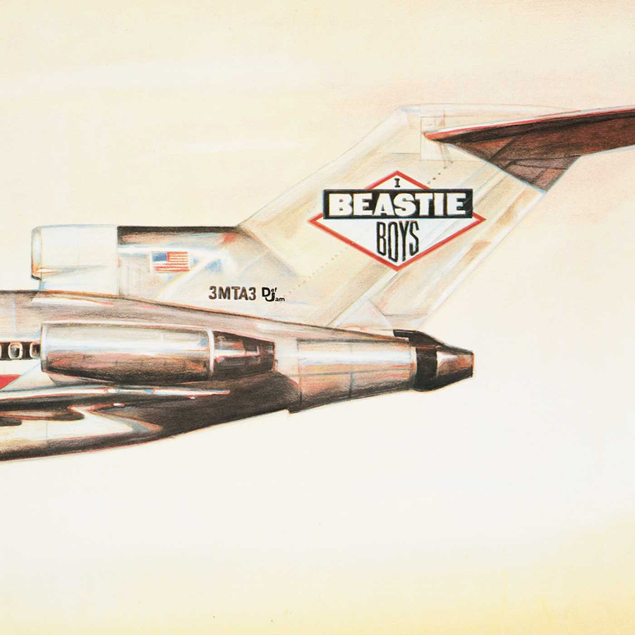
I was in 7th grade when this album dropped, and it blew my mind; an album cover could be a whole concept in itself. The image of a plane crashing into a mountain, doubling as a burnt-out joint, was the first time I really noticed conceptual art. Designed by David Gambale, one of my favorite touches was the graphic on the side of the plane that read 3MTA3—which, when flipped in a mirror, spells “Eat Me.” That detail absolutely cracked me up as a teenage (and honestly, it still does). That pretty much says it all—humor and edge, a Beasties tradition.
Buena Vista Social Club
Buena Vista Social Club (1996)
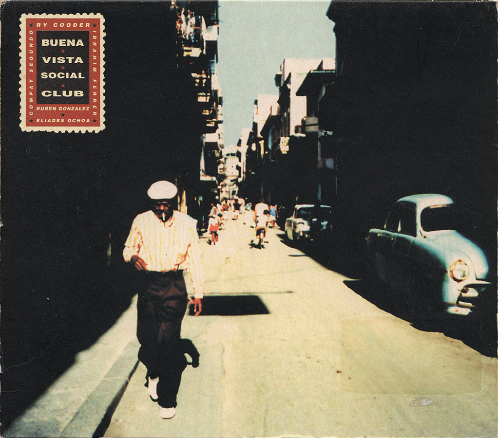
This photo feels like a candid snapshot from the backstreets of Havana, maybe even near the original Social Club. The album gave a voice to the marginalized Afro-Cuban community, celebrating their music on their own terms. The cover feels like a window into their world, capturing its spirit with raw authenticity. Nils Jorgensen took the photo, and Susan Archie designed the cover.
Simon & Garfunkel
Sounds of Silence (1966)
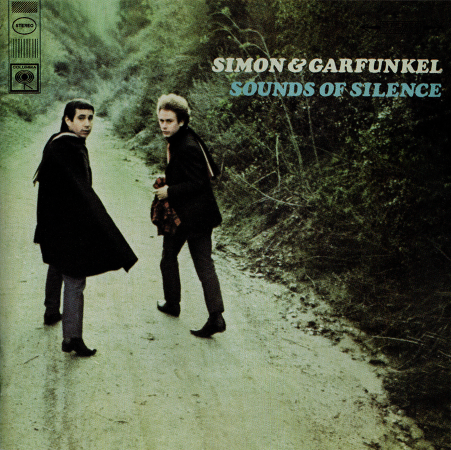
The first vinyl my dad introduced me to—I knew every song by heart. Their voices were warm and familiar, like old friends telling stories. The cover photo taken by Guy Webster captured that feeling perfectly—an invitation to walk alongside them down a well-worn path. It feels almost accidental, like we’ve just stumbled upon them mid-conversation. As they glance back, it’s as if they’re welcoming us on their journey.
Elliott Smith
Figure 8 (2000)
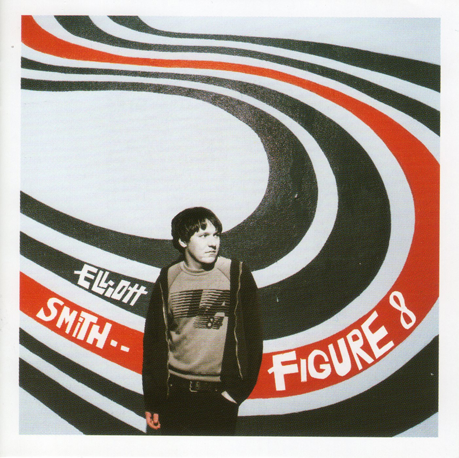
Sometimes, cool just wins. Autumn de Wilde shot this photo of Elliott in front of a mural at 4334 Sunset Boulevard—a wall that became famous and stood as a memorial after his passing. The colors, the shapes, the angle—it all feels so L.A. The T-shirt helps. For an artist who often seemed uncomfortable in the spotlight, Autumn captured a rare moment of ease, a sense of belonging in this space, even if just for a moment.
John Coltrane
Blue Train (1958)
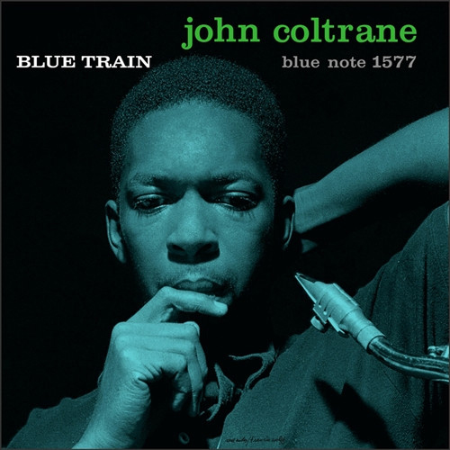
This portrait of the artist is absolutely captivating. My mentor had a blown-up print hanging in his editing suite, and I spent days just staring at it. There’s something about Coltrane’s expression that captures the creative process—the introspection, quiet moments of being lost in thought. It’s a reminder that artistry isn’t just about what we produce, but the deep, unseen work that makes music happen. The photo was taken by Francis Wolff, a co-founder of Blue Note Records and a prolific jazz photographer. The design was handled by Reid Miles, who was responsible for many Blue Note albums.
The Who
Who’s Next (1971)
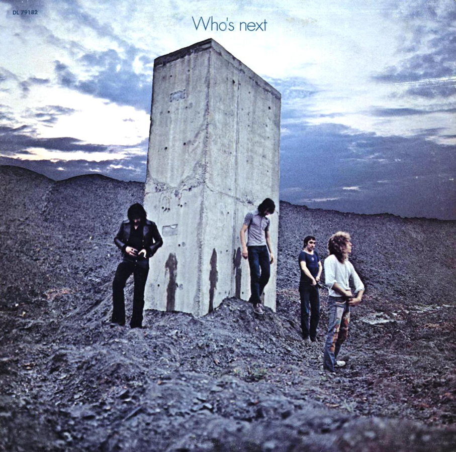
What I love here is the duality. The photo is clearly a nod to Kubrick’s 2001: A Space Odyssey—a film that takes itself very seriously. And in one shot, The Who take the piss out of it. Literally. The sheer audacity of someone not only coming up with this absurd idea but actually making it the album cover? That’s about as rock ‘n’ roll as it gets. The photo was taken by Ethan Russell, a renowned rock photographer.
The Raconteurs
Consolers of the Lonely (2008)
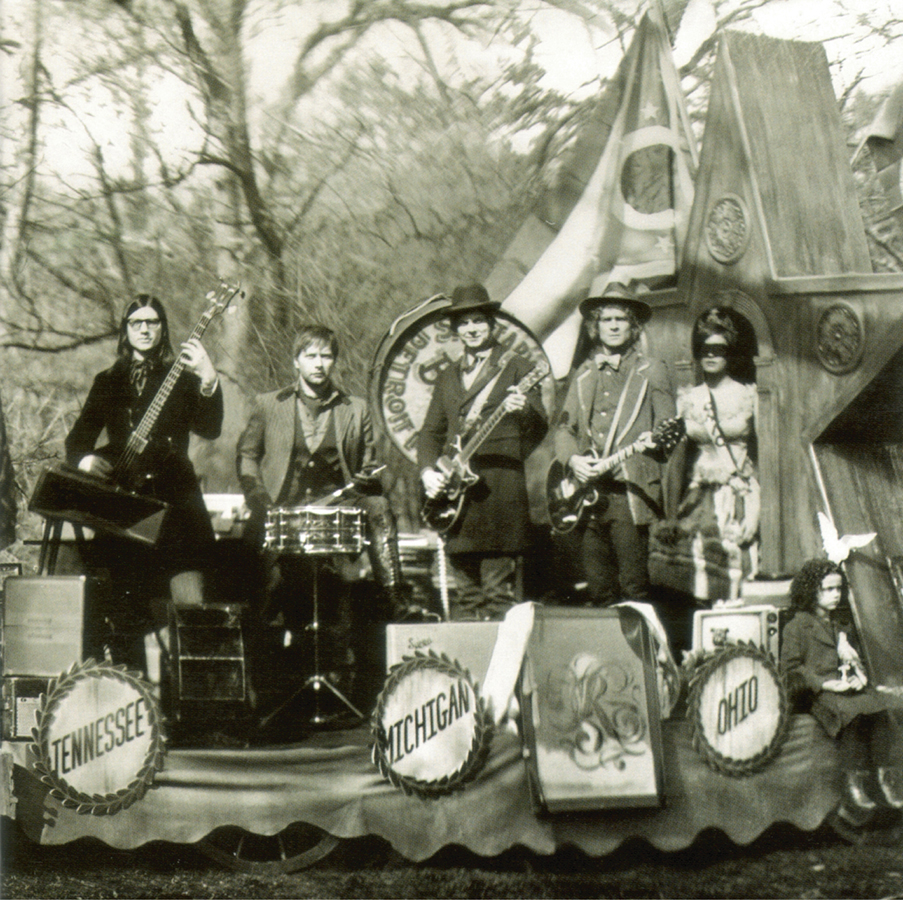
This was another album I had the privilege of working on. I edited its three music videos, all directed by de Wilde. “Salute Your Solution” was the first single, and I cut it together using over 2,500 actual photographs—an intense but unforgettable process. So, for me, the memory of this cover is completely tied to my experience working on those videos. The setting and attire evoke a Wild West or Americana vibe, which complements the album’s fusion of blues, rock and country. I would call this approach timeless, which I think is reflected in the photo. It has a Civil War-era vibe and yet we know it’s contemporary. It immediately sets the tone of the album, a modern classic.
Art of the Album is a regular feature looking at the craft of album-cover design. If you’d like to write for the series, or learn more about our Clio Music program, please get in touch.