10 Great Album Covers, Chosen by Warren Fu of Partizan
Chappell Roan, Beastie Boys, De La Soul and more
Having worked on both music videos and album covers, I owe my entire creative career to music and the art that surrounds it. I went through many phases of genre-switching in my youth, trying to figure out where I belong. I think I’ve come to the conclusion that I feel most at home being a shapeshifting-chameleon. I get a high off seeing any artist who has found their stride, where the visuals and music work together in harmony, like they were always meant to be.
I always loved opening album packaging and flipping through liner notes. Who is this Muggerud guy who is making all these Cypress Hill and House of Pain beats? Who are Flyte Tyme Productions? Someone named Alan Moulder seems to work on all my favorite Depeche Mode records. Who created the album cover? Who was the photographer? It’s a bit sad knowing that the joys of opening a physical booklet while you listen to music are falling away, but at least we still have the album cover in the digital age.
Anyway, here are some standouts for me.
The Pharcyde
Bizarre Ride II the Pharcyde (1992)
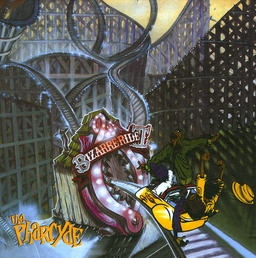
My favorite graffiti artist growing up was Slick. I was already obsessed with Pharcyde’s first single, “Passing Me By,” and when my friends and I found out Slick did the album cover, we all rushed out to buy the CD (Compact Disc, if you will.) The way Slick drew the band, somewhere between graphic novel, illustration and caricature, was so uniquely his style, and it worked perfectly with the band’s vibe: loose, playful and self-deprecating. Then, my friends and I unfolded the poster, revealing that the cover was just the bottom right piece of the full picture. Pearls were clutched.
New Order
Blue Monday (1983)

Yes, every album cover designer worships Peter Saville. Yes, I know this is a single and not an album, but the power and influence of this song and artwork cannot be overlooked. This was a band in transition from post-punk into electronic music and Mr. Saville’s use of a floppy disc as a graphic design element for another media format, a record cover, was such a bold, postmodern move. Nice one Saville. You did it again.
De La Soul
De La Soul Is Dead (1991)
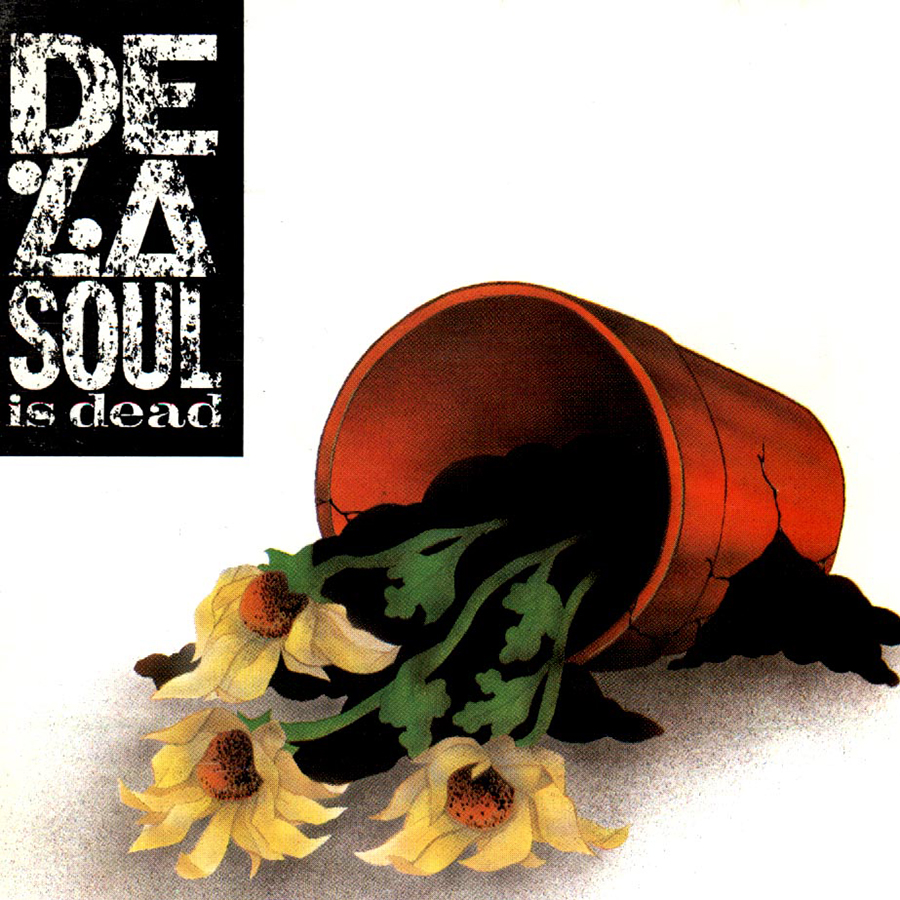
I was deciding between Tribe’s Midnight Marauders and this one, and this one won. This album cover was a f**k you to the daisy-loving-hippie box that they were put in. This is De La redefining themselves on their own terms. It’s my favorite De La Soul album, complete with hilarious skits oozing with irony and satire. The cover encapsulates their rejection of their image and the sarcasm that comes with it. With the tracks “Peas Porridge,” “Ring Ring Ring,” and “Saturdays,” this album became my personality in my youth.
The Velvet Underground
The Velvet Underground & Nico (1967)
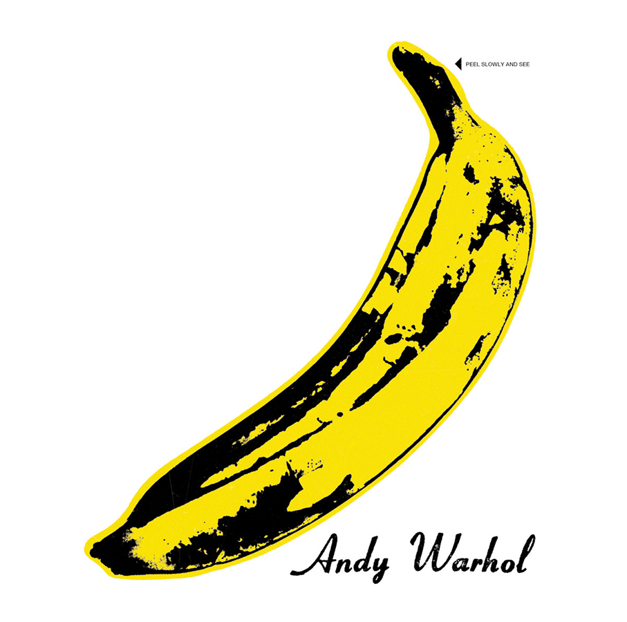
I’ve always been fascinated by long-running relationships between artists and musicians. Anton Corbijn and Depeche Mode. Storm Thorgerson and Pink Floyd. Peter Saville and New Order. Andy Warhol had a unique relationship with The Velvet Underground in that he almost acted as their producer, providing the studio for them to create freely without the interference of a record label. This cover, with its clean and striking simplicity, is also provocative and full of innuendo (the banana is pink when you peel it back). Should this list be changed to “Pearl Clutchers?”
Earth, Wind & Fire
All ‘n All (1977)
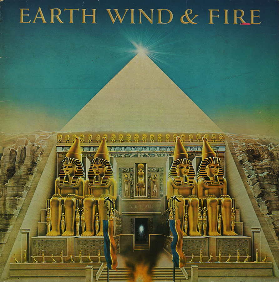
This cover was a big influence while we were working on the album art for Daft Punk’s Random Access Memories. Guy Man introduced me to a book of Shusei Nagoaka’s airbrush paintings. I had been familiar with his album art, but I never knew it was all done by the same person. I love how this album cover was a cross-collaboration between an Asian artist and a Black-American band, showing how music and art have the power to cross cultures and borders. Something about the meticulous, bright 80s airbrushing feels so optimistic, showcasing the Egyptian civilization in all its prime glory. We not only tried to emulate the look and feel of Shusei’s airbrushing, but we also loved the hints of portals to other dimensions. Stand out track from this album is the interlude Beijo aka Brazilian Rhyme. My DJ friends in the Bay used to throw this interlude on at a party to change up the vibe, and the crowd would go crazy.
Yeah Yeah Yeahs
It’s Blitz! (2009)
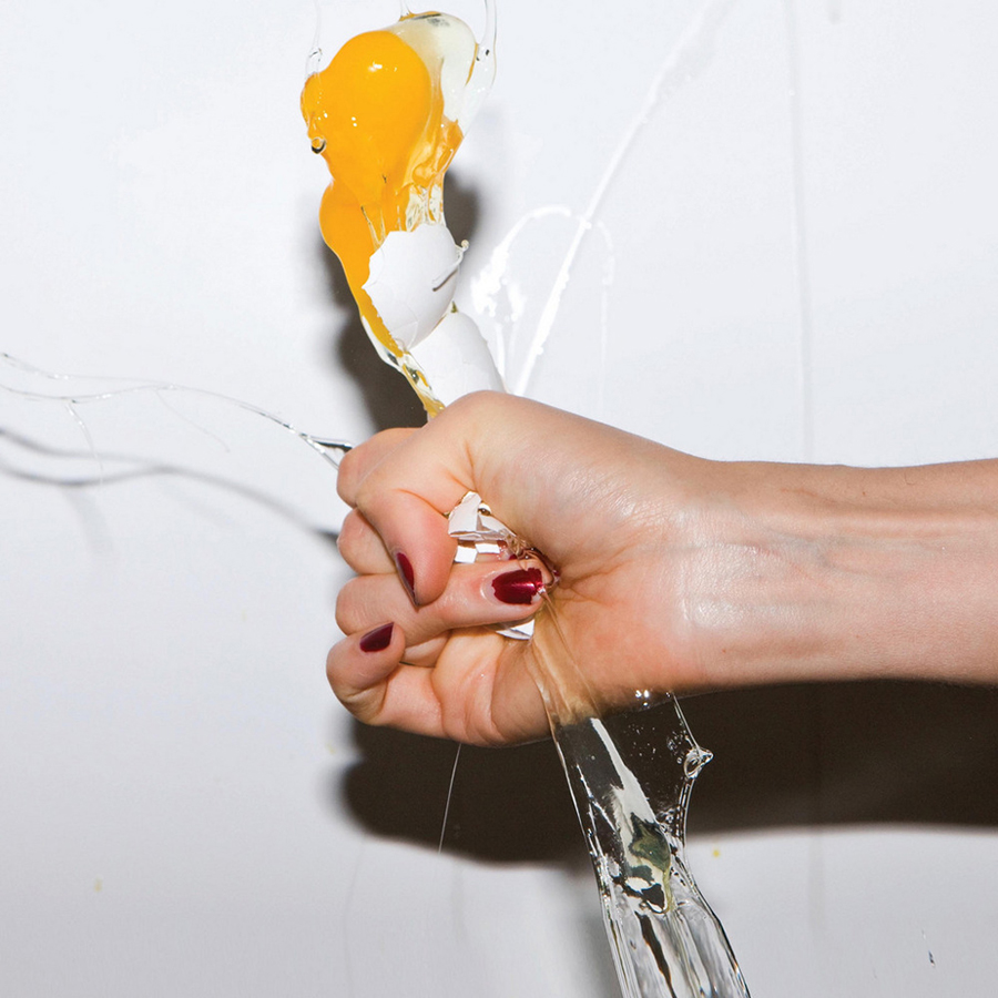
I played this album to death when it came out. So many bangers on this one—“Hysteric,” “Zero,” “Heads Will Roll”, “Soft Shock.” I just love the simplicity of the image with no title or text. It’s just an exploding egg captured in the flash of a camera. It looks like how the title sounds. Try staring at the cover and say, “It’s Blitz!” loud and fast. Now faster. Louder. Faster! Louder! See? Now, you’ve just made a fool of yourself at your office, church, or home bathroom.
Chappell Roan
The Rise and Fall of a Midwest Princess (2023)
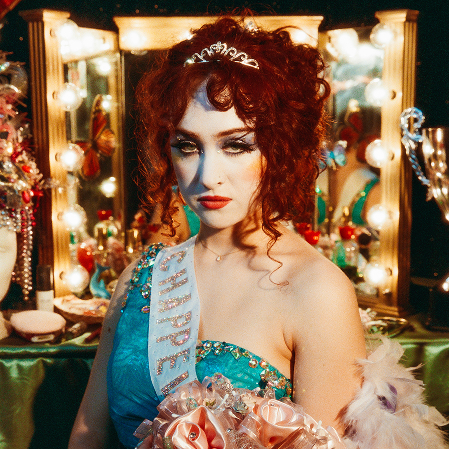
I love everything she’s doing musically and visually. It’s just great to see a young artist hitting their creative stride where everything just works. The album title paired with that image of her in drag-style makeup, is a striking contradiction that makes you want to learn more about her.
The Clash
London Calling (1979)
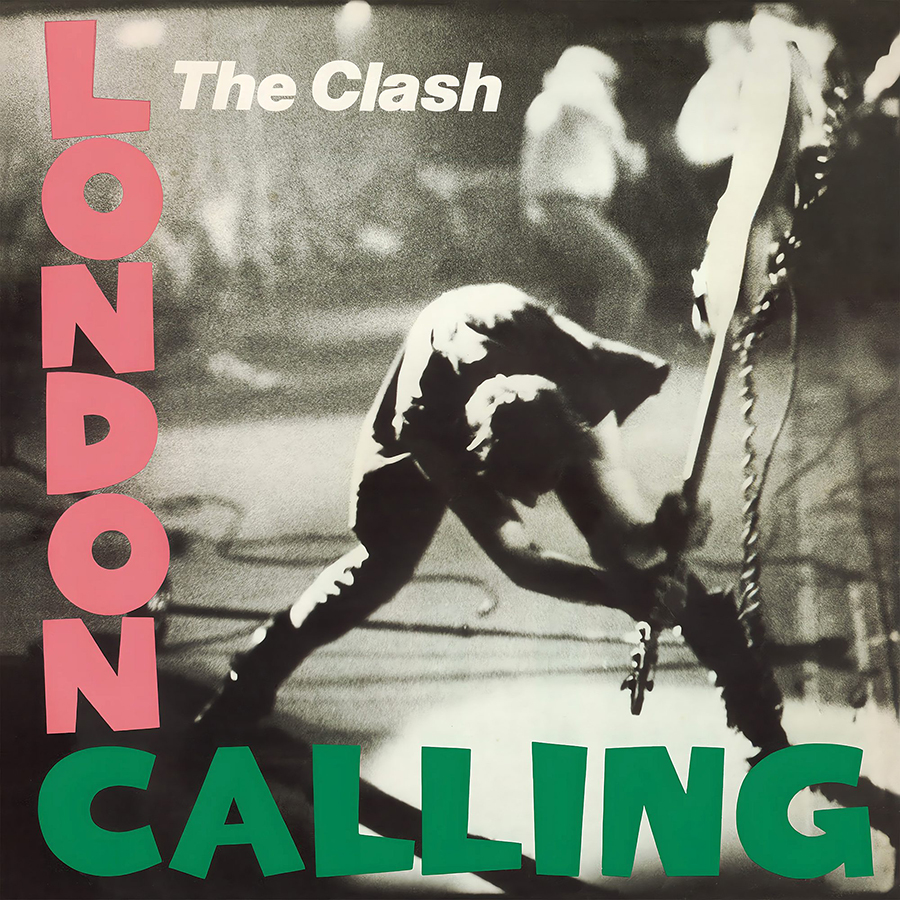
One of the great peers of graphic design is the ability to take the familiar and flip it on its head. I love how this Clash cover apes the font and layout of an Elvis Presley record, signaling the arrival of punk and smashing the old establishment of rock. Fun fact: for the final Tribe Called Quest video, I had Qtip recreate this moment when he smashes a crowbar.
Beastie Boys
License to Ill (1986)
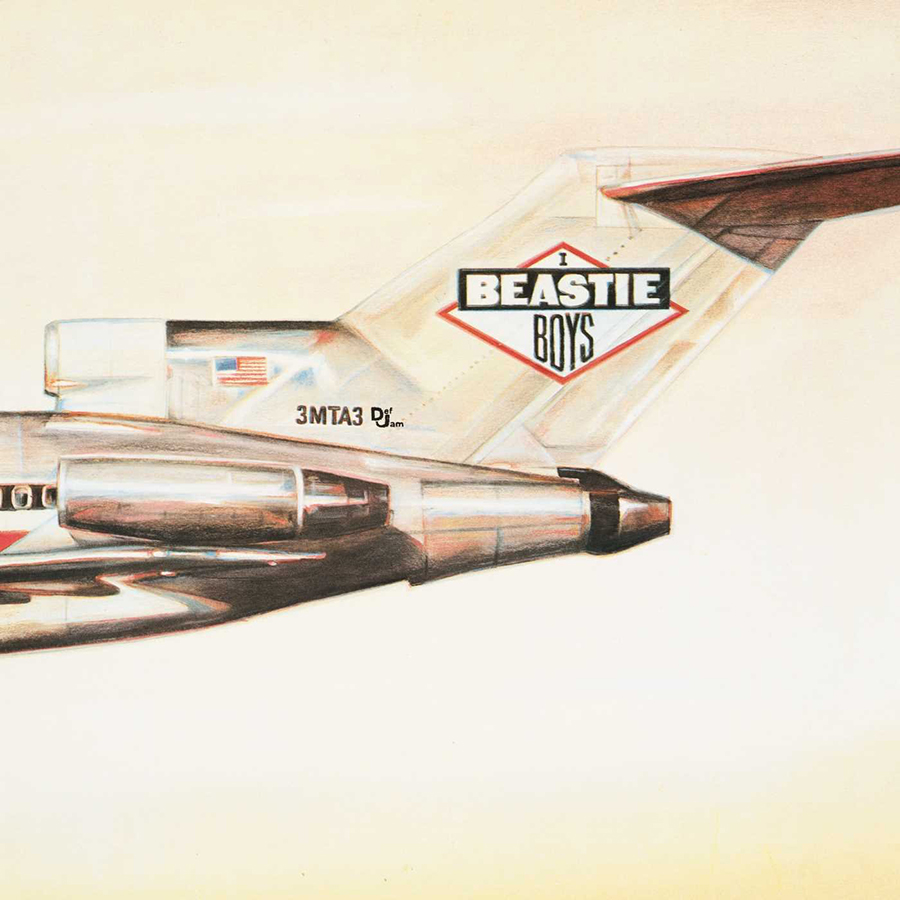
I have always loved hand-painted album art. To me, the Beastie Boys were a New York City punk interpretation of hip-hop. What made them cool was their ability to fuse very different genres and find commonality in the rebellion. What I love about this cover is the very clean, graphic, ACME-esque nature of the composition and then the surprising punchline on the back cover showing the plane has crashed into a wall. For a band filled with irreverent punchlines, this Mad-Magazine fold-out style cover works perfectly.
Lana Del Rey
Born to Die (2012)
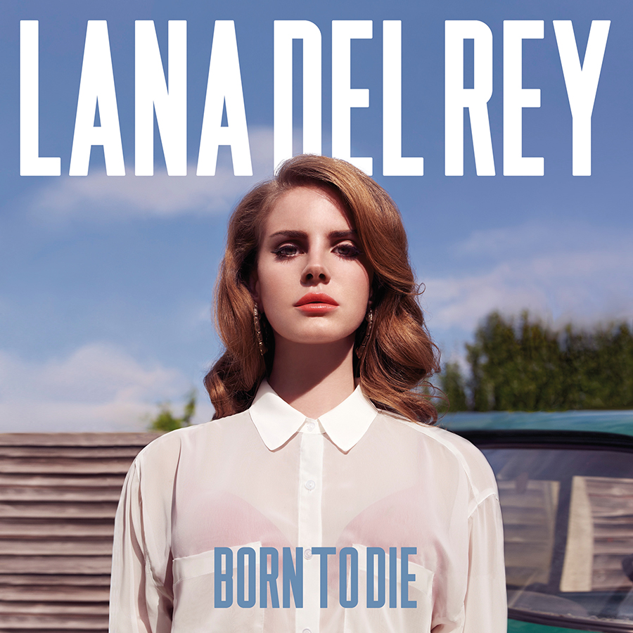
There’s something so captivating about the stillness of this composition. Her stage name and the album title all centered and staring straight back at you. It’s almost like the Mona Lisa, only… not really. Whether or not it was an intentional nod to Grant Wood’s American Gothic, it encapsulates her music and her brand of American aesthetic of a time gone by. Dreamy and haunting, her music and visuals feel like a yearning nostalgia for an America that actually never really existed.
Art of the Album is a regular feature looking at the craft of album-cover design. If you’d like to write for the series, or learn more about our Clio Music program, please get in touch.


 Events