12 Great Album Covers, Chosen by Karl Heitmueller Jr.
B-52's, Frank Sinatra, KISS, Built to Spill and more
When I agreed to participate in this series, I quickly realized how daunting it was going to be to limit myself to just a dozen covers. To winnow the list, I decided to only use records I actually own, leaving some covers that might’ve made the cut (e.g., Elvis Presley’s eponymous debut) for others to highlight (not that there won’t be some crossover here). Additionally, my criteria are completely subjective, meaning some covers might not seem to some of you as being particularly striking from a design standpoint. But to me, with every one of these albums, the link between music and cover art is inextricable.
The Sex Pistols
Never Mind the Bollocks, Here’s the Sex Pistols (1977)
Virgin/Warner Bros.
Artist: Jamie Reid
One of the most life-changing records of my life, this genre-defining slab of punk rock remains as fresh and incendiary as it was when I first heard it come out of my pal Kevin’s speakers over 40 years ago. And the graphically stark, mismatched text-only cover in fluorescent pink and green (as the American version was colored) was as much a reaction to slick, overdone album covers as the music was to the bloated nature of much of what comprised 1970s rock. Everything about this record, including the cover, is perfection.
The Dave Brubeck Quartet
Time Out (1959)
Columbia Records
Art: S. Neil Fujita
Let’s face it, from a design perspective, it’s hard to beat jazz LPs of the 1950s. There are hundreds of beautiful covers that utilize a deft mixture of photography, artwork and typography. But this one is what instantly springs to mind when I think of that era, that sound, and that visual esthetic. This cover is everything that lies inside: sophisticated, innovative, smart, elegant, playful.
R.E.M.
Reckoning (1984)
I.R.S. Records
Art: Howard Finster with Michael Stipe
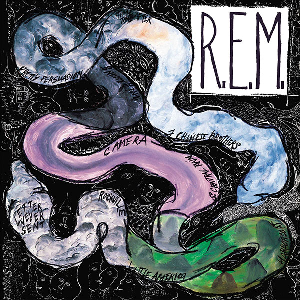
R.E.M. lead singer Michael Stipe gave Howard Finster a crude drawing of a snake and asked the folk/outside artist to paint over it for the cover of the Athens, Georgia, band’s second full-length LP. The resultant imagery, a cover like graphic kudzu, greatly increased Finster’s audience (more people to whom he could preach!). I can still remember how much this cover just leapt out of the record racks when it was new, like a crazy street preacher speaking in tongues. Which, in this case, was a perfect match.
Various Artists
A Very Merry Christmas (1967)
Columbia Special Products
Artist unknown
This department-store compilation has been a perennial every December for as long as I can remember (and may well have been my first favorite album). The design is simple: a flat, red background with the 14 contributing musical artists depicted in circles stacked in a triangle with smaller green circles as ornaments and the record title (in Clarendon?) at the top to form a Christmas tree, with the “Produced exclusively for Grants by Columbia Special Products/STEREO” info serving as the trunk of the tree. This record might be more responsible for instilling a “less is more” design esthetic in me than any other piece of hard media in my wee formative years. Although, thankfully, I no longer cry when Jimmy Dean’s version of “Jingle Bells” ends.
The B-52’s
(Self-titled, 1978)
Warner Bros. Records
Artist: Tony Wright (as Sue Ab Surd)
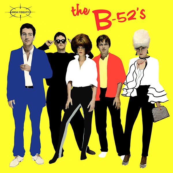
The weekend after this prototypical new wave band appeared on Saturday Night Live, I begged my father to stop at Budget Disc-O-Tape in downtown Lancaster, Pennsylvania, to buy me their debut LP. An indulgent parent, he came home from work that Monday with the record, and when I pulled it out of the brown bag from the record store, the overly saturated photo, the flat colors and the bright yellow album cover seared into my brain as another visual complement to my burgeoning sense of proud alienation from the mainstream. Screw Boston (the band, not the city)!
X
Under the Big Black Sun (1982)
Slash/Elektra
Artist: Alfred Harris
One summer day shortly after my graduation from high school, some friends and I traveled the 90-minute drive to Philadelphia specifically to go record shopping. At one of the shops we hit that day, I spotted this striking black-and-white cover, curiously wrapped in loose plastic wrap (like shrinkwrap that hadn’t gone under the gun). Somehow the Los Angeles art-punk band X’s first two albums had eluded me, but this was one of those not-uncommon scenarios where I knew I had to own the record just based on the cover(s, including the back). Bleak but romantic, equal parts poetry and anger, this record made me instantly fall in love with the band, who went on to become my second favorite of all time. (First place goes to the Clash, who are curiously absent from this list, but only because London Calling is too easy a pick and I already mentioned its design inspiration in the introduction.) But back to the cover—while it’s certainly great, whoever had the idea to use the loose shrinkwrap also contributed to the design that I found so eye-catching.
Julie London
Around Midnight (1960)
Liberty Records
Designer unknown
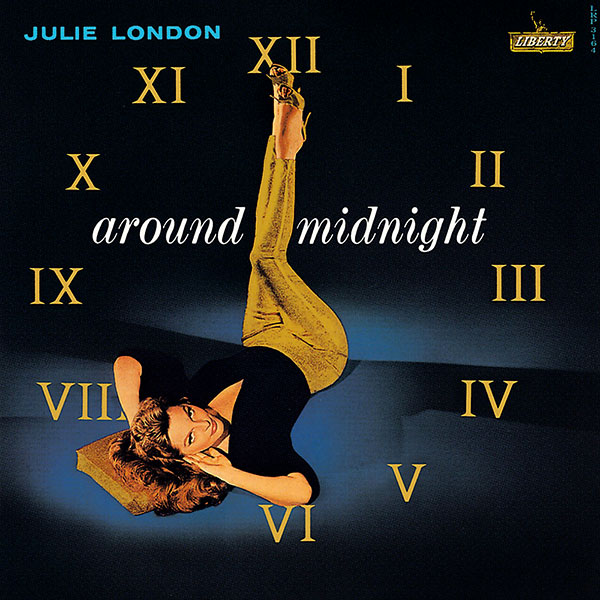
It’s here that I confess a decidedly un-woke yet abiding affection for classic “cheesecake” album covers of the 1950s and ’60s. I couldn’t not have one on this list, and while Paul Weston’s The Sweet and the Swingin’, Nelson Riddle’s Sea of Dreams, and Esquivel’s Other Worlds Other Sounds are all framed on the wall in my entranceway, I have to give the nod to Julie London’s 1960 side of slinky seduction, Around Midnight. While London regularly trafficked in provocative covers, this one is the gold standard … literally. On the cover, Julie lies (no doubt uncomfortably) on her back, legs in the air, arms behind her head, just barely supported by a small pillow as she cranes her neck to look at the hapless romantic holding the record in his sweaty paws. Julie’s encircled by a clock’s Roman numerals—embossed with gold ink, along with the pillow and the singer’s tight pants and high-heeled mules. She may not have been able to get enough air in that position to sing “You and the Night and the Music” but that album cover sure fit the tune.
The Mono Men
Sin & Tonic (1994)
Estrus Records
Design: Art Chantry
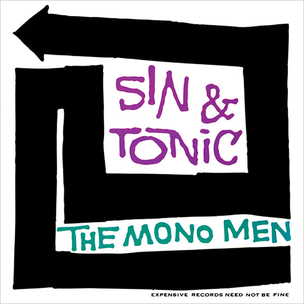
Speaking of a cocktail esthetic, nobody did the retro thing better than Art Chantry, the legendary Pacific Northwest designer whose work became synonymous with garage rock in the 1990s. Taking inspiration (sometimes liberally) from all aspects of vintage pop culture, Chantry paid attention to every detail of the records, posters, T-shirts and CDs he designed, and made better use of type than almost any artist in the past three decades. As computers began to take hold as the primary tool for designers, Chantry steadfastly clung to analog art techniques, matching the primal immediacy of bands like Mono Men of Bellingham, Washington, one of my favorite bands of the era (don’t call them grunge).
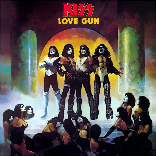
KISS
Love Gun (1977)
Casablanca Records
Artist: Ken Kelly / Designer: Dennis Woloch
Prior to my punk rock epiphany in 1979, I was a member of the KISS Army. True story. I’m not ashamed. The combination of their pop-metal anthems and comic-book sensibility was ripe for my adolescent picking. And being keen marketers (as we now all know), they paid as much attention to their album packaging as the music inside (maybe more). 1977’s double-entendrefest Love Gun featured a Ken Kelly-painted cover in which Conan the Barbarian would’ve felt right at home. Inside, the band’s logo was approximated by blood on a green marble background on the inner sleeve, and a cardboard fold-out pop gun bonus took the album’s name way more literally than anyone else did. And it all works.
Frank Sinatra
September of My Years (1965)
Reprise Records
Artist: G.R. Bartell / Art Direction: Ed Thrasher
Considering this entire list could’ve been nothing but Frank Sinatra albums, you’ll forgive me mentioning a few runners-up: Come Fly With Me, No One Cares, At the Sands, Sings for Only the Lonely… It’s no surprise that the man who first conceived the record album as a thematic piece would also have some fantastic covers that match the music. This achingly melancholic reflection on aging is perfectly adorned in a slightly impressionistic, blue-and-green-tinged painting of the singer seeming to lean out of the way of the full track listing in the upper left corner. The cover exudes a weary, reflective maturity that’s maybe less iconic than a lamppost and a tilted fedora, but is every bit as powerful.
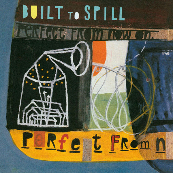
Built to Spill
Perfect From Now On (1997)
Warner Bros. Records
Art and design: Tae Won Yu
Photographer/guitarist/artist/designer Tae Won Yu is an indie rock Renaissance man with a long list of credits, but his cover for Built to Spill’s 1997 masterwork, Perfect From Now On, is particularly inspired. Meandering but cohesive, enveloping all sides of the package, you can see something new in it every time you look (again, just like the music inside … except, you know, with the hearing instead of the looking—heh). I also have a personal connection to this record because it came out during my tenure as the East Coast Alternative Marketing Regional at WB, and was one of the defining records of that era, a time when artist development was still a priority, albeit beginning to head towards its sad but inevitable end.
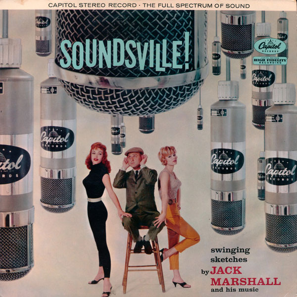
Jack Marshall
Soundsville! (1959)
Capitol Records
Designer unknown
OK, I’ll be honest, I don’t love this record. It’s rather forgettable jazzy easy listening (augmented with whistling!) from the producer/songwriter/guitarist (perhaps best known for writing The Munsters theme). But that cover!! It’s everything I love about this era in record cover design in one simultaneously swanky and cheesy package. No explanation required, there’s no subtle subtext here, and you either dig it or you don’t (and if you don’t, you probably REALLY don’t). But even if this record were completely unlistenable (and it’s not), it would still earn a spot on my shelf.
There are so many more covers that I love, and as with all subjective lists of best/favorite/most iconic whatevers, if I were to rewrite this next week, there might well be some swapped choices (like maybe Talking Heads’ More Songs About Buildings and Food for The B-52’s? Cannonball Adderley’s Things Are Getting Better for Time Out?). In fact, I spent way too much time debating the last two on the list with so many other runners-up yelling at me from my shelves. These are the things that never bother Spotify users. Sigh.
Art of the Album is a weekly feature every Thursday looking at the craft of album-cover design. If you’d like to write for the series, or learn more about our Clio Music program, please get in touch.


