11 Great Album Covers Chosen by Sarah Weck From Mr. Bronx
Tame Impala, Fleetwood Mac, Khruangbin and more
Album covers are particularly exciting to me because they can either enhance a record or contrast its sound with a completely different visual—and either choice tells you something about the artist and the music itself. Do they want to deliver an aesthetic as advertised, or do they want to flip your expectation on its head for a wholly new experience? My choices sample from a bit of both. As a post-production mixer and sound designer, visuals play a huge part in inspiring my sound design work and the music that draws me in most.
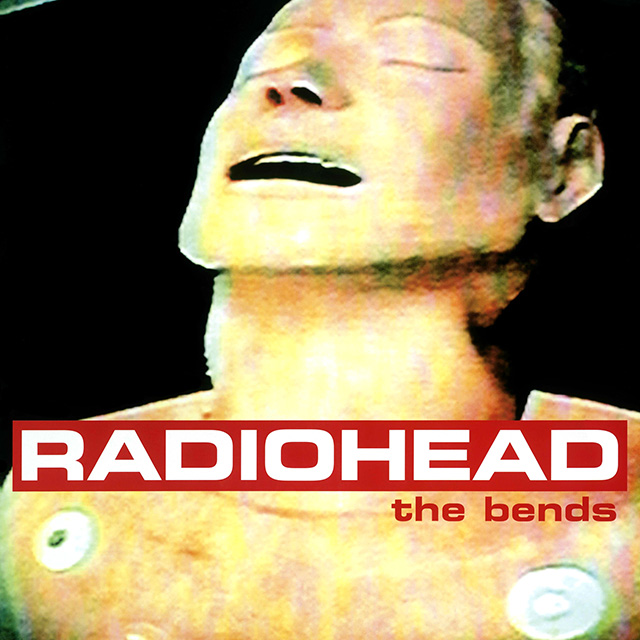
Radiohead
The Bends (1995)
One of my favorite album covers is the CPR dummy visual on Radiohead’s sophomore album The Bends. I was very young when this came out, so listening to the album feels like pulling out distant memories. I love how the dummy, which was originally on a cassette tape that they hooked up to a TV and photographed, looks like it is experiencing intense human feeling. That essence is captured in this album, especially “Fake Plastic Trees” and “My Iron Lung.”
Okay Kaya
Watch This Liquid Pour Itself (2020)
I discovered Okay Kaya at the beginning of the pandemic, and this cover really fit my mood at the time. The music also feels hyper-specific to our current epoch. Kaya’s wild lyrics on tumultuous mental states and whispered confessions at times seem a bit shocking, but the cover lets you know that’s what you’re in for—and I love that spookiness coupled with her sardonic attitude. Makes us all feel a little less weird for feeling bizarre in these strange times.
h hunt
Playing Piano for Dad (2016)
I remember back in high school I used to complain to my art teacher about not “getting” minimalist art and formalism. It annoyed me when an image didn’t have inherent meaning or something that could be easily interpreted. That’s certainly the case here, but I’ve learned to appreciate that. This album was recorded for the composer’s father without the intention of creating an album, and you can feel the intimacy of that in the small creaks and breaths in the recording. So this is a great example of a visual that doesn’t have an obvious correlation to the music itself, but being let into the quiet warmth of the album is a privilege in itself.
Fleetwood Mac
Rumours (1977)
My best friend in high school had this one on vinyl and we would lie on her floor and listen to the whole thing through. The mystique involved in the cover art is something neither of us had seen or felt with current music of the 2000s, and we loved Stevie Nicks’ witchiness and the crystal ball they both hold in the portrait. We loved the stories about the band, too, but I didn’t know at the time the story of the wooden balls hanging from between Fleetwood’s legs. Pure mischief.
Kendrick Lamar
To Pimp a Butterfly (2015)
My favorite rap album cover is Kendrick Lamar’s To Pimp a Butterfly. Lamar’s family and friends stand in front of the White House over a judge who—according to Lamar—represents how his community’s life has been impacted negatively by the law. The celebration on the cover he said represents how he felt when he was signed, and I love the intersection between the personal and political he always manages to expertly convey in all of his work.
Tame Impala
The Slow Rush (2020)
I’ve always been a fan of surrealism so I love all of Tame Impala’s visuals, but The Slow Rush is my favorite. The image feels both expansive and contained, which is hard to accomplish, and also a difficult balance to strike within sound design—so relatable to me there.
Patti Smith
Horses (1975)
Photographer Robert Mapplethorpe’s deep friendship and relationship with Patti Smith is what draws me and so many others to this album. The two created the image for the cover in their own intimate setting, which makes it hold many different emotions. Listening to Patti Smith is to be reminded of the expansive world in all its politics and fervor, and also to feel as if you are receiving a message from a close friend. Patti’s eye contact with Robert’s camera (and subsequently the listener) on the cover lets us know that she wants us to hear that message.
Dr. John
In the Right Place (1973)
The king of New Orleans funk could never disappoint—especially with this album. I love this cover: the fiery burst of color and how the different scenes in each corner contrast against the black background. The drawings feel like clues to unlocking the mystery of this record.
Led Zeppelin
Houses of the Holy (1973)
This image I associate wholly with the record itself—the music and these little children climbing up the rocks into the red sunset is fused with “The Rain Song” and all of the album’s crazy guitar solos and Robert Plant’s iconic vocals.
Blood Orange
Cupid Deluxe (2013)
This is one of those covers that subliminally makes so much sense when you’re just listening to the album, but on closer inspection, there’s a lot to see. Everything is extra-sensory. The pink glow around the woman pictured just feels like the taste of blood orange, and her banana yellow heels and purple hair clips perfectly capture the intelligent fun that is Dev Hynes’ music.
Khruangbin
Hasta el Cielo (2019)
I have this one on vinyl, and the sleeve with its beautiful folk-art cover is leaning up against the wall on a side table in my room. The picture really embodies Khruangbin’s sound: organic and natural elements fused with the psychedelic and playful.
Art of the Album is a regular feature looking at the craft of album-cover design. If you’d like to write for the series, or learn more about our Clio Music program, please get in touch.


