10 Great Album Covers, Chosen by Director Drew Kirsch
OutKast, Harry Styles, David Sabastian and more
Album covers bring me back to a time where one of my favorite things to do was hit up Tower Records or Sam Goody for an hour or two. I had a booklet of 100+ CDs beautifully organized, with their album cover next to each of them. Without knowing it at the time, these covers played a big role in my later life, as inspiration for my creative work. As a film director, I tell my crew every frame should look like an album cover, beautifully composed, like something someone would want to screenshot and put on their wall. These 10 covers have made a big impact on me, so I’m excited to share them.
Gina G
Fresh! (1997)
This is shot by one of my all-time favorite photographers, David LaChapelle. I love how bold, colorful and fun this cover is. From afar it looks like a rather simple cover, but when you look up close, you notice Gina G is covered in chocolate. The minimal set design blends perfectly with the vibrant texture of the image. Also, her beautiful hair pops, matching her energy.
Travis Scott
Astroworld (2018)
Another one by David LaChapelle. This trippy, carnival-themed cover makes you want to explore what is inside. I love how there is a level of grit below the vibrancy. It feels surreal and reminds me of my favorite place on earth, Burning Man.
Harry Styles
Fine Line (2019)
This Tim Walker-shot cover screams nostalgia to me—the extremely wide fisheye lens, Harry’s insanely cool wardrobe (you can never go wrong with a Gucci fit), and the color scheme that reminds me of a ’50s diner. Apparently, Harry hadn’t actually had his face on any of his albums or single artworks ever, until this one.
David Sabastian
DUH (2015)
David Sabastian is one of my all-around favorite artists ever. Everything he does is perfection, from his covers to fashion to music. This is one of his more “toned down” album covers, even with him wearing a giant piece of yellow fur. The characters on it seem like a group of fun misfits who don’t give a shit about what people think. It’s also very Byron Atienza. I’ve seen hundreds of photos shot in front of the famous Paul Frank pink wall on Melrose, and I’d say they all look the same to me, except for this one.
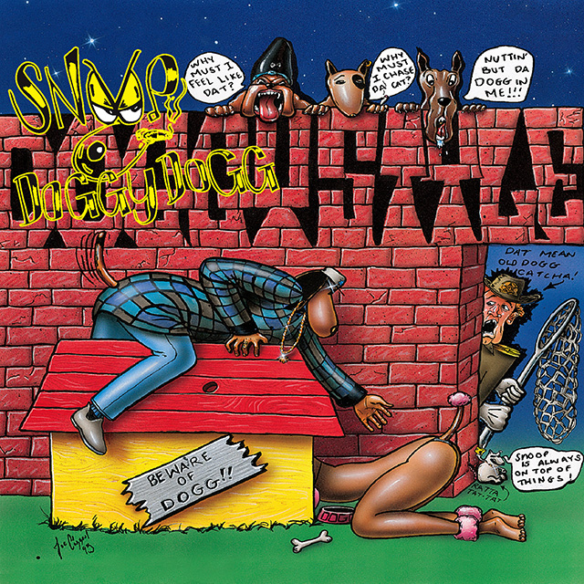
Snoop Dogg
Doggystyle (1993)
I have to add this cover on here because my mom banned it from my childhood when she saw it for the first time at Tower Records. At the time it felt so loud. As a kid under 18, owning it felt like you were doing something wrong, which I loved. Snoop’s cousin designed it, and when it was released, people were pissed because it’s so provocative. I respect it because they decided to break the rules, and the risk ended up being worth it for the reward.
Tyler, the Creator
Flower Boy (2017)
“Flower Boy” sounds so sincere and unusual for a rap album, and this cover matches the name perfectly. The portrait of Tyler feels dreamy, whimsical, youthful and inviting.
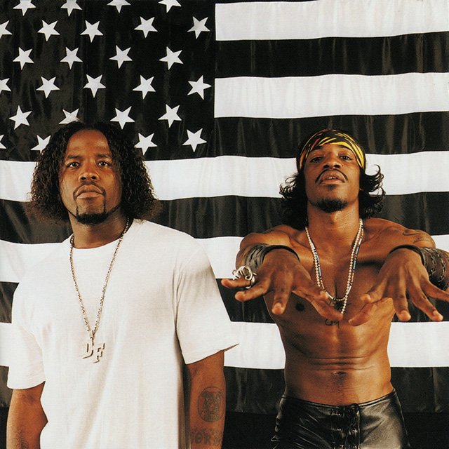
OutKast
Stankonia (2000)
This critically acclaimed 2000 album cover is an iconic image for the youth of the time. By standing in front of a huge black-and-white U.S. flag with inverted stars, they took a bold approach and visually separated themselves from mainstream America, a place where they didn’t feel welcome. I’ve seen this image referenced multiple times throughout the years for other projects, and I respect their unparalleled approach.
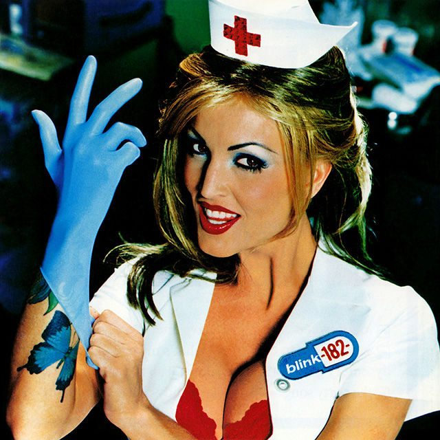
Blink-182
Enema of the State (1999)
This iconic cover was shot by photographer David Goldman and features adult film actress Janine Lindemulder as a nurse preparing for an examination. This was pretty provocative at the time, but not enough that it was considered porn or anything. This meant that a teenage boy (which I was) could print it and hang it on their wall (which I did). LOL.
Glass Animals
Dreamland (2020)
The little design details on this cover—the bowl of Cheerios, VHS tape, chainlink basketball hoop—are so satisfying. The pastel color scheme is so perfectly in line with the other elements. It’s also amazing how calm Dave Bayley’s face is amidst all the surreal chaos around him. The other versions of this cover are super cool, too, and you should check those out!
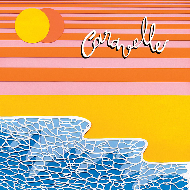
Polo & Pan
Caravelle (2017)
I want to print this on a giant rug or something for my home. To me, it screams happiness. The simple, vibrant and funky cover matches the energy of their album seamlessly.
Art of the Album is a regular feature looking at the craft of album-cover design. If you’d like to write for the series, or learn more about our Clio Music program, please get in touch.


