10 Great Album Covers, Chosen by Jonathan Parks of ALIBI
The Crystal Method, Prince, Black Crowes and more
As a production music executive and straight-up music fiend, I’ve spent countless hours of my life at record stores and scrolling through releases on Spotify. Many times, the enticing artwork representing an album’s vibe has drawn me in and actually introduced me to music I might not have considered before. And while it’s not the cover that keeps me coming back to a particular album once I’m hooked, I’ll always hold a special appreciation for artistry behind these gems. Here’s are 10 of my personal faves.
Cream
Disraeli Gears (1967)
Cover Art: Australian artist Martin Sharp

The Jimi Hendrix Experience
Axis: Bold As Love (1967)
Cover Art: David King

My favorite form of music art has always been ’60s-style poster art for concerts that all seemed to pose the question, “What would it look like if Alphonse Mucha dropped acid?” These are two of the album covers I adore that come closest to that style to me. Also, pretty sure this is what the sound of a wah pedal looks like.
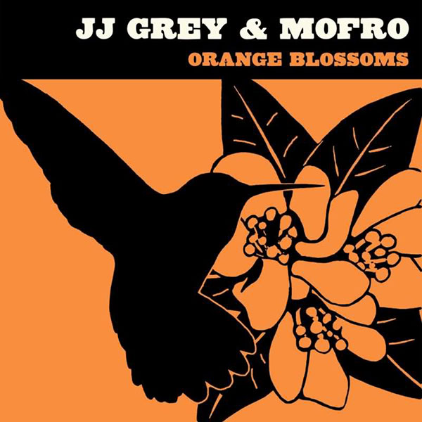
JJ Grey & Mofro
Orange Blossoms (2008)

As much as I love an explosion of colors, well-done minimal elements are always going to catch my eye as well. This cover’s wonderful illustration and use of simple color has the down-home welcoming southern feel of the album it represents.
Prince
Purple Rain (1984)

Purple motorcycle, purple suit, purple smoke—this cover is the immortal Prince in his prime, and the font is simply perfect. I was 7 when this came out and had the cassette on repeat, requiring lots of old-school respooling with a pencil. Considering this is the album that was responsible for the first use of Parental Advisory stickers, I’m guessing I probably shouldn’t have been listening to it when I was 7?
Ian Moore
And All the Colors (2000)

Ian’s always been one of my favorite artists. This mysterious and intriguing orange-light cover with a folk-art-styled sleeve over the case reflects the intense, beautiful, haunting songs and range of emotion on the album.
Crystal Method
Tweekend (2001)

The surreal dystopian depiction was created to get attention and it definitely worked. Was there a racing video game in 2001 that didn’t use tracks from this release? Interestingly, this cover art was a direct homage to the cover art for Supertramp’s Crisis? What Crisis?
Welshly Arms
No Place Is Home (2018)

Beautiful work in simplicity on this one with color use and font placement. A confident and welcoming design to my eyes.
Foreign Air
Lying (2017)

Another cover for the surreal bin. I’m a lover of collage art, and the combinations of images that don’t quite fit together until they do.
The Black Crowes
Lions (2001)

Bright, saturated colors will always grab my third eye as this one does. I remember running to Frye’s during my lunch break when I was working at EMI and blasting this one on my headphones for the rest of the day at work.
ALIBI Music
Dreamy Beats (2020)

As the founder of a company that started as a one-person entity, you get your hands into every job imaginable. We’ve grown quite a bit, so our team members have taken a lot of that off my plate while continuously improving their respective areas of business. However, one of the responsibilities I’ve hung onto and still do myself is the artwork for ALIBI’s albums and playlists (I’ve designed over 2,000 such covers to date). It’s enjoyable to present visual interpretations of what a collection of music sounds like, with the designs needing to be as vast and different as the music is. I especially have fun with albums that are cool, modern and slightly ethereal like this one.
Art of the Album is a weekly feature every Thursday looking at the craft of album-cover design. If you’d like to write for the series, or learn more about our Clio Music program, please get in touch.


